It happened! I painted the dining room walls and have hung some art. I’m also making moves on painting the chairs, I just need to decide how to do it, but more on that later. If you’re just joining-in, welcome to week 3 of the Fall One Room Challenge, hosted by Linda of Calling It Home. Each week 20 official participants share their updates // here // and then everyone else a.k.a the linking participants joins in on the link-up // here //.
Catch-up on // week 1 // week 2 // week 4 // week 5 // week 6 // The Reveal
*Behr Paint, Rugs USA, Wayfair & Parima Studios sponsored this post, but all thoughts are my own. Thank you for supporting the brands that make PMQ for two possible.

*Behr Paint, Parima Studio, and Jenny’s Print Shop sponsored this post, but all thoughts are my own. Thank you for supporting the brands that make PMQ for two possible.
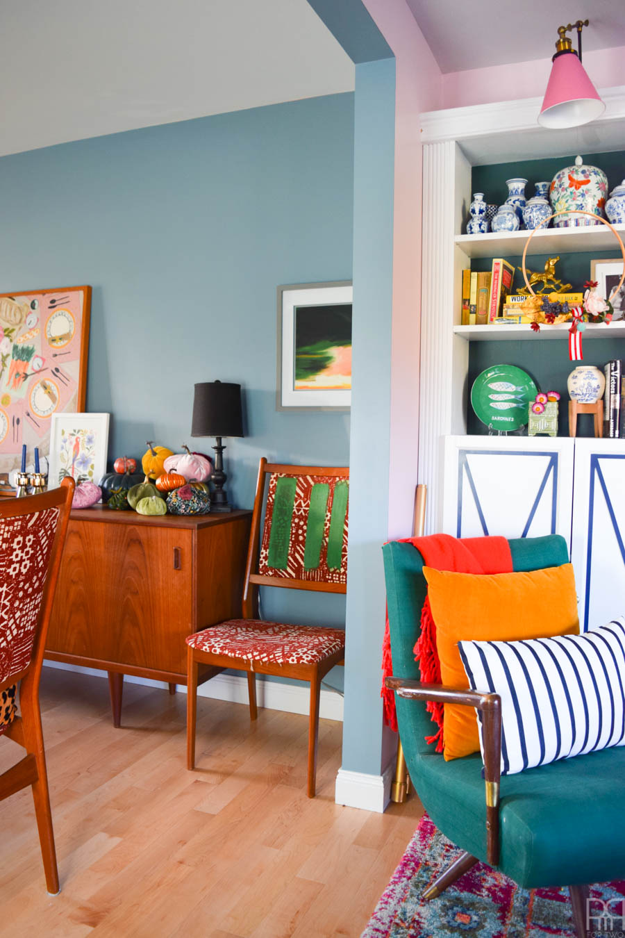
If you were to walk into my house today this is what you would see. The Rainy Season Blue meets the Rose (both by Behr Paint) at the end of a doorway, and it’s colour blocking perfection. While I still have some touch-ups to do it’s essentially perfect. I want to paint the entire main floor this shade of blue, and I have enough paint left to do it. REAL FAST: do I paint the entire main floor Rainy Season blue?
Before I get on with the business of showing you more updates and sharing some of the choices I’m making, I want to quickly thank all my sponsors without whom none of this would be possible.

If you remember my week 1 post // here // you’ll know that this space was pink with a guava jelly orange wall. In photos it looks vibrant orange, and unperson it’s only slightly less intense. I loved it. I loved it so much, but it was too warm a shade for the space once I added all the teak furniture.
Once I got down to it, painting over the dining room was actually much easier than I thought. You guys know I love Behr paint’s various lines, but their Marquee brand is by far my favourite. The one coat coverage is hard to beat, and this is the perfect example why — it covered the orange-y wall (pictured here) in one coat.
The marquee paint is like butta, it goes on thick but smoothly, and covers everything. I don’t think I could ever use any other paint, and that’s saying something!
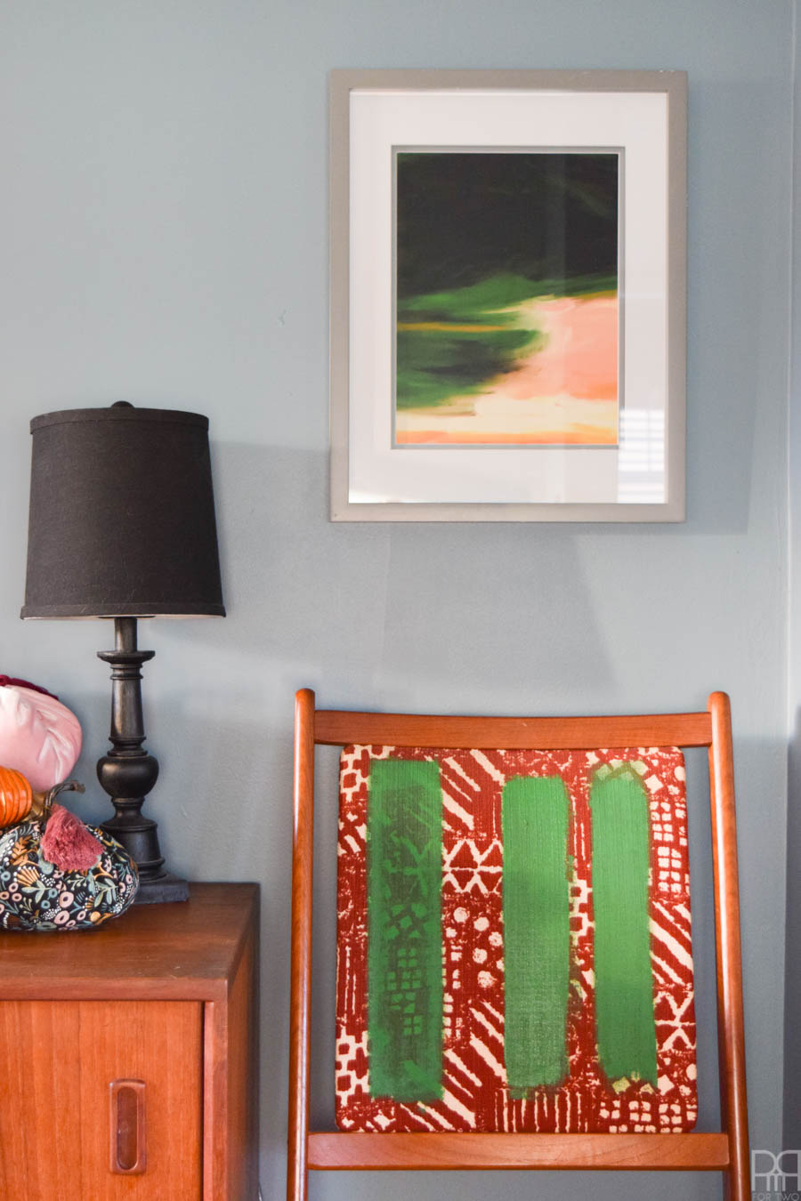
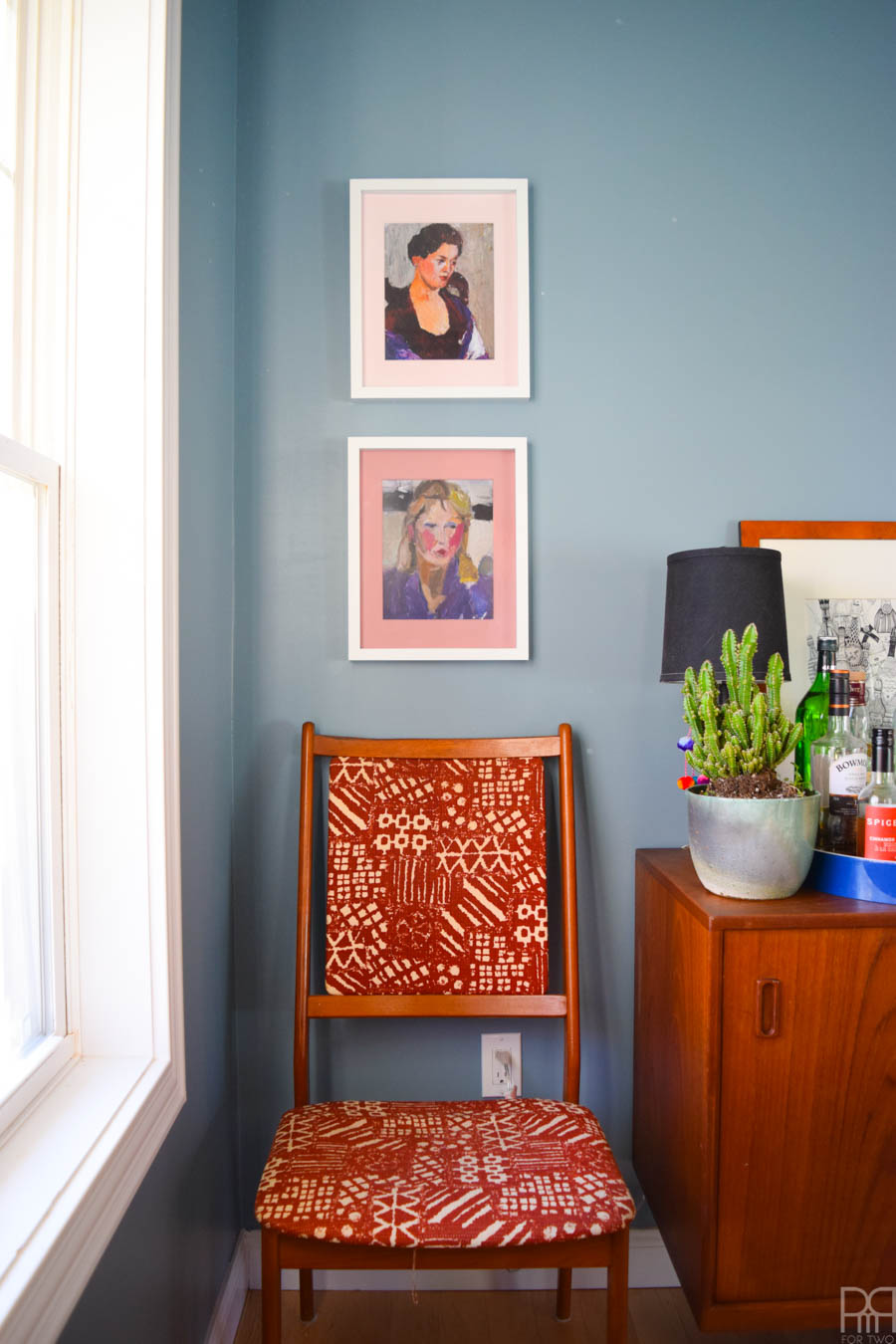
p.s if you love that green print above the chair as much as I do, you can grab it from Parima Studio // here // It’s called The River.
p.p.s if you love the pumpkin patch you can learn how to make your own // here //
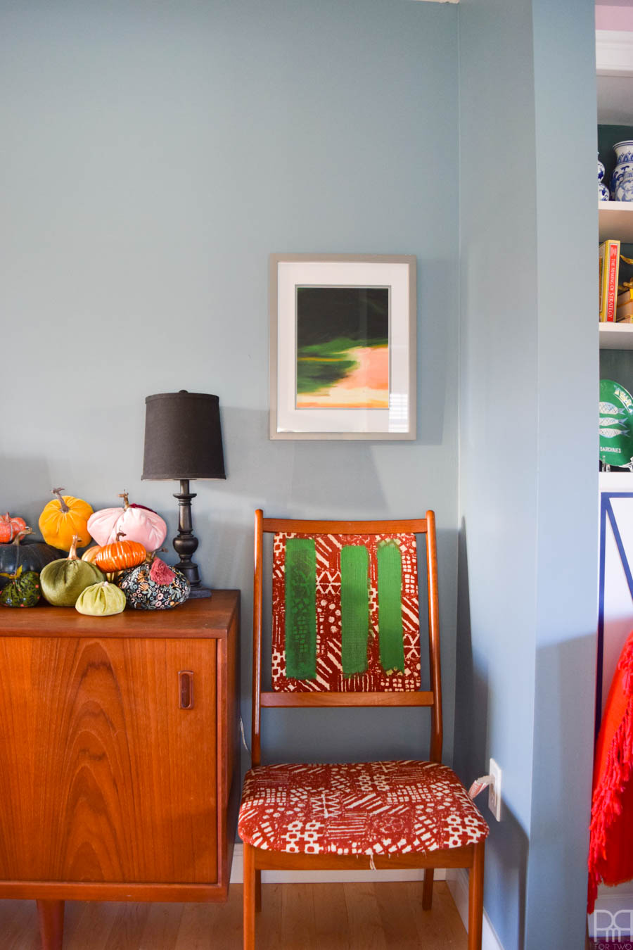
Right here you’re getting a good read on how the paint looks against the sideboard and the dining set. You can also see that I’m testing-out green paint on the chair before trying it on all of them.
I’ve read a million different posts, asked the blogger brain trust, and finally tested-out the best options for painting upholstered furniture.
Now, you’re probably wondering why I don’t just reupholster them – good question! Well, to start, I can’t afford to. There’s only one person locally who does this kind of thing, and they ain’t cheap. I could do it myself, but having taken a look at the different seems on this chair, I don’t feel comfortable trying it myself. I’ve had experience with this type of upholstery job, and it never quite turns out how I want. Since I love this set too much I don’t want to tempt it.
This brings us back to paint. I know I’ll have to reupholster one day, but in the meantime I might as well do the best paint job possible and save up!
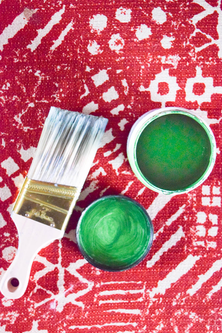
I’ve got many paint brands at my disposal for painting the upholstery, but I’ve heard that wall paint is just as good, so I’m testing-out a Behr Marquee sample (from Home Depot) in my shade of choice.
I’m testing-out watered-down paint (on the Left), paint and fabric medium (in the middle) and paint on its own (on the right). The shot above is with 2 coats on each strip. I’ll have a post on which option I went with, and how I did it, later.
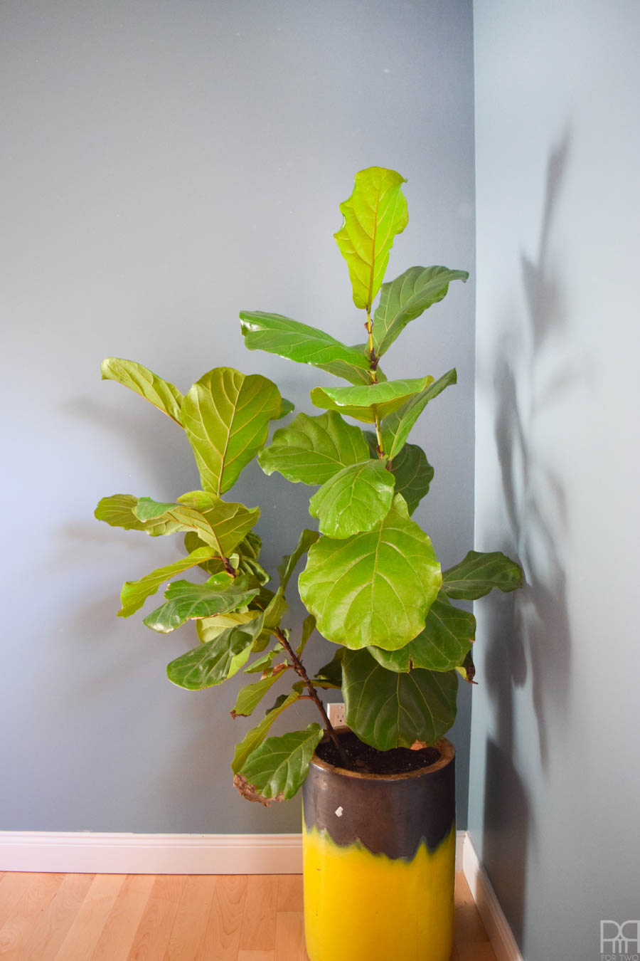
I’ve got a fiddle fig in the dining room, and I’m still not sure if I’m keeping it. This spring I re-potted it into a bigger pot so that it could grow, and by god it has! That being said, I’m not sure if it’s the right fit for the space. Thankfully we have a friend who is more than willing to give it a temporary home while I figure it out.
On the other end of the buffet I’ve got these two lovely ladies: June and Eleanor. They’re digital art prints that I got through Jenny’s Print Shop (one of the official sponsors for the challenge). I placed them in simple white framed but painted the mats in a pink and light purple to help bring-out their colours in contrast.
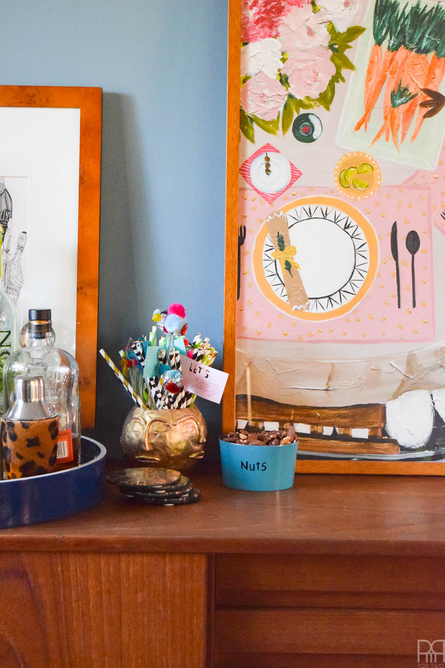
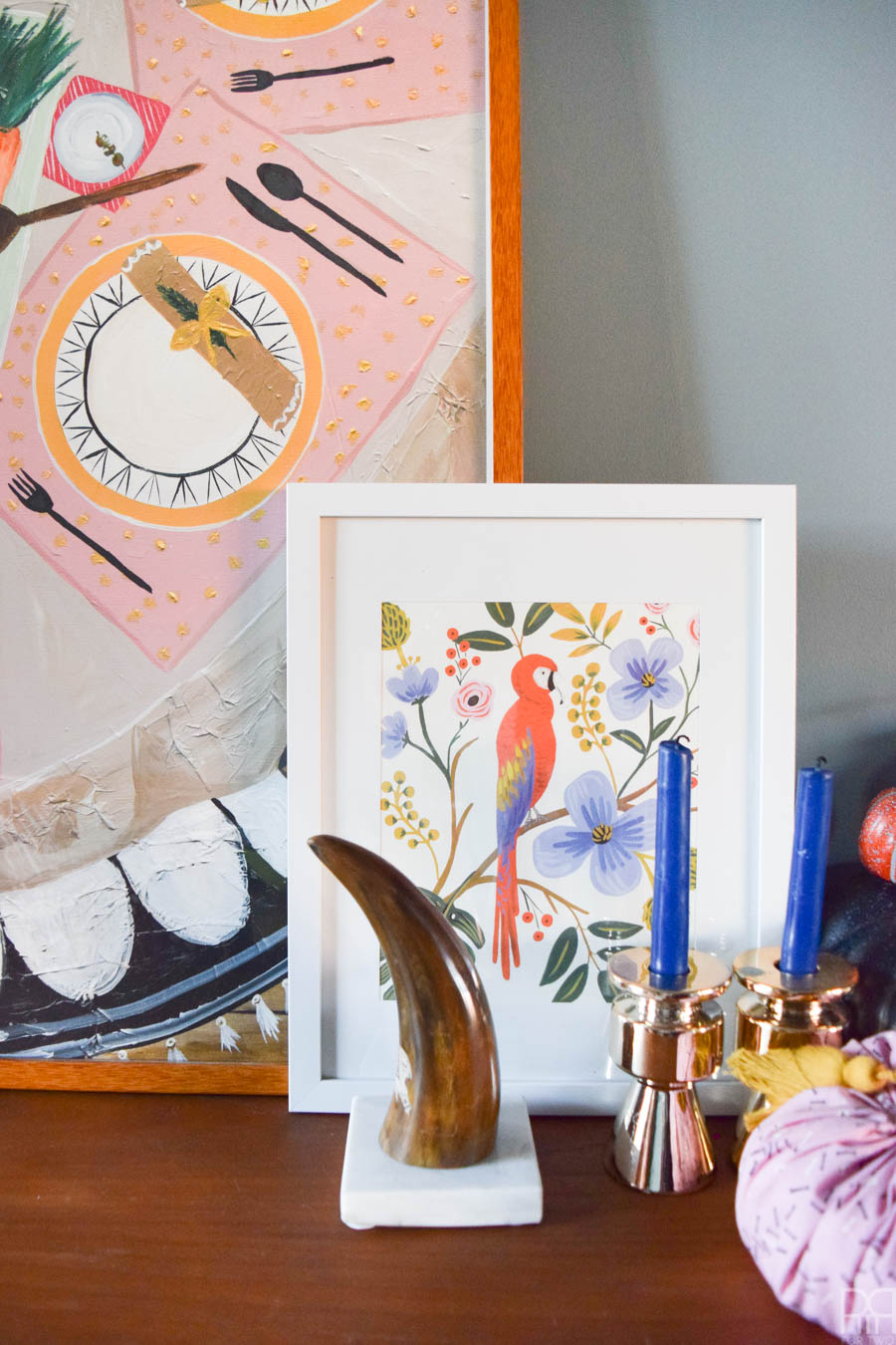
You can see a little bit of the big piece that will be prominently displayed. I’m saving bigger shots of that until the reveal, so you’ll just have to sit tight in the meantime. Because the space is constantly in use, it’s kind of styled, but not really. I promise to have more concrete styling for the end.
In the meantime, make sure you double back to the link-up ad check-out everyone else’s rooms.
To Do List
- Paint the walls – CHECK
- Instal new light fixture
- Paint (or maybe reupholster) the dining room chairs – IN PROGRESS
- Acquire and instal art – IN PROGRESS
- Lay new rug
- Make roman blind for the window
- Swap light switch-plates – CHECK
- Decor, decor, and more decor! – IN PROGRESS

That blue paint is so pretty! It’s so perfect with the teak! Good luck on the painted upholstery!
isn’t it lovely? I love the shade so much that I brought it into the dining room hahaha
oh I have never thought about painting upholstered furniture before! looking forward to seeing how yours turned out and your tips on how to do it perfectly! loving the two colors in your between your living room and dining room too. … so fresh!
Me neither! but necessity is the mother all invention right? I know I can do a better job with the paint than with upholstery (playing to my strengths yo), so I figured it’s a safer bet. I glad you noticed the contrast, I am totally digging it too!
Oh my goodness Ariel!!! I love that blue what it a difference it makes!! I want to try painting upholstery but am so scared to do it!! I will wait and see how yours turn out and then maybe I will jump in (since my upholsterer is booked until December, ahhhh). Can’t wait for next week!!
Thanks Suzanne! I am not gonna lie, I’m kinda scare to do it too! I’ve got a tester going right now, so I’ll keep you all updated!
The painted mattes on the pictures are so pretty! That really makes all the difference. So much beautiful color in your home– I actually almost like the print on the chairs with everything else going on!
aren’t they lovely? It’s such an easy upgrade to any frame, and a great compromise on white frames.
I love how this project is taking shape – the wall color is gorgeous and I am excited to see which option you chose for your chairs. love how you balance the bold and vivid!
Thanks Joy! I hope you’ve stuck around so far to see where we’re at by now.
You’re moving right along! this totally sparked my interest on painting chairs. I can’t wait to see how it turns out.
moving at a clip! That’s for sure
The progress looks amazing! I especially love the two portraits hanging on the wall–perfect!
me too, I love some symmetry from time to time.
The colors you use in your home are so beautiful! I think i need to learn from you about how to mix so many different colors. You make it all work so well!
you’re making me blush!
The new color is looking good, though i wasn’t hating the old color, I understand the need for change. Looking forward to seeing how the paint turns out. My mid-century set need re upholstery too (thanks to my messy son) but mine are the seats only so it’s not a hard job. Good luck!
thanks! Yea, it was a great colour, but it was too much for all the teak, and I wasn’t going to pass these pieces up. Paint is an easier fix!
The perfect complimentary colour for that gorgeous furniture – love it! Can’t wait to hear all about the fabric painting!
thanks bebe!
Hi Ariel!
I can’t wait to see how your chairs turn out. painting fabric always scares me. Maybe now I will get the courage to give it a try!
I hope you do try it! It has turned out beautifully so far!
That wall color is the perfect creamy blue!! Love the teak credenza against it. Looking forward to the painted chairs- good luck!
it’s like butttttaaa
Oh I can’t wait to see these when they are finished!
I was almost scared to do them, but I’m glad I did!