People have been low-key dying to see what the new Q looks like. While I won’t do the full reveal for a while, I will be revealing room by room!
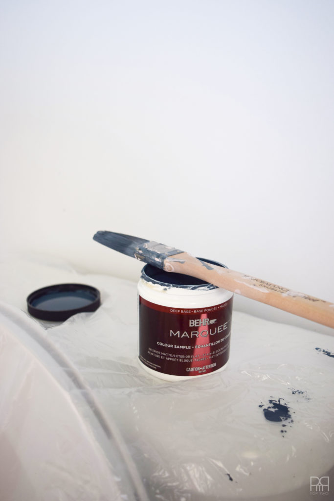
Like foreplay though, I need to tease you guys a bit, so I’m showing some thigh i.e paint colours.
See that little painted swatch in the middle? That holds all our colours. Take it all in! Breathe in the gorgeousness.
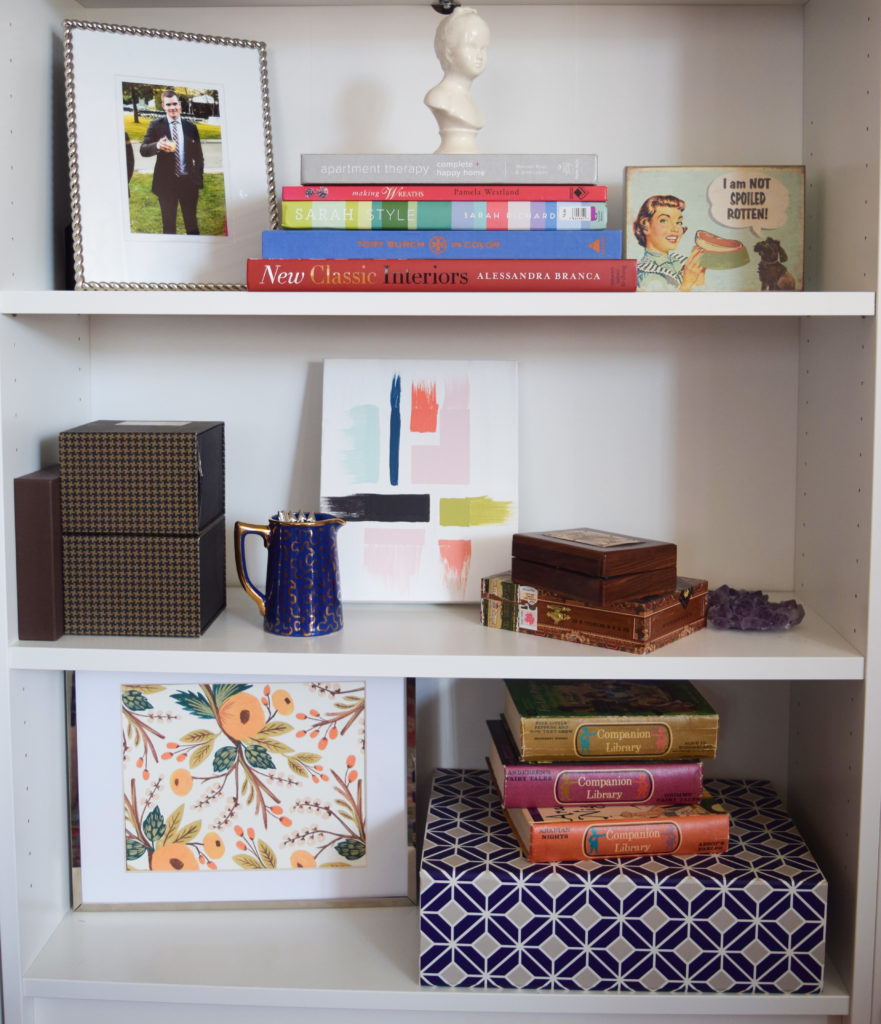
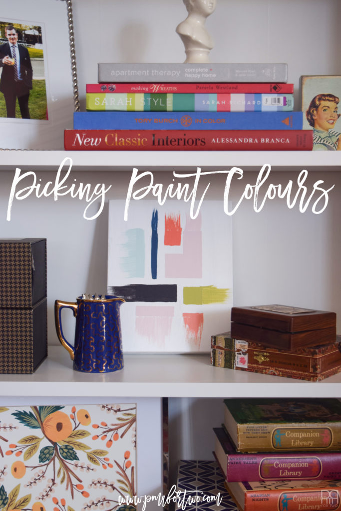
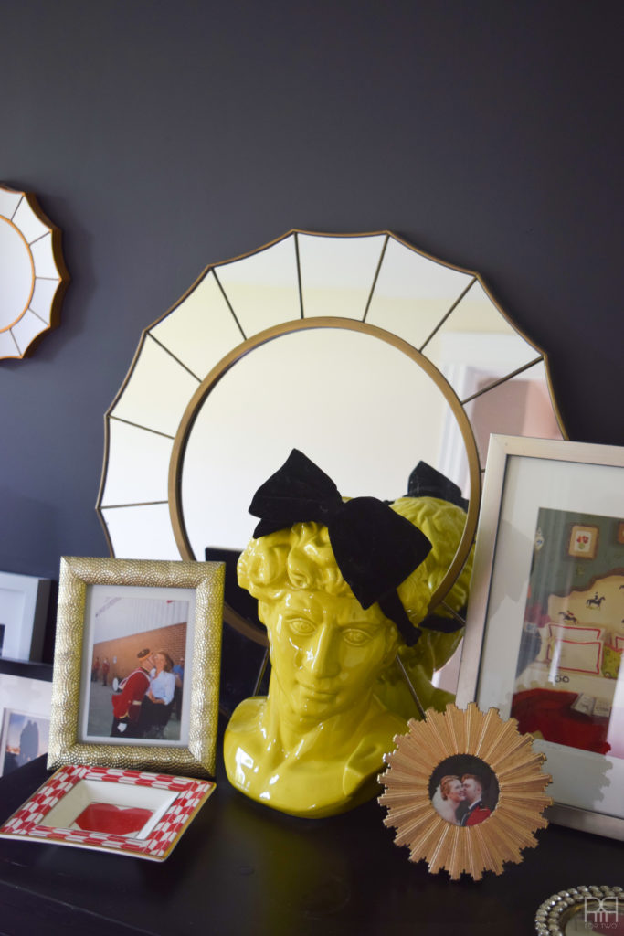
Our living room like a heck of a lot like the space I envisioned –> here <– and the shelfie is a little peak at what we’ve done.
Like I said in my post –> 10 design mistakes to avoid <– I wanted to be more deliberate with paint colour choice this time around. So, I did what every decor savy person does, I found an image that inspired me and went from there!

This Wes Anderson movie inspired piece is what our house is based on. Real talk.
The worlds he creates on camera are cinematographic stories that I want to go hang-out in. They are rich landscapes full of colour, texture, classic and mid-century design elements, and did I mention, colour?
When you think about it, this explains a lot. Unwittingly I’ve drawn on elements from each oh his films. I’ll share some of my favourite
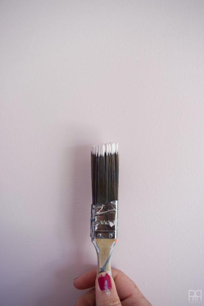
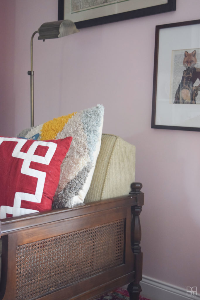
The main colour in the house is Radiant Rose S140-1u by Behr paints. It’s in the living room and dining room as well as part of my office.
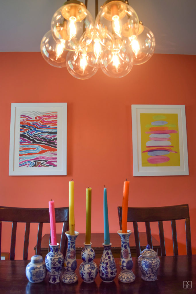
The dining room is one of my favourite spaces. It’s paired down compared to previous spaces, but an accent wall in Guava Jelly P190-4m by Behr Paints stole the show.
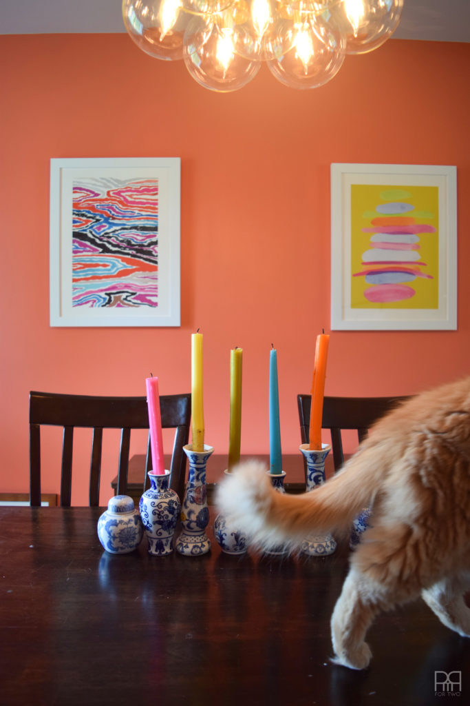
No photo shoot is complete without Boots wandering through a shot.
The Kitchen is very similar to our previous kitchen in that we’ve chosen a light blue. Because the cupboards are so dark and the living room is so bright, I needed a subtle colour that would sooth the brown.
We went for Rio Sky M440-1u by Behr paints. It’s a shade darker than our previous blue, and more chalky. I quite like it.
For the main floor bathroom I’ve opted to leave the walls white. It’s a smaller space but the ceilings are high. To accentuate the height and draw the eye upward I painted the ceiling using our old faithful –> the painted moulding.<– We used Midnight in the Tropics S480-7o by Behr paints.
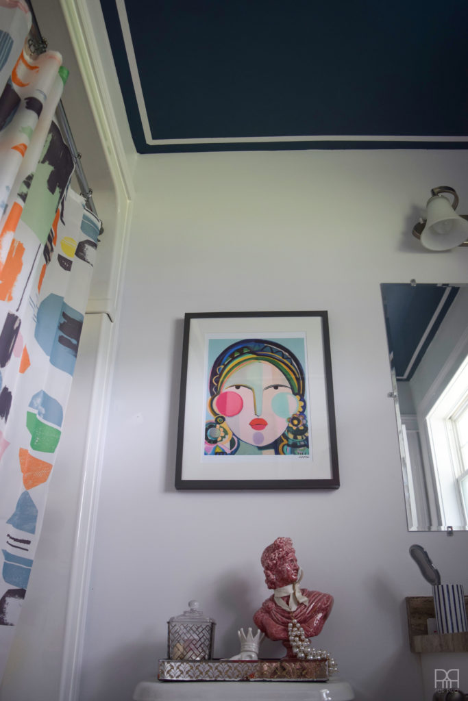
Because the bathroom is so small I don’t want to give you a second photo in case I give it all away! You’ll have to wait for the final reveal to see it all.
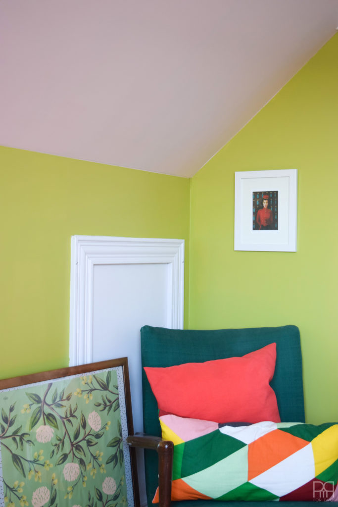
In my office on the second floor there were no holds bared. I went with a bold new colour for me – chartreuse – also known as Pistachio MQ4-42i-m-e-d by Behr Paints. DH is not a fan of the colour, he refused it for the master bedroom and calls it “shrek green.” But what does he know?! He’s actually colour blind for green-blue.
As you can see, I’ve used the same pink on the angled walls to add more of a contrast.
For the master bedroom we had one heck of an adventure picking-out that colour. We had originally chosen a really nice green-blue. When we got the sample to try it on the wall it came out a gorgeous shade of teal blue with the lightest green undertones. When we went back to get the can to do the wall it came out a vibrant shade of shamrock green. That gross kind you see at Dollarama for St.Patrick’s day. We went back to get another can, thinking they had given us the wrong colour mixture. But nope. It was the same colour. Two weeks later, only after having painted it, did we notice that the sample we got was not the same as the paint chip which was not the same as the cans we bought. What a disaster!
I had had enough of it at that point so I painted it Octavius by Beauty tone Interior design paint (from Home Hardware). I was sick of driving into town for home depot so I went to Home Hardware and bought a nice dark grey.
I first fell in love with Wes Anderson movies when I was 14 with The Royal Tenenbaums. The pink and red contrasted with pastel blues provided a captivating contrast. The family home full of whimsical galleries, bold pattern and architectural elements harkening a bygone grandiose era had me hooked!
BY THE WAY, I’ve been detailing a lot of our painting journey and sharing sneak peeks on snapchat. So if you don’t have snapchat – get it so that you can follow me. And if you have snapchat, follow me!


Woah I can’t believe all this is painted and you look so moved in already!! Holy smokes! Way to go on the bold choices. I *love* that light pink… dreamy!
Thanks 🙂 We move quickly! We had a window of opportunity to paint before all our stuff arrived so we hoped on that bandwagon!
The light pink is giving me life! Life!
LOVE your accent wall in the dining room! ????
Thank you so much Melanie! I didn’t want to do a bold red but I also didn’t want it to be the same as the rest of the walls. The Guava Jelly is a nice middle ground.
Omg! The idea for the bathroom ceiling is genius! I think I’m gonna copy that one!!!
thanks girl 😉
if you do, link back to me! XO
This is why you are so amazing! I LOVE that chose a Wes Anderson inspired whole house color palette!!! I swoon over the design in his movies every time, and I would move into The Royal Tenenbaum’s house in a heartbeat! You are absolutely rocking these bold, retro colors and I cannot wait to see more!!!
*that you chose
Ahhh! Thank YOU! I figured hey why not! Let’s go for a bold palette. Sleep over in the Tenenbaum house?
Ariel! You talented lady! I love it all! You are making me want to switch my mind from all white to colorful rooms in my new house!
thanks girl! Do it! I’m not bold enough to go all-white – can’t wait to see what you do in your new digs!
I LOVED seeing all the choices on Snapchat ! such a great colour combo. Also, what great inspiration! I love Wes Anderson movies and agree, there is something about the colours that makes you want to stay:)
Thank you so much Heather 🙂 Snapchat is such a fun way to share spaces and projects as they’re going on. Love following yours as well 😉
I love that your color theme was based off of Wes Anderson!! It all looks fabulous!
Thank you Eva! Wes Anderson 4 lyfe !
Wow… Love love love the colors ????
Thank you Salma!
I can’t wait to see more. Do VIPs get a FaceTime walk through??? All jokes aside, the inspiration and outcome are fabulous. As I was reading, I looked up at my walls and thought “blah, white”, despite some mauve 😉 I can’t wait to see more.
You get a Facetime walkthrough 😉 Thanks girl XOXOXO
So nice! I’d never even think to put all these colours together and you’ve made them look fantastic. Can’t wait to see more you tease 😉 !
Thanks Jane 🙂 I put a lot of thought into it and having an inspiration image definitely helped!
Looks great so far! Can’t wait to see the rest 🙂
Thank you beautiful!
You are fearless with paint and I love it. Also love where you got your colour inspiration. Can’t wait to see the rest of the pad.
Thanks girl! Why not?! You can always paint it back to white! Go for the bold with colour!
Love the colors, art print, Wes Anderson, and those beautiful spaces.
Thank you!!! This is the house of living bold in colour 🙂
Nice color choices 😉 Loved the half cat photo too!