Today’s the day I reveal my home office! We’re calling it The Green Grotto because “man-cave” is gross and “lady lay-about” makes no sense. This room has only physically been in the works since the new year, but I’ve been creating it in my mind since we moved last June. If you’re curious to see what the space looked like when we moved in you can spot it // here // as the penultimate space (scroll to the end).
I laid out my plans in a mood board // here // and gave you guys a quick update last Friday with a teaser // here //. So after a relatively short build-up, may I present the radest home office you’ll ever see!
*Behr Paint, Wayfair, Therese Marie Designs & Online Fabric Store sponsored this post, but all thoughts are my own. Thank you for supporting the brands that make PMQ for two possible.
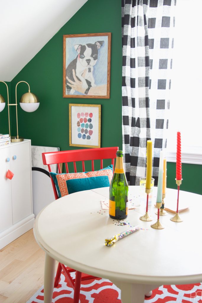
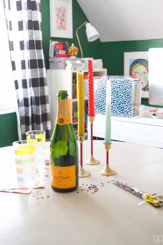
And yes, I’m presenting it to you as it will look most days; with a bounce sheet, foam core boards, champagne and confetti! I set myself a little party to celebrate the transformation. Me, myself, and I were the only ones invited and we had a grand ole’ time.
As soon as you walk in you’re greeted by the bank of cupboards. They’re ClosetMaid stock cupboards from The Home Depot // here // that I’ve retrofitted in a similar style to our renter-friendly built-ins // here // using Metrie millwork to frame them. I can now hide all my craft supplies and no one is the wiser!
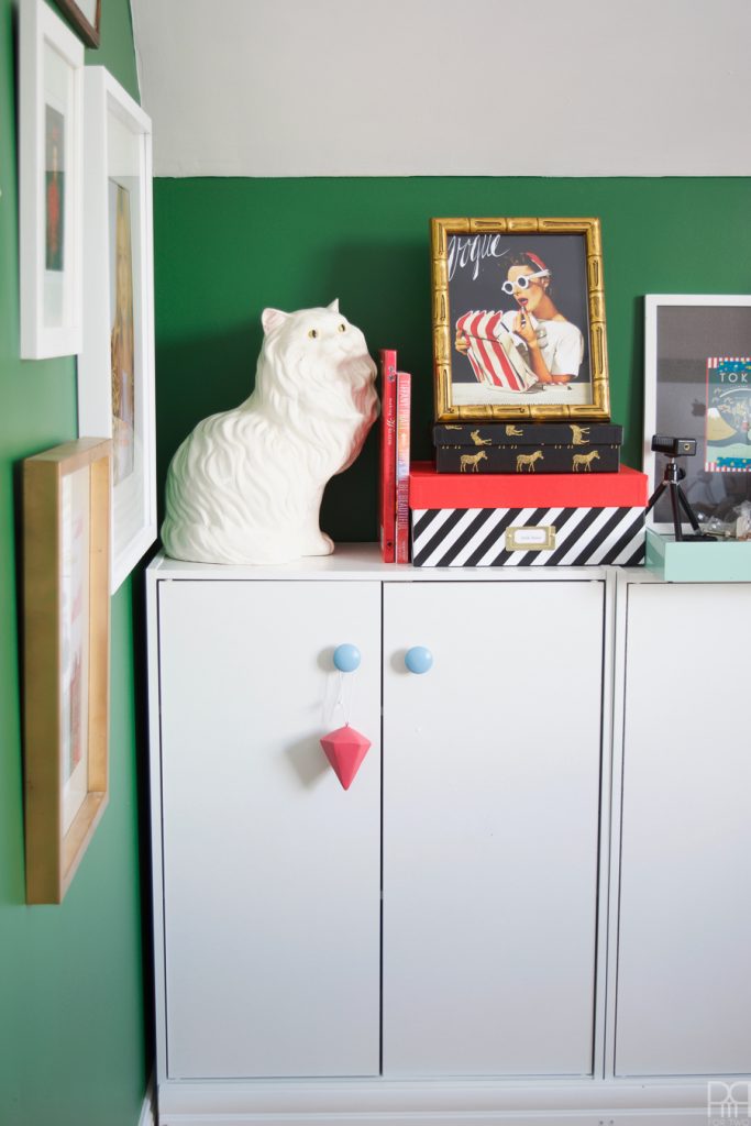
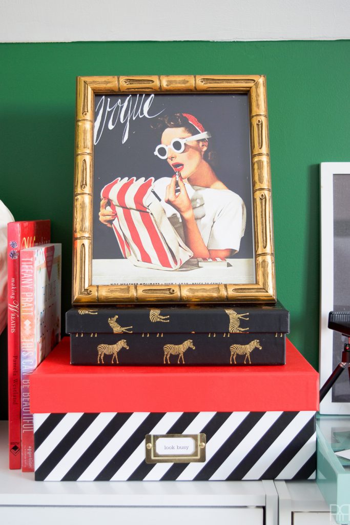
“Look Busy” is a fun way to say “actually be busy, and be busy enough that people don’t ask you to do things.” Because I’m looking to fashion and nature for inspiration this year // here // I added some classic fashion iconography to the space like this Vogue magazine cover in a fabulous glided bamboo frame.
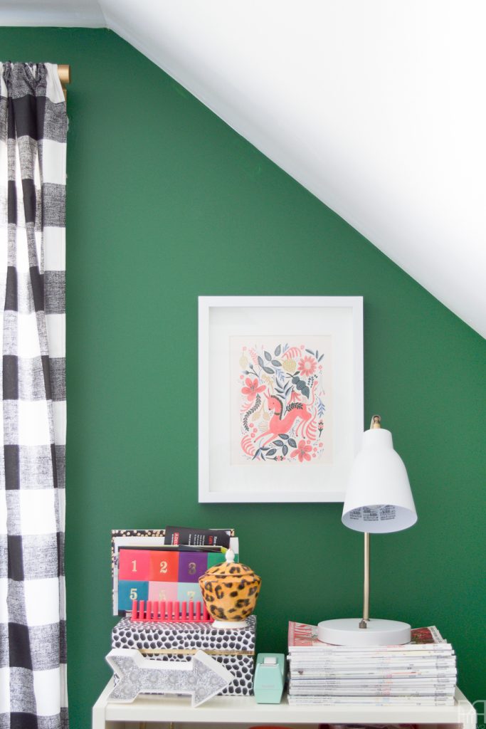
The green walls are really what provide the backdrop for the stunning contrasts in this space. The colour is called Perennial Green M410-7 and is made by Behr Paint. You can find the colour code and more info on it // here //
*The following product links contain affiliate links. Thank you for supporting the brands that make PMQ for two possible. For my full policies click // here //
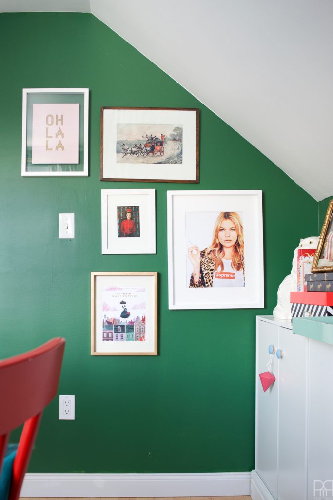
Because I need to have at least one gallery wall in my home I figured I’d make one in my office. No, it’s not a gallery built from tiny little 4×6 images, rather a larger composed scene. I’m mixing whites, golds and wood tones in this space to contrast the heaviness of the green. What do you think? Kate Moss print // here //
P.S. what do you think of my knick in the paint? I could shop it, but I’m going to leave it #realhome
All in all, I’m quite pleased with how the cupboards turned-out. They also give me a nice bit of ledge realty to display some art and keep my // Cricut Explore Air 2 // which looks pretty sleek sitting on there.
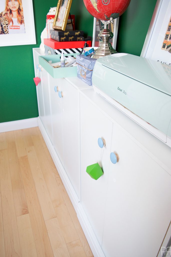
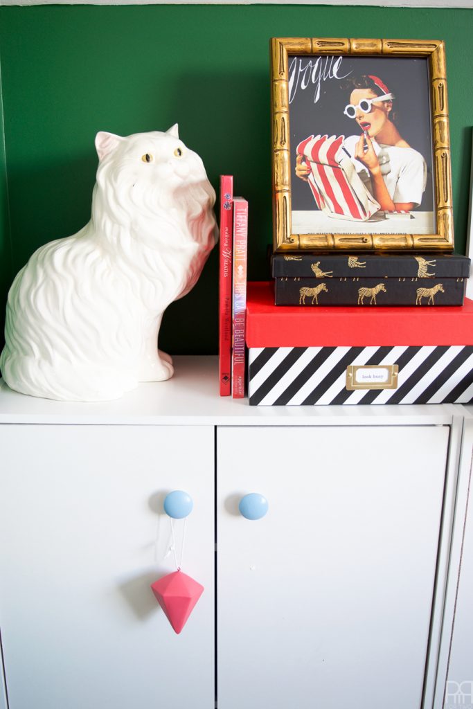
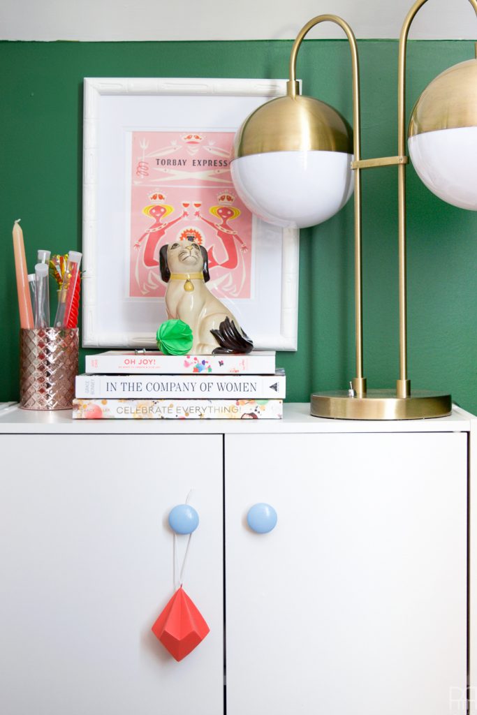
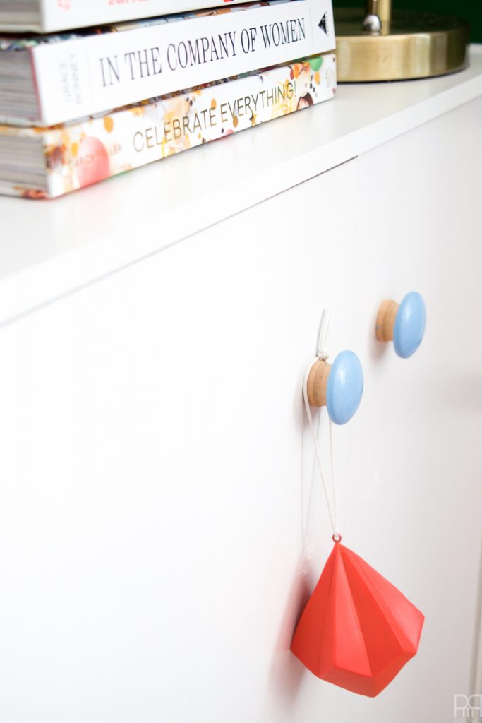
Here’s an expanded scene from an Instagram share over the weekend. I swapped-out the cupboard handles for wood knobs that I then painted blue using Deco Art paint (Baby Blue). The geometric tassel is actually a left-over ornament I picked-up at Canadian Tire in early January.
That lamp is seriously the envy of Instagram these days. I have been asked more times about where I got that lamp than I care to count. It’s from Wayfair and you can buy your own // here //
Here’s another shot of the knobs because I find them interesting. I didn’t paint them entirely, just the head. The contrast between the white, blue, wood tone and coral is quite striking, but not overwhelming.
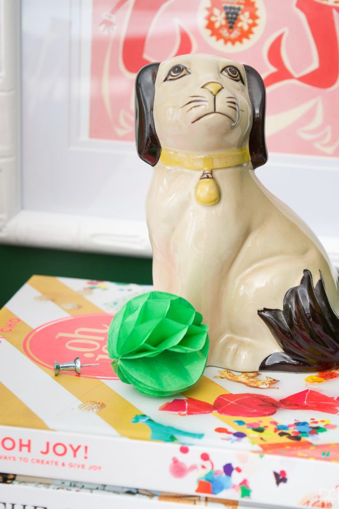
I love the // Oh Joy!: 60 Ways to Create & Give Joy // book, it’s full of colour and great ideas for home decor and parties alike. The little foo dog was found at VV boutique (aka Value Village) for 2.99$ and I couldn’t pass him up!
The table in the middle of the room has become my crafting space. Believe or not, I used to craft at my desk or on a piece of foam core that rested on a folding side table that I would wedge between my desk, myself, and the window when photographing. It was tight quarters and impossible to walk around in here. The table gives me a more natural setting for crafting and keeps the clutter and glitter off my desk. Look! Even here in my unveiling I have confetti strewn freely on the table.
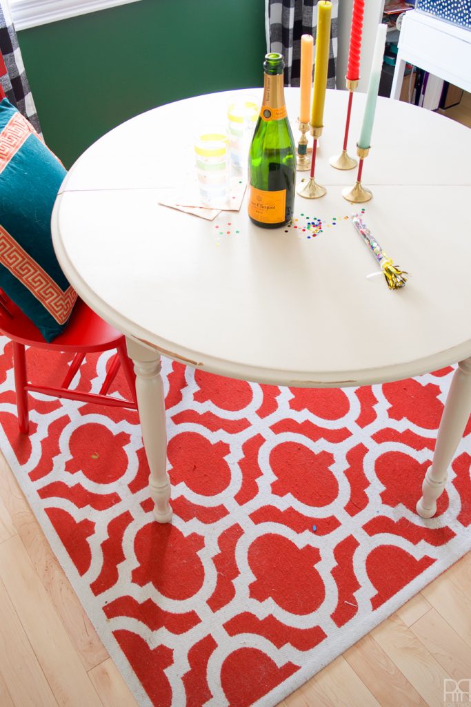
You can also see the rug and why I’ve decided to keep it for now. I vacuumed before taking these photos and somehow more glitter and scraps have found themselves on the rug. Blame the dog?
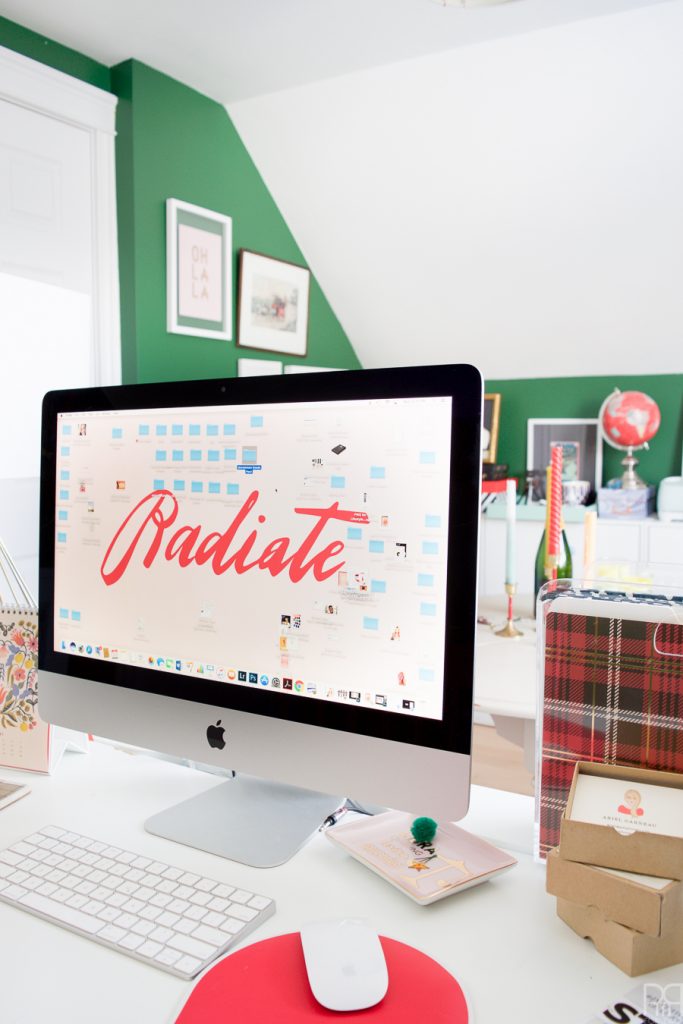
From here you can see my desk. I backed it up against one wall so that I wouldn’t take up too much floor space and avoid any glare on my screen. I added a few larger pieces behind my desk to provide something to look at when I’m lunging for a file folder or prop candy. You can find that lovely abstract portrait // here //.
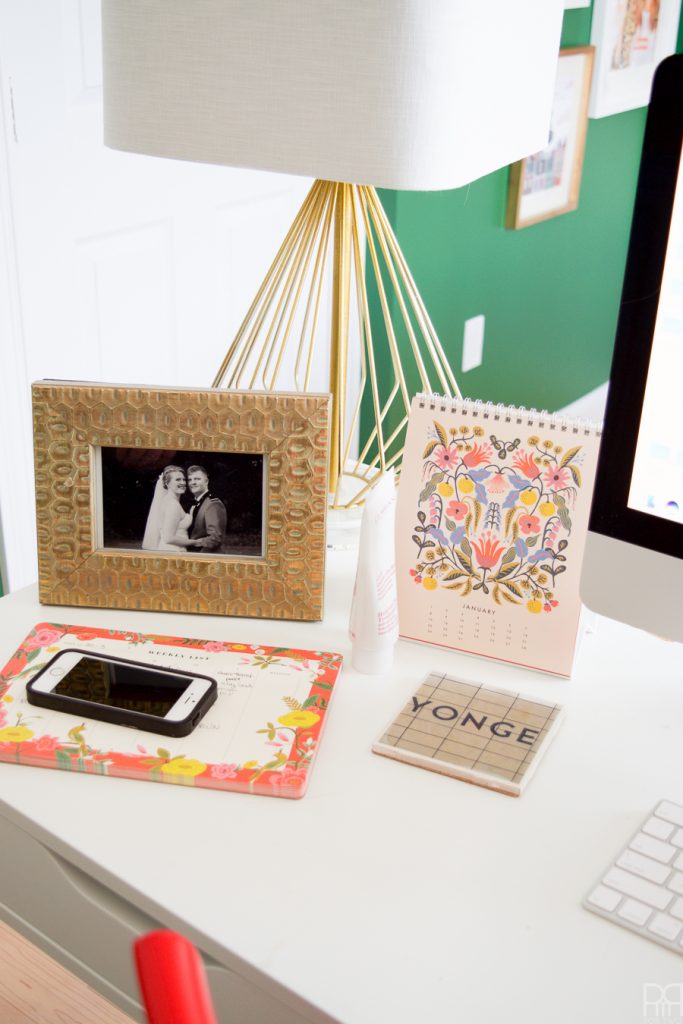
That coaster is one-of-a-kind and I purchased it on a trip to Toronto this summer. It’s a photo of the walls in the subway that was epoxied to a tile and then coasted in a tick gloss. Cool eh? I grew up on the Yonge Street Corridor, so having a reminder on the daily is nice considering I live in Gagetown, NB.
Can you imagine if this space was a bedroom?! With the two slanted walls, the large window and the closet, it’s a miracle I can fit everything I need in here! Speaking of which, I will never ever show you what is in that closet because it’s akin to asking a woman to open her purse. It could be a mess or eerily clean. Either way, you don’t need to know 😉
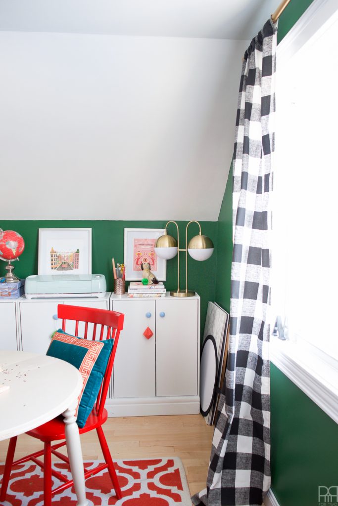
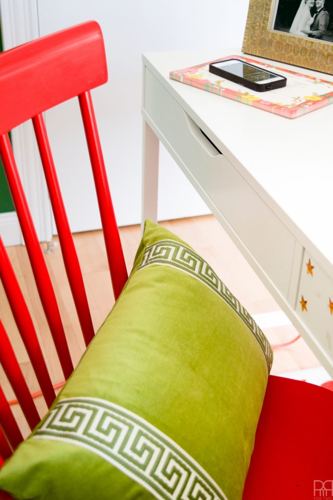
Let’s talk about two things here: the curtains and that pillow. The curtains are made from a beautiful thick fabric I got from The Online Fabric Store // here //. It was a dream to work with, provides excellent coverage and make one heck of a statement don’t you think?
The pillows, like I mentioned in an earlier post are made by Therese Marie designs // here //. The green one I featured a few photos up is perfect for my back when sitting at my desk // listing here //, and this teal and orange version is very complimentary for my red chairs // here //.
And there you have it. You’ve seen my Green Grotto and I am open for feedback. So tell me, how did I do?

The color is what makes it! The green is perfect! You should send a link to the people that shared your green accented built ins! I am sure they would love it too 😉
Wouldn’t ya know I just did that! <3 Thanks for the love Angie
It turned out so beautiful but I knew it would. Love the color, love the pops of color, love it all.
Aww thanks Jessica! <3
love that green! what a great space!
Isn’t it flipping fun?! You’d have expected a big dose of pink in here, but instead I went the other way! Green!
You know i’m always up for color. The green is great!
I know you are 😉 Colourful decor till the end!
What a fun and inspirational space to work in!! Love all the color!
Thanks Kathy!
Thank you for not calling it a lady cave either. 😉
THe green looks amazing and I love the buffalo curtains! I’m jealous of all of your storage!
yea, lady cave sounds vaguely sexual. The Green Grotto prevails!
Ariel, i absolutely love it and now want to do a green accent wall in my office. but the rest of the room is such a mess! i love all the bright colors and those curtains are divine! buffalo check for the win! i have to check out all of your sources because i want your office!
Thanks girl!!! <3 The green has been life changing! I'm normally a pink everywhere kind of person, but the green is totally working my office. You should absolutely check-out all my sources 😉
I absolutely love your bold use of color! stunning!
Thank you Morgan 🙂
As always, I LOVE the color! So fun – the green is perfect. great job!
Thank you Amanda <3 I think the green is also super relatable!
Ahhhh! You knocked it out of the park! That green is so bold and so amazing, and your whimsical accessories are everything I would expect from an Ariel space – perfect! Love this so much!
Thank you friend! Whimsical, bold, eclectic, glam! I’ve got it all!
such a great space! I am now very keen to see if I can re-jig my home office/diy den – crafting and working for clients in the same spot is tricky….I absolutely LOVE the colour and all the art you’ve put up – a beauty of a space:)
You should! I used to have my desk in the middle of the room bordered with a shelf and some tables. It wasn’t working. I like this layout so much more!
Seriously, you can do no wrong. This looks amazing. I love the green. I am now wishing that I should have painted my son’s room that color. So good! Also, your art is on point. I love it. pinning.
So clearly we both knocked it out tha’ park today! HOME RUN FOR THE ECLECTIC GIRLS! This green is amazing though. It looks more dull on the sample cards, but in the right space it is nice and rich.
looking good, Ariel! Really, really good. So colorful and clean at the same time. Love it
Thanks Mila!
You truly did such an amazing job! I love this space so much!
thank you so much Julie! <3
I love it!!! The wall color, the art, that awesome wall clock, and the furniture! Great job!
Thanks Karrie! I had a blast picking-out everything. The curtains were one of my favourites!
OBSESSED with the green! Awesome job!
SAME! In with the green!
Darker greens are not usually my thing (I get flash-backs to the forest green/cranberry era) BUT you have awakened me to the possibilities!!! So great!!! Love the use of the white – such a good call. I’d be thrilled to have that space! Enjoy! And well done!
omg now that you mention it, it’s all I can see! I think there’s definitely room for an expanded green palette this year, especially on the darker side. It just has to be balanced well with other bright and contrasting colours.
Cuuuuuute, girl! I’m loving that green color and that charming little foo dog–what a find!
xx Hannah // http://www.HomemadeBanana.com
ain’t it great?! VV boutique!
What a great space! So happy and bright and that green really pulls it all together!
Couldn’t agree more!
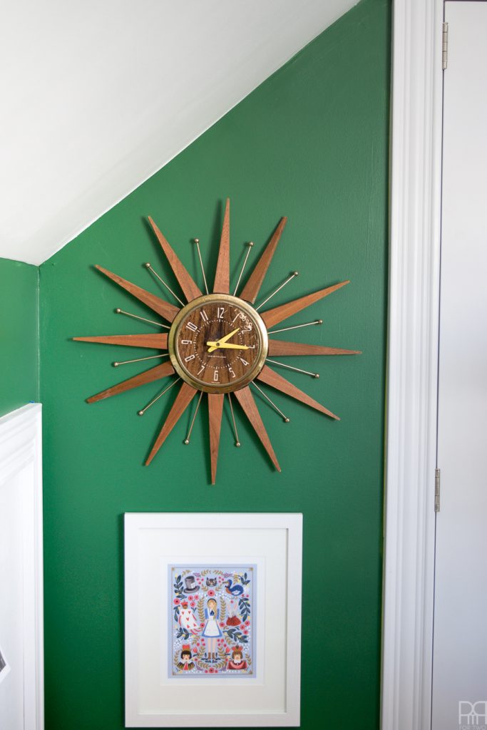
Love the color! And that clock is so beautiful and fun. What a great space.
Thanks Kati 🙂 It’s such a beautifully vibrant green