

Ah yes, Spring. The time of the year when I throw open the windows and try to usher-in summer with a refresh and a deep clean. It’s also a great time for a blog hop, so rather than disapoint you I’m participating in Stephanie from Casa Watkins Living‘s #MyHomeStyle blog hop. You may remember it from the fall // here // and Christmas // here //. This time around we’ve changed up the format a bit and are looking at what makes our style ours – the mixing, matching and coordinating that we all do on a daily basis when making our homes is something that’s not always easy or obvious. Here I’m breaking down the styles and influences in our PMQ one photo and space at a time.
If you’re new to PMQ for two, my name is Ariel and I create bold, bright, colourful & eclectic home decor and DIYs. You can read more about me // here // and visit my project gallery // here //. Don’t forget to check-out my Instagram account // here // because it’s where I’m the most active.
I struggled to define how I mix and match styles, but then it hit me – I don’t mix and match styles deliberately – I mix and match colours, the style is incidental. Because so many different stylistic elements interest me, I unite them through my use of colour. Colour is the great decor equalizer and allows you to blend decades and styles seamlessly, but it also allows you to set the tone in a space and evokes all the feelings you didn’t know that a home’s furnishings could make you feel. Colourful is a powerful thing and I use it to make my home in military housing across the country.


The first thing you see when you walk into our home is the living room // here //. The built-ins are renter-friendly and totally transform the space while allowing me to showcase the most colour possible, because let’s be super up-front about this – our home is full of colour… and pets. As you can see though, Ive got a variety of styles happening including a glimpse at my ginger jar collection, a funky plate, some brass and velour.

I’m also a sucker for plants and flowers (not always real), so I’ve usually got a few floating around. I’m trying to be more concious about bringing living, breathing, things into our home for the better and while you won’t catch me touting essential oils – ever – you will catch me talking a bit more about plants.
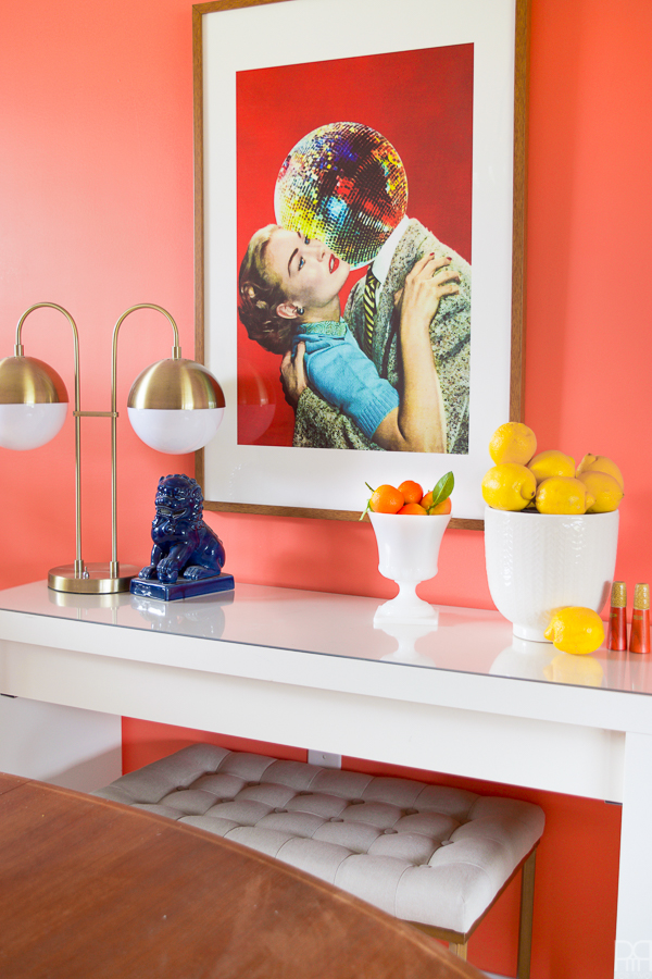
The dining room got an facelift recently and is still “in the works” but I’ve shared a quick peek at our new dining room table // here //. In the meantime, this shot of the sideboard kinda tells you everything you need to know about my home style, cont’d. Bold colours, a mix of decades and influences, styled through colour.
p.s you can buy that print // here // & that lamp // here //
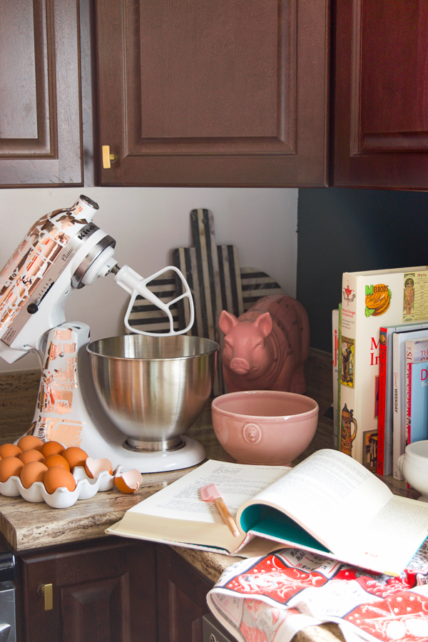
Recently our kitchen got a renter-friendly makeover as part of the Splurge vs. Save campaign with Behr Paint. You can view the plans // here // and the reveal // here //. In this space we were constrained by the dark cabinets and ugly countertop, but still made the most of it by adding bold colour, fresh hardware and era defining lighting.
Did you know you can DIY your own Kitchen Aid Decal? Catch the tutorial // here //
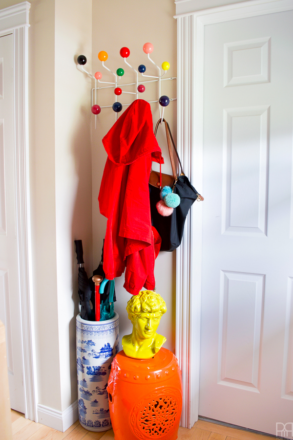
Next-up the hallways in our home are always kind of left to hold whatever is left in terms of art and decor, but I recently gave them a cohesion facelift and tried to bring – you guess it – bold colours, a mix of styles and eras, and some warmth to them in my post // here //. The Eames coat rack is bright and colourful like the garden stool and some of the prints, but the varied art and frames help balance the hallway so that it’s not an all-out assault on the senses.
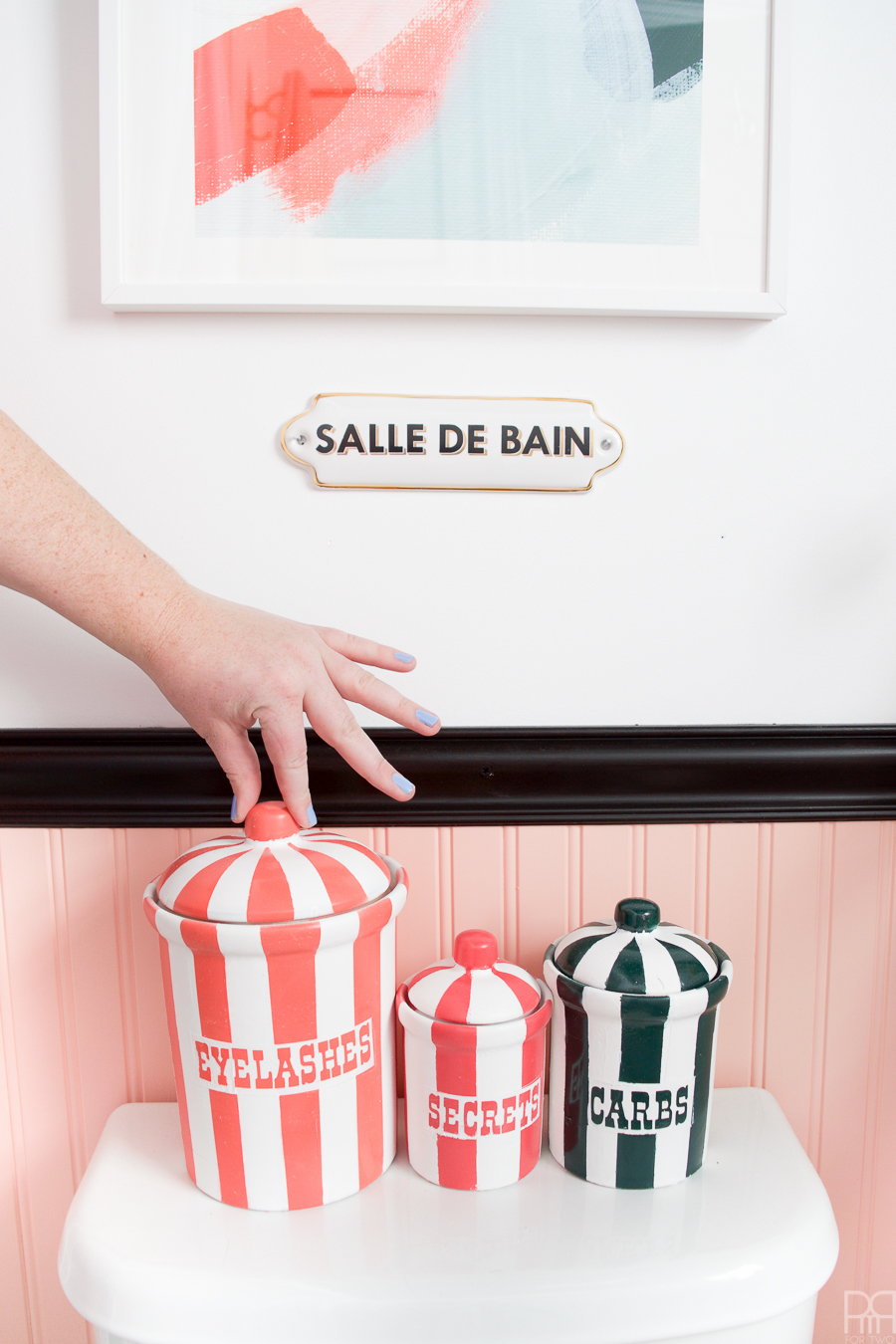
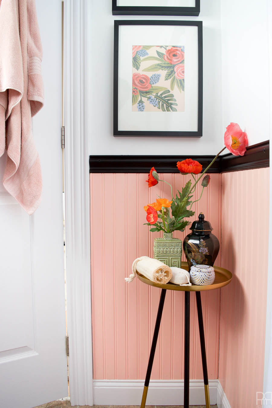
The main floor bathroom was also recently refinished. You can catch the plans & inspo // here // and the reveal // here //. The space was a risk for us, as renters we can’t do things that can’t be undone, but opting for bead board and fresh light fixtures was a step in the right direction. Keeping a large portion of the walls white has allowed the colours to shine without being overpowering.
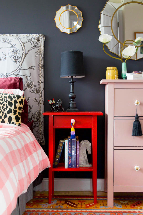
Our master bedroom is an equally colourful place. Although this space was first revealed // here // as part of my first MyHomeStyle blog hop, I am scheming away on some updates and will hopefully be delivering those near the end of the summer / early fall. One thing I do love about my master bedroom is how warm and inviting it feels because of the shades we used. It’s not every day you see a black wall in the master bedroom, let alone bright and bold bedding and side-tables, but hey, it’s my home after all. What did you expect?!
My home office is a pop of colour on the other extreme of the scale – it’s fresh green that stimulates my creative juices and lets me be creative at any hour of the day // here //. I love it in here (where I am currently writing this post) and have got a few changes to make now that I’ve been in the space as-is for a few months, so stay tuned for those updates.
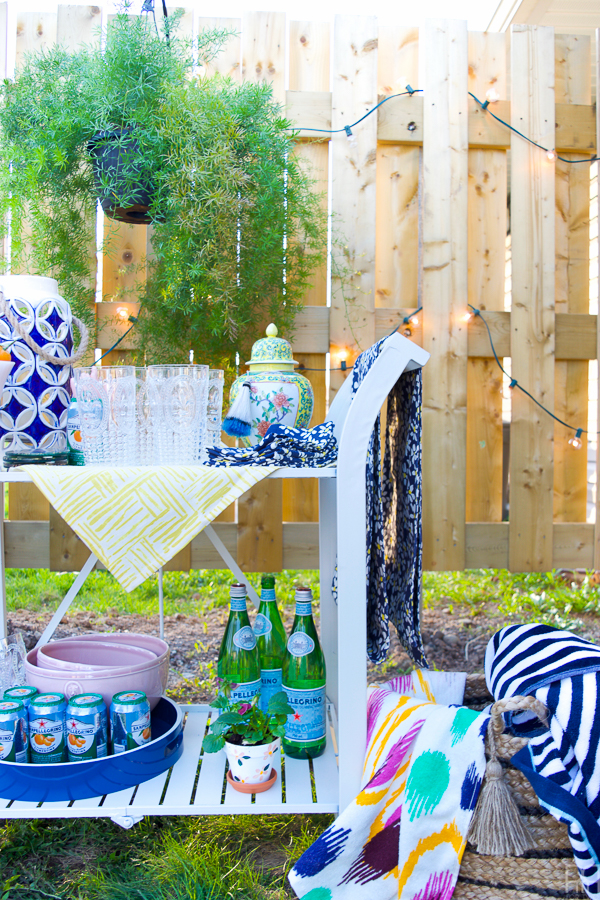
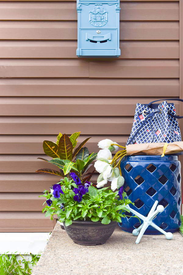
The most recent spaces to be completed in our home, and that really explain my home style better than words, are the great outdoors. For the most recent One Room Challenge we gave some life to our outdoor spaces with the help of HomeSense & the Home Depot. You can view the entire series and start the journey // here //.
With all that being said, I still don’t think I could nail-down what exactly my style is. I fall in love with colours, not styles, and then try to make it work with the rest of my home. Sure, each time we move I try to start over and be mindful of my decor choices, but then a new colour or piece will strike my fancy and set my creative fire. *insert shoulder shrug emoji*


Wednesday Home Styles
Thursday Home Styles