We are off to the races guys! I am finally participating in the fall edition of the One Room Challenge (ORC), and I’m redoing the family room in someone else’s home. Crazy huh? Because our house has just been redone, there wasn’t a space I could justify starting from scratch with. But, I’ve been looking for a way to give back to my community and those who support the blog for a while, so I figured this would be a good way to do it. In early August I put a call-out for people who had a budget and a space. On September 21st I drew Ainsley’s name, and that’s where this adventure began.
Catch-up on the One Room Challenge to date:
Week 1 – You are here
Week 2
Week 3
Week 4
Week 5
Week 6 – The Reveal

Now, under the best of circumstances redoing a room is stressful, fraught with complex and ever-changing timelines, design questions that need to be resolved quickly, and lots of “hurry up and wait.” Okay, picture all of it happening within a 5 week time-frame, and in someone else’s home!
You’d think we were on an episode of Leave it to Bryan.
Not quite, this is the ORC! and sleep is for the weak.
The ORC is hosted by Calling it Home twice a year (October & April). There are 20 official participants and then everyone in the blogosphere can join-in as a guest participant i.e me.
You really have to see the reveals from last spring’s ORC –> here <– and –> here <–
Ainsley and her husband Brendan live in a beautiful older home with their two adorable children – one of whom was way too shy to be photographed, even wearing a batman mask! I’ll try to capture him in a pic later.
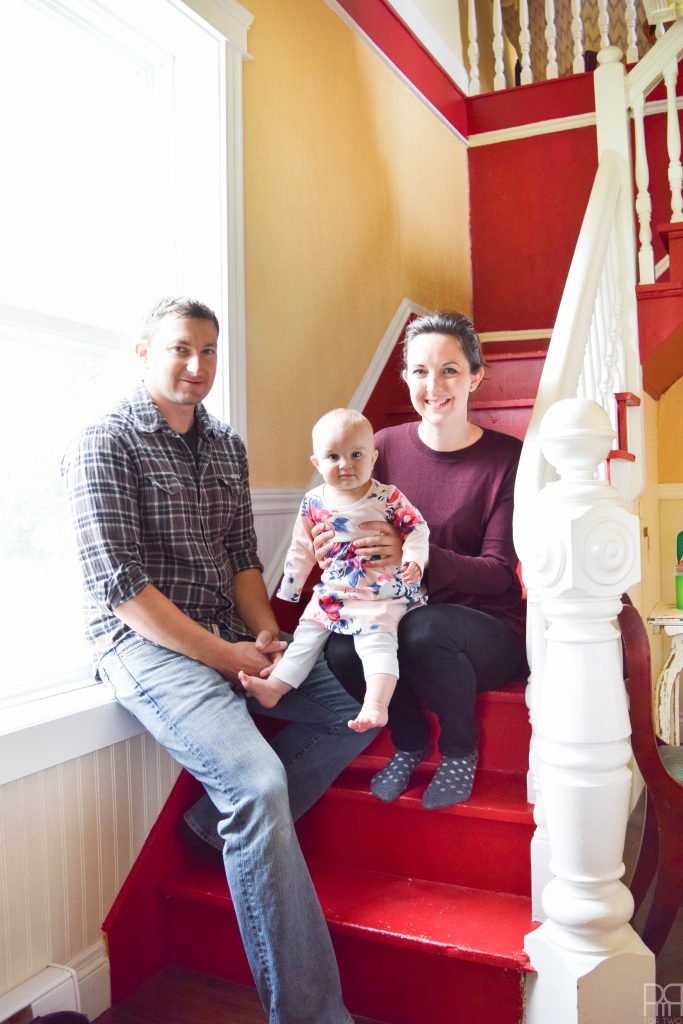

Can we talk that about how cute that baby is for a minute?!
When I met with Ainsley and Brendan they were thinking of doing either the dining room or the family room. In the end we went with the family room, because the open concept in the dining room would have brought the kitchen into the makeover, and we didn’t have the time or resources for that big a project. PLUS, they use the family room every day, so they would get the most mileage out of it. They’ve just finished redoing the master suite in grey tones with beautifully restored barn wood, with a smack of modern about it. They did a great job in the space and clearly have the know-how and energy for room transformations.
I met with them just over 10 days ago and got a feel for their style, needs and wants within the space. I’m sure Ainsley – and anyone else involved in this transformation – can attest, I am non-stop! Things are happening at a clip, and so far they seem to be enjoying the ride!
Because of the age and style of the house, we couldn’t go in certain directions (because it would stick-out like a sore thumb), but this ended-up being helpful because we had fewer choices to pick from.
On their list of must haves in the space, were the following items:
- TV
- Storage for toys
- Overhead light and task lighting
- A solution for what we refer to as “the corner”
Their list of “nice to haves” included the following items:
- A carpet
- New wall colours
- Gallery Wall
- Library
Before we get to the looks, I want to take a minute to introduce and thank our sponsors, without whom this project would not be doable.
- Home Depot has provided materials for the build projects.
- Rugs USA is providing a rug for the family room
- The Online Fabric Store has provided fabric to re-do a chair and foot stool
- Wayfair has provided a gift card for incidentals
- Behr Paint is covering the paint
- Society 6 has provided a framed art piece of our choice
- and Ryobi has provided power tools that will be used
Thank you to the brands that make PMQ for two possible. I couldn’t do it without you!


And now back to the design! After meeting with them I went home and worked on three designs; similar in a few key respects, but also different enough to warrant some thought.
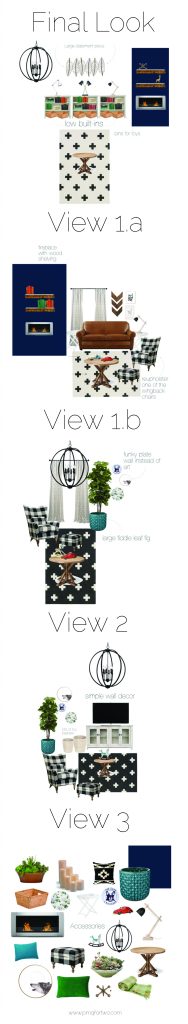
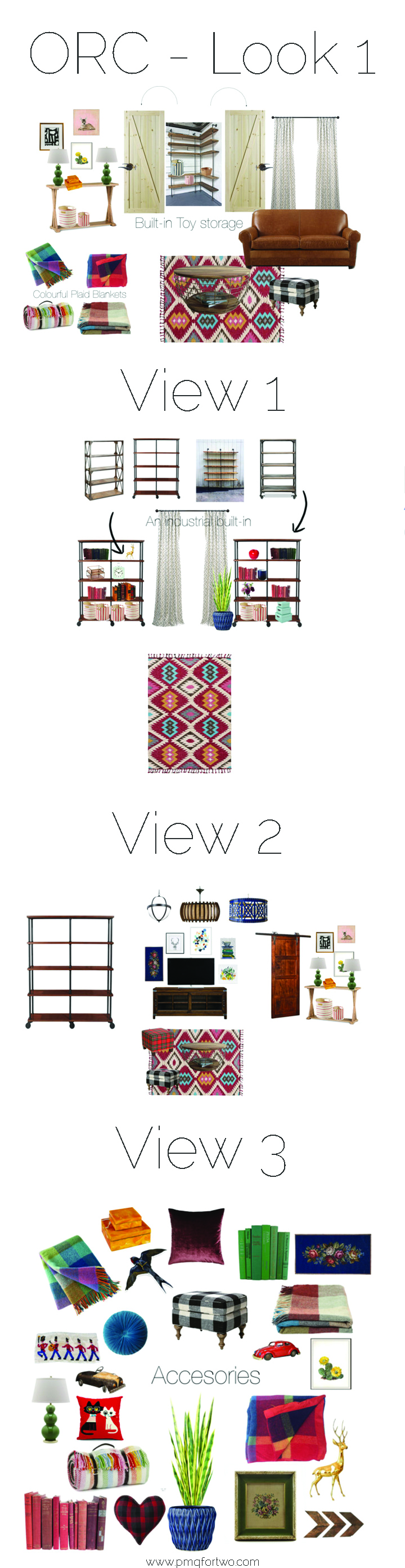
Look 1 was colourful and slightly midwestern, with a dose of industrial. I was thinking of bold and colourful accents with open shelving and doors over the “corner” as well as a sliding barn door for the entrance to the room.


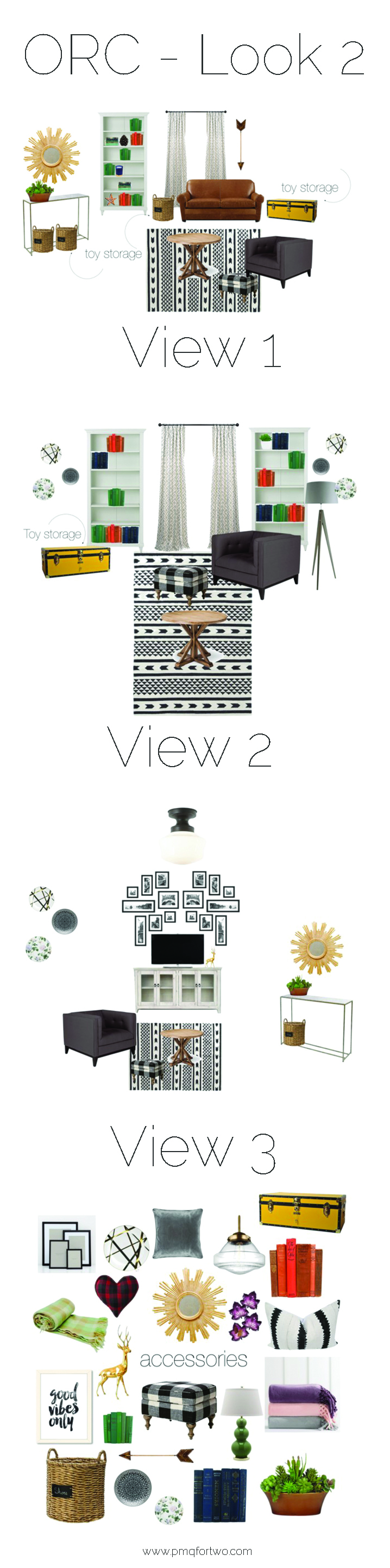
Look 2 was more monochromatic, a touch more modern, and had built-in book cases on either side of the window at the front of the house, with a bookcase completely covering the “corner” and some colourful trunks for kid storage.

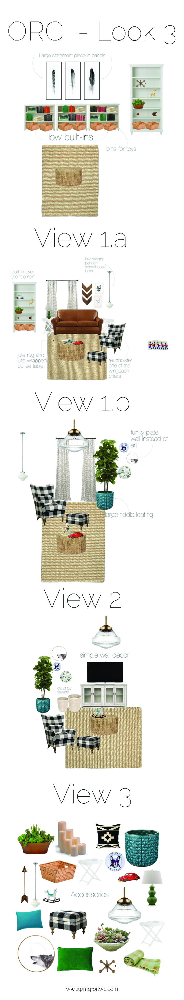
Look 3 was even simpler, and probably the most doable from a budget perspective. It was a simple palette like Look 2, but had low built-ins on the wall next to the door, a book case over the “corner” and nothing on the wall at the front of the house.

What they went for is something completely different! We were having a hard time nailing-down what to do with the “corner” and they were unsure if built-ins on the wall with the window would look good if the window wasn’t centred.
We’ll be adding a gas fireplace in the “corner” an accent wall in blue, a large plant, low built-ins, and a cool rug and lighting. We’re already underway in terms of the room update, and next week we’ll have an update on the paint situation!
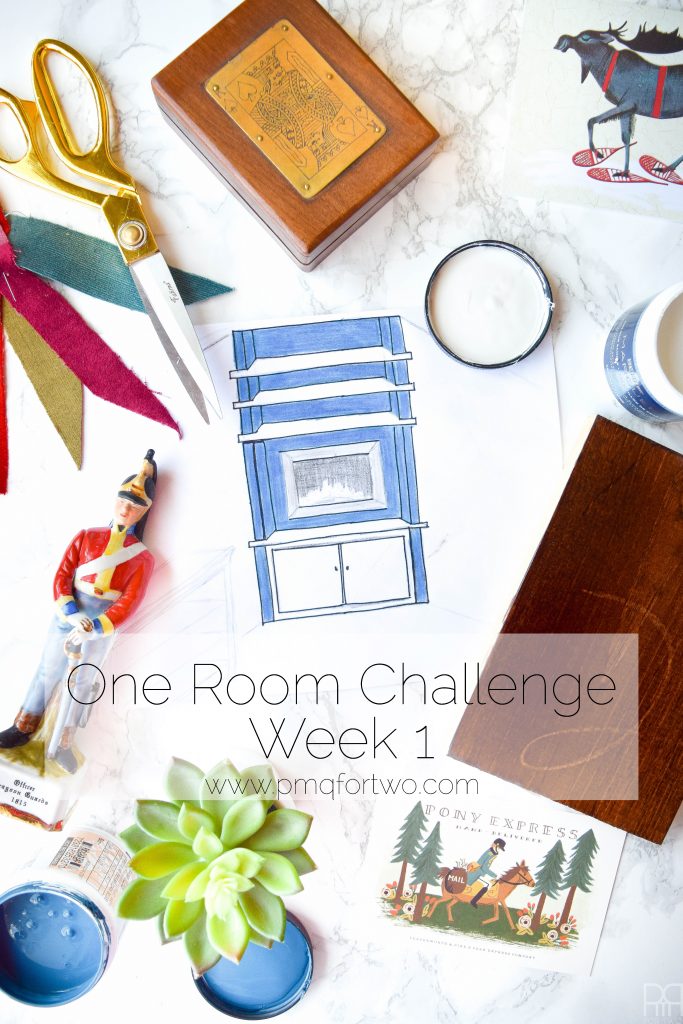
I’ll share photos of the space next week when we talk about paint colours!