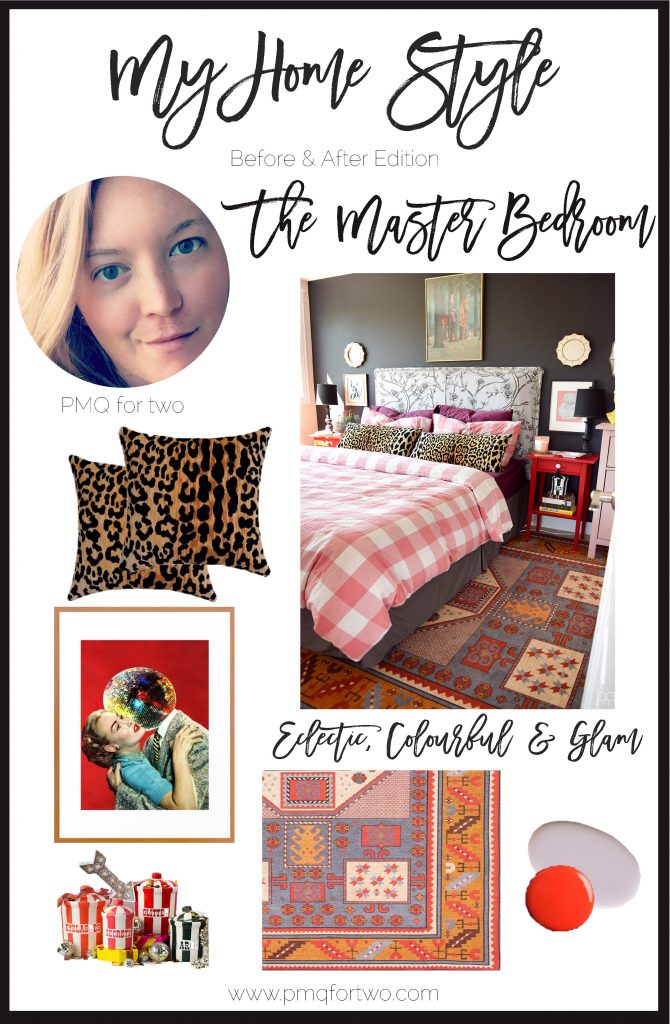
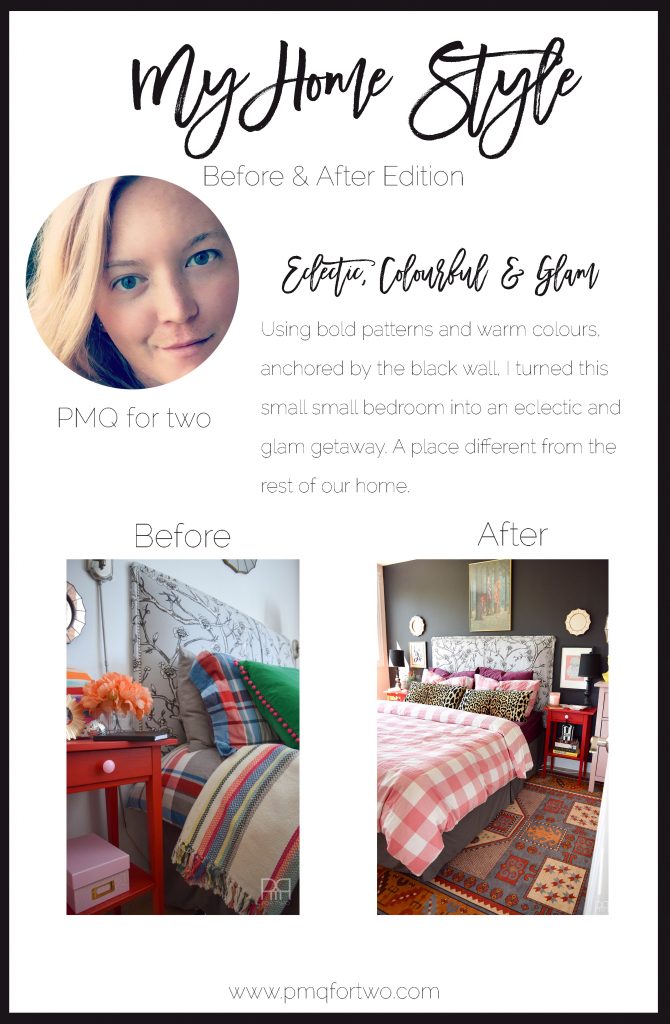
I’ve got another reveal for you guys on the blog today! I’m finally revealing our A Black & Bold master bedroom that shines in a rental house. Bold accents and saturated hues complete this space., and I’m doing it as part of the My Home Style blog hop, the Before & After Edition hosted by my friend Stephanie from Casa Watkins Living. Her colourful and global style has resonated with me from day one, and what started as an IG friendship has evolved into a nice blogging one. That’s right y’all, I am friends with other bloggers in real life. How crazy is that ?

If you’re joining me from any of the other blogs in this round up, welcome! My name is Ariel, and I’m the voice behind PMQ for two. I offer accessible and affordable home decor and DIY options for eclectic, colourful and glam living. In case you don’t know, we live in Canadian military base housing, so each space has its own constraints and features, and I do my best to make each one feel like home. You can read more about me // here // about what a PMQ is // here // and about The Newsletter // here //
P.S. I think this has been one of the wordiest posts I’ve written in a while. It’s not every day you guys get a novella out of me, so savour it! Share it! And tell me what you think. For full sources, scroll to the end for image boards with links.

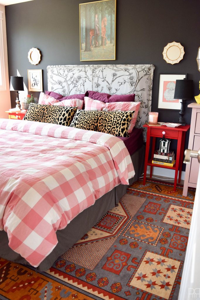
This space has tortured me from the get go. In our current style of Q, you can only fit a Queen sized bed in one of the two bedrooms. The closet takes up an entire wall, a window takes the other, and that leaves two walls – one with a door. It was slim pickings as far as furniture arranging goes, but I think it’s paid-off in the end since everything is anchored by the black wall.
If you want the details on the paint colours, check-out the picking paint colours post //here//
I’ve seen some fabulous black/dark grey accent walls of recent, and figured there was no better way to cover up what will be known as the “shamrock green incident” than with black. Sure, we’ll spend a small fortune on primer when we move, but we would have to do that anyways. So the point is moot as far as we’re concerned. Ready to cover-up a monstrosity real fast, and excited for a fresh direction, I painted this wall dark dark dark grey. And I love it.
The rest of the house is so colourful and eclectic, that in our bedroom I felt like we needed the other side of the colourful, eclectic and glam coin. So that’s what we did!
To see the living room click // here //
To see the dining room click // here //
To see the main floor bathroom click // here //
Our last master bedroom had 16 foot ceilings, an exposed brick wall, a teeny tiny window, and mirrored closet doors. It was a weird setup, and one that my design skills at the time weren’t fully ready to embrace. If you’ve been following me since then, you’ll know that the bedroom was seldom photographed. The only existing pics can be found in our house tour // here //
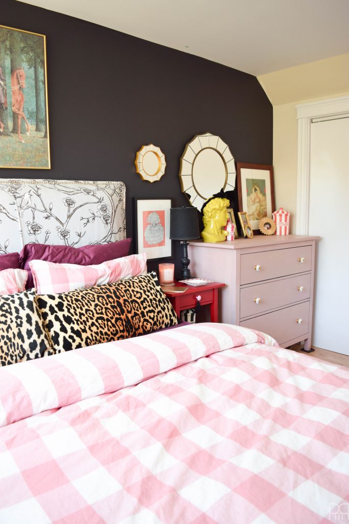
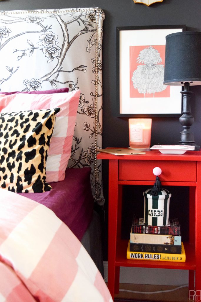
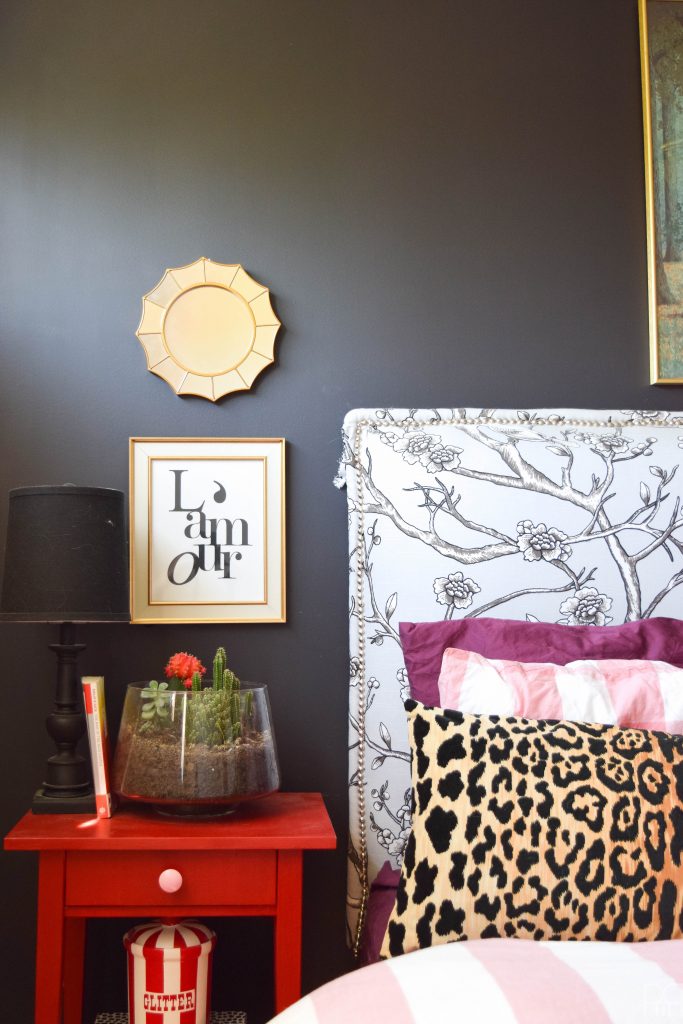
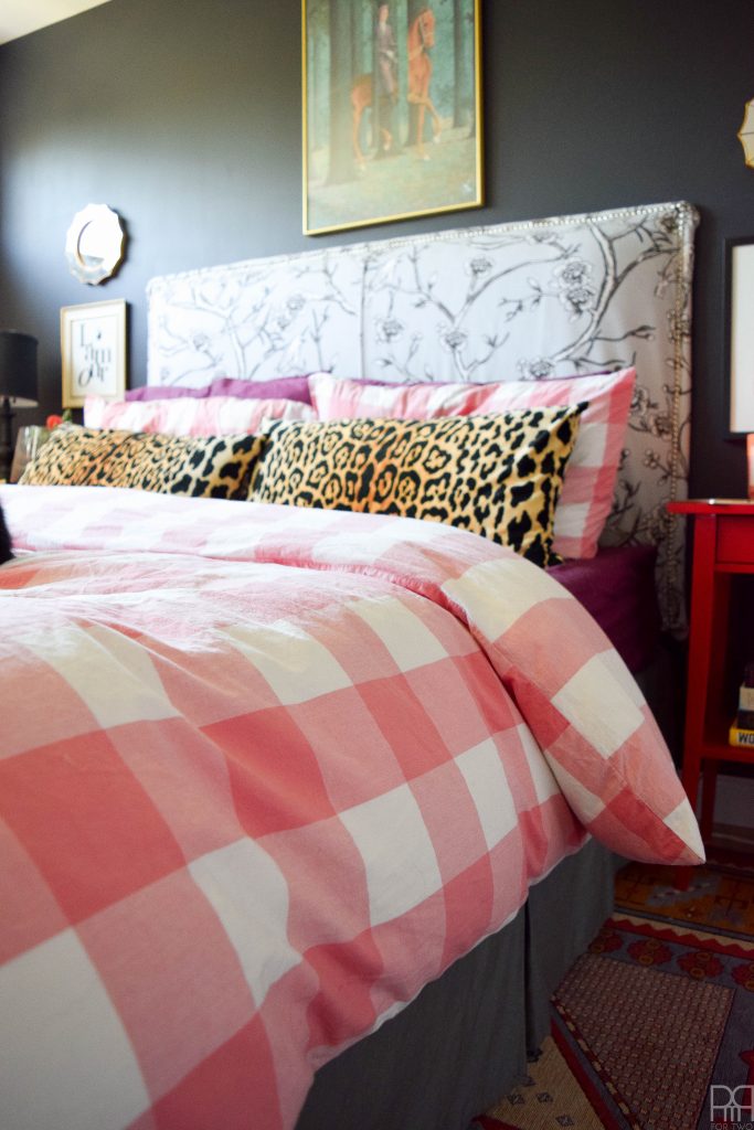
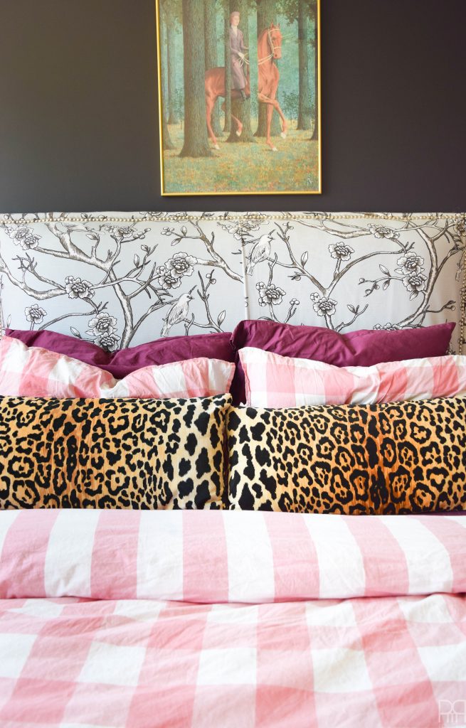
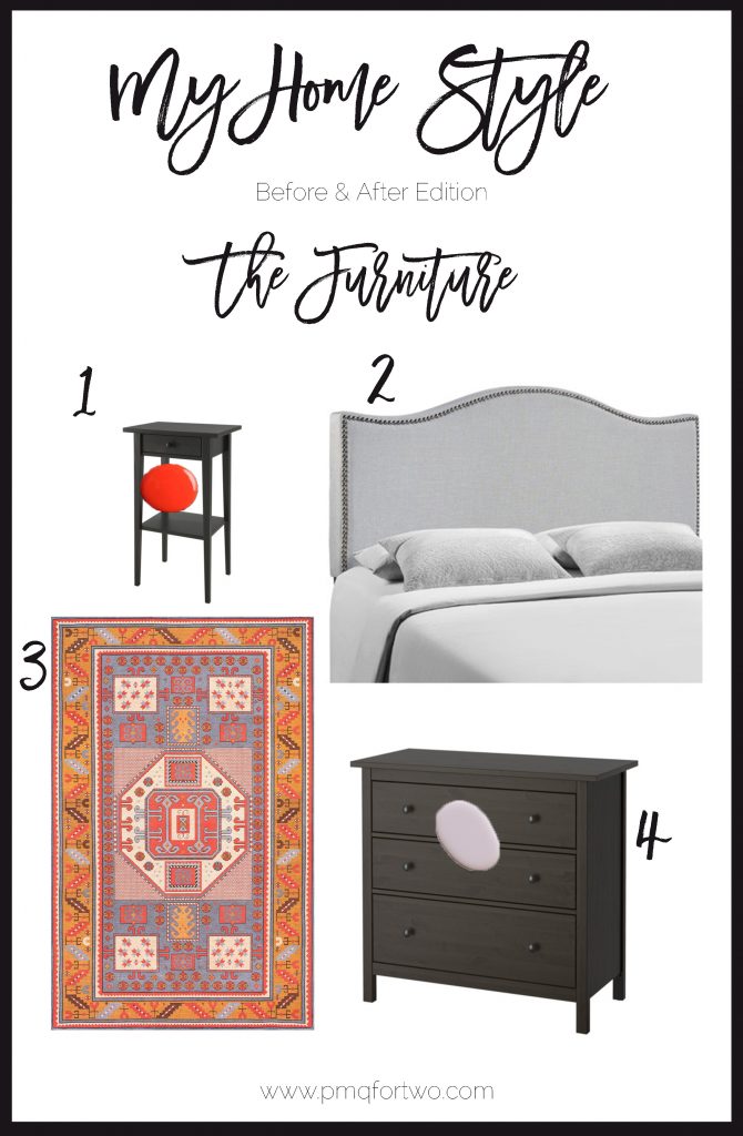
The headboard was staying. It cost me a small fortune in Robert Allen fabric, and I bought the nice foam. So were the nightstands // here //; I love the red colour I chose to do them in. They play with the softer tones of the headboard really well. And because painting IKEA furniture has turned-out well for me so far, it prompted me to paint our matching IKEA Hemnes 3 drawer dresser.
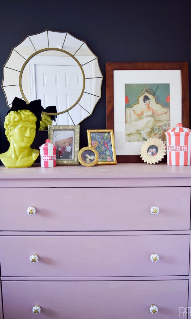

It was that ugly brown/black that IKEA makes, and against the black wall it was too much dark. Since I’m not a fan of the country chic or chippy paint look for milk paint, I was reticent to use it. But after seeing how it would look when it wasn’t all chippy, I decided to give it a try! I used Miss Mustard Seed’s Arabesque on the dresser. It took me damn near 3 coats with a bonding agent, and then I sealed the whole thing with her tough coat. I love the final product.
I love how it looks in this space – It looks modern and fresh. This goes to show that context is everything when it comes to furniture, and that you can always use a popular product in a different way.
The rug is the standout piece here I think. After loving the quality of our first Rugs USA rug, I had no issues ordering a second one, this time in a tribal pattern with muted colours.
I went with the Beeda DN01 Tribal Octagon Medallion Rug for three reasons: it had a similar pattern to the one in the living room, the colours were daresay less trendy classic, and it wasn’t too big that we couldn’t use it in another room in a later house. With the colour bomb rug on the main floor, DH was ready for a calmer floor covering in the bedroom. Poor man, gotta let him win from time to time.
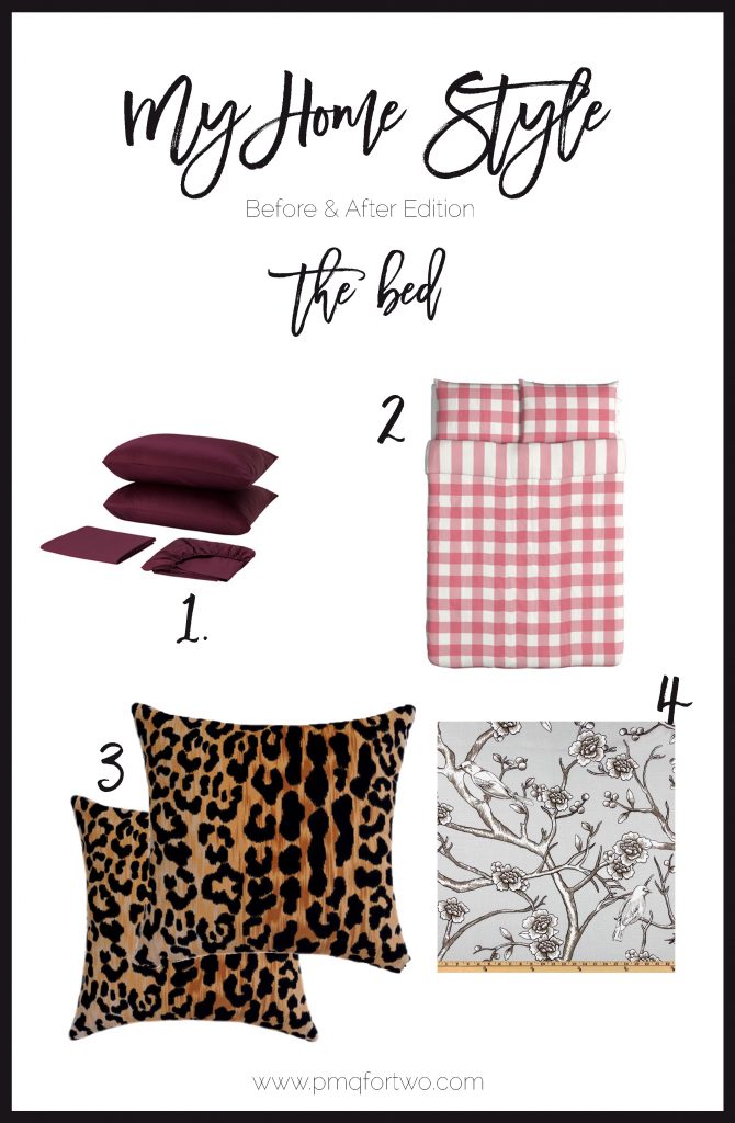
The bed sheets seem to change more often than the weather. We have a flannel set for winter, and a summer/spring set for when it’s too hot to move. With this posting we decided to implement some new house rules, and that means no more dog in the bed. He nests in it and scratches the sh*t out of the duvet and sheets trying to make a pile. He has ruined more sheets than he is worth, so with the new sheets we kicked him out. I chose a big pink buffalo check from IKEA because everyone is doing buffalo check these days. It’s such a versatile pattern and the colour matched the dresser! The dark marsala bed sheets – also from IKEA – are there to ground the palette.
Don’t you love that you can see the pet hair on things?
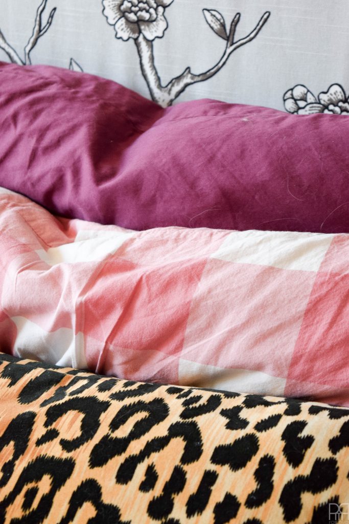

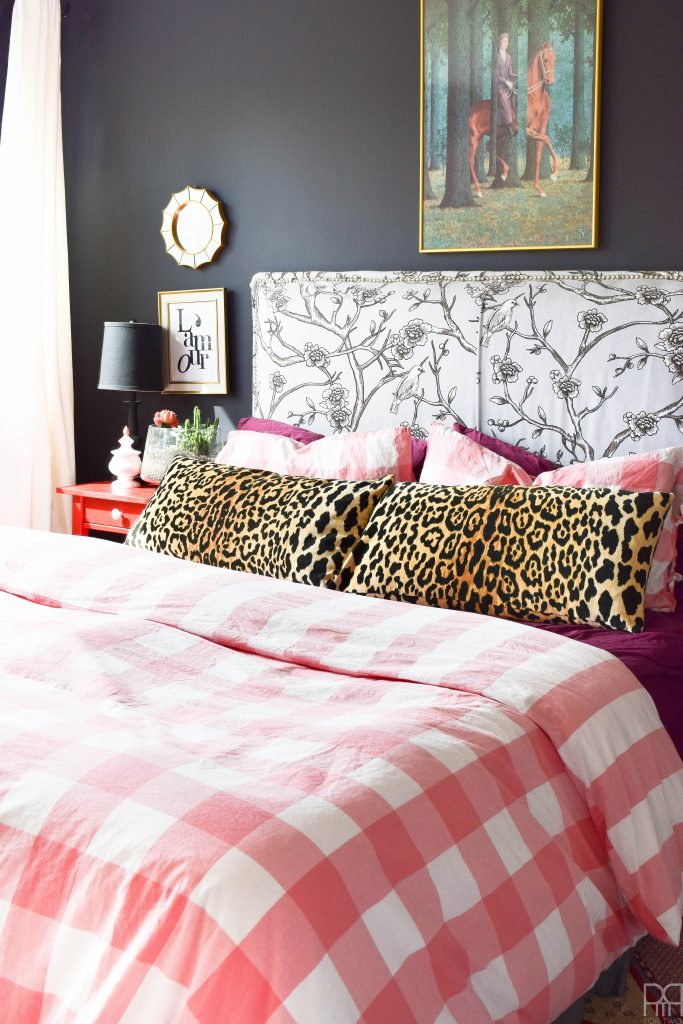
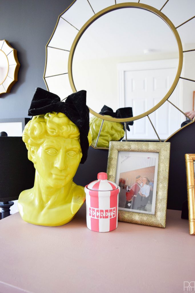
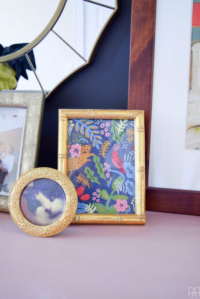
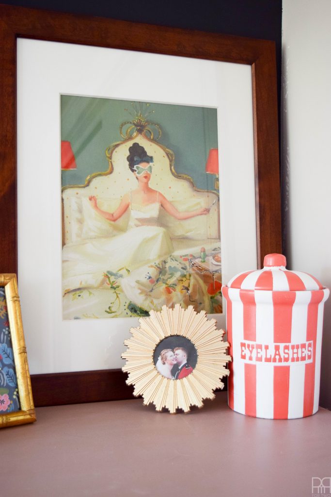
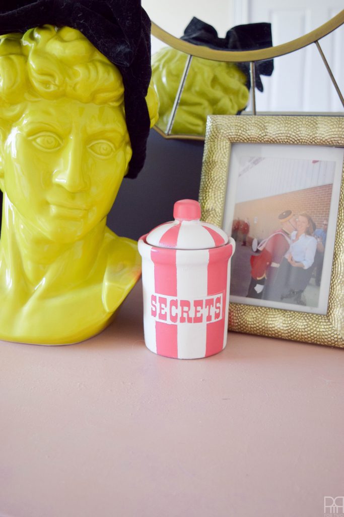
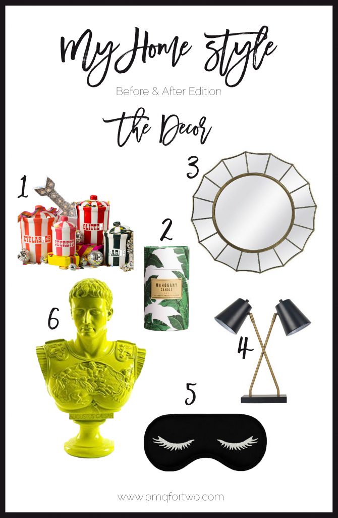
I’d have to say the glam element in the space comes from the stuff on the dresser and our nightstands. The gilded mirrors and frames, the creepy yet gorgeous green bust, and all the little things that make this space feel like an escape. The jamil lumbar pillows are my secret obsession though. I’ve been lusting after the fabric for a while, and bit the bullet on our two lumbar pillows from The Pillow Cover Store. The sticking is top notch, the fabric is so soft and velvety, and the colours are nice and rich while being glam. Score!
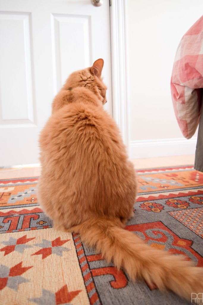
More dust and pet hair I missed while cleaning. It’s crazy what two cats and a dog can do to a space!
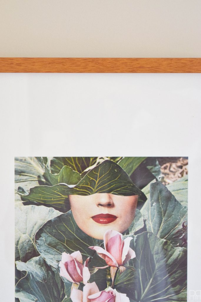
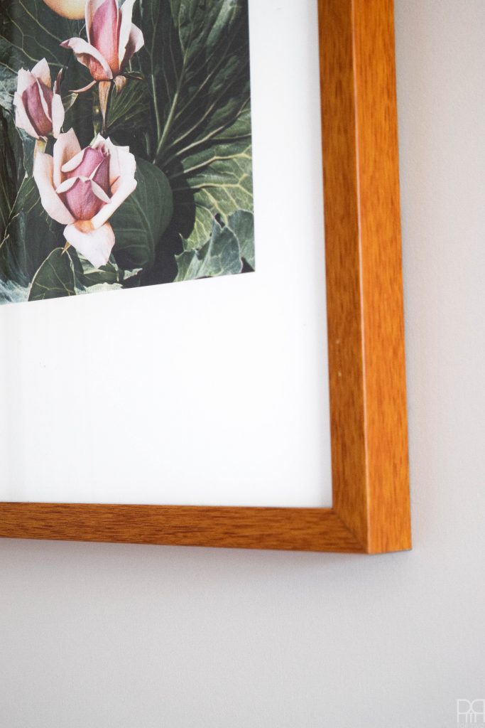
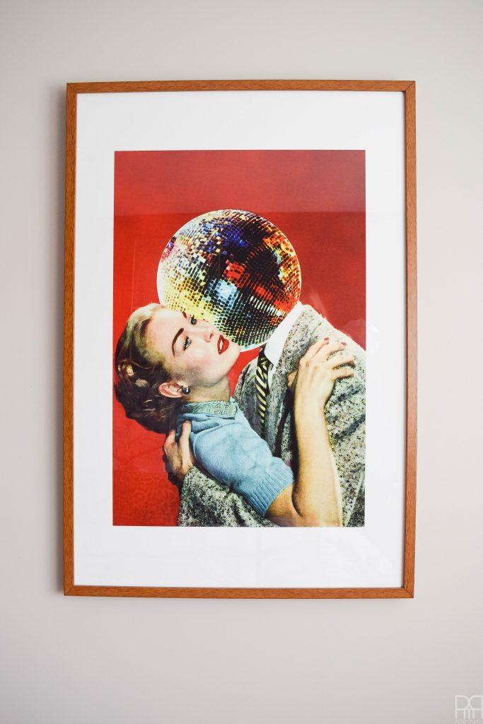
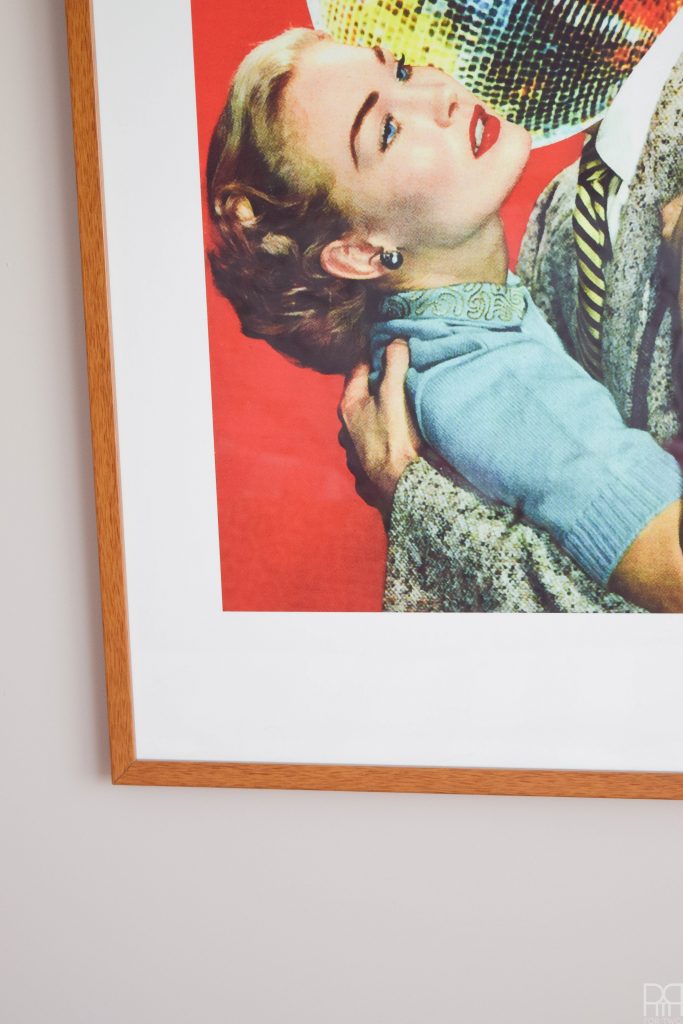
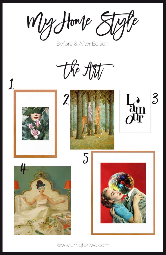
But can we take a minute to talk about The Discotheque? This piece stole my heart. Like, it robbed my heart-shaped bank and took off running. I’m having a moment with mixed media art. I found this piece on Society 6 and had to have it. The artist, Eugenia Loli, does some great stuff, and I’m sure this won’t be the last piece I buy. Much like Seasonal by Beth Hoeckel. I love the collage style, and I think the colours and images are super funky.
EDIT: I finally have curtains! They’re white, floor length, and hung from the ceiling with a beautiful black grosgrain ribbon down the middle.


If you’ve enjoyed My Home Style, you’ll also enjoy these other bloggers. Make sure you track back through the week to see what everyone is up to.

MONDAY
TUESDAY
WEDNESDAY
–> PMQ for Two <– You are here!
THURSDAY
FRIDAY