I am proud to say that we are now done with Blush & Brass Studios! // here //. If you saw in last week’s unveiling of the studio, the kitchen are was not done. But after a very productive long weekend and a little help from Dan, I was able to finish it all! I am so in love with how it turned-out, and as you’ll see, it feels like a little slice of “me” in a new and exciting shared space.
Source list at the bottom
*FAT Paint, BEHR Paint and Homesense sponsored this post, but all thoughts are my own. Thank you for supporting the brands that make PMQ for two possible.
This area felt like it was never going to come together. At first our initial order from IKEA fell through, and then there was a 2 week delay, and then our final shipment got cancelled entirely because someone could no longer make it out on time. So last Saturday morning I stood in the aisles at Home Depot trying to find the best way to get the look we wanted.
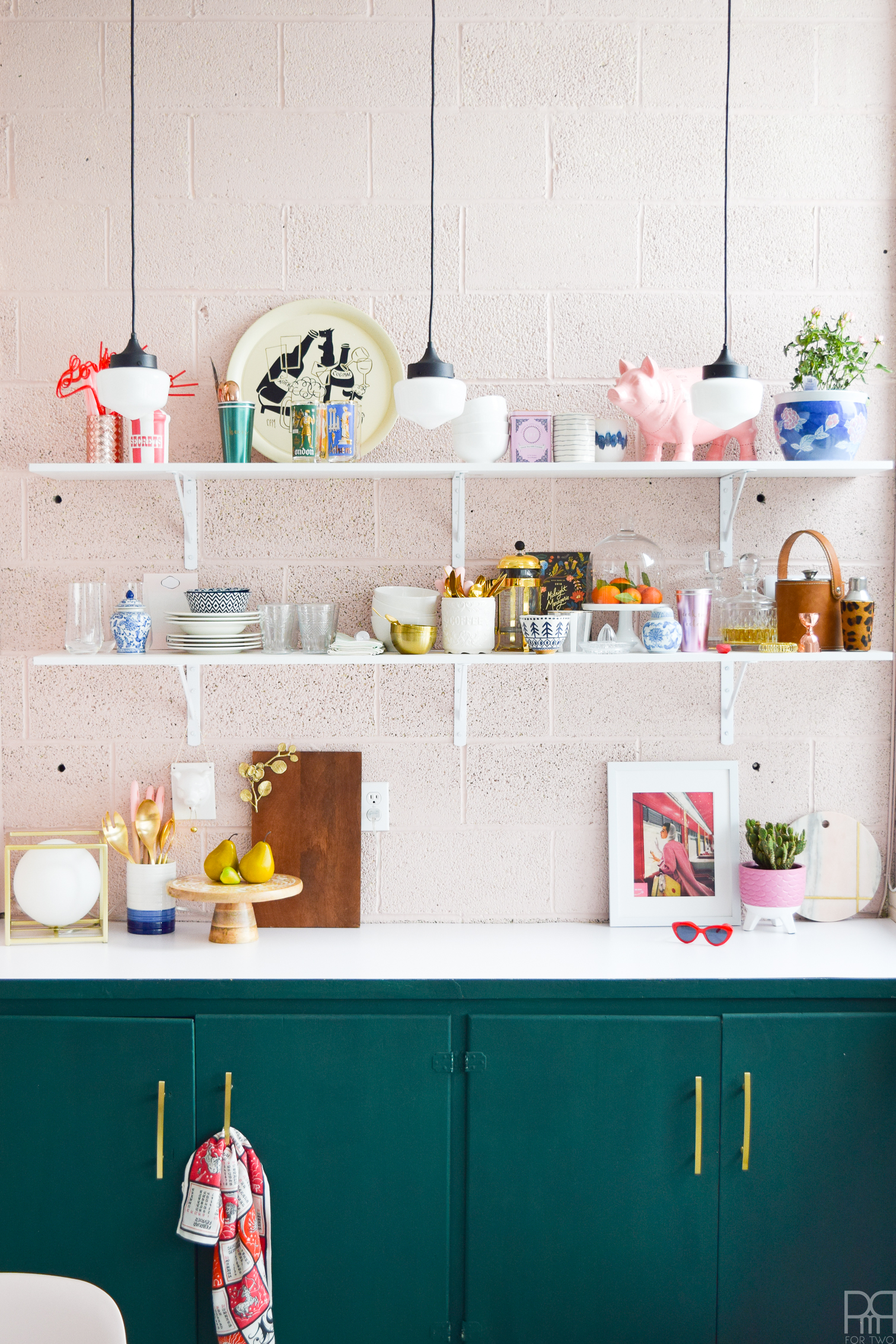
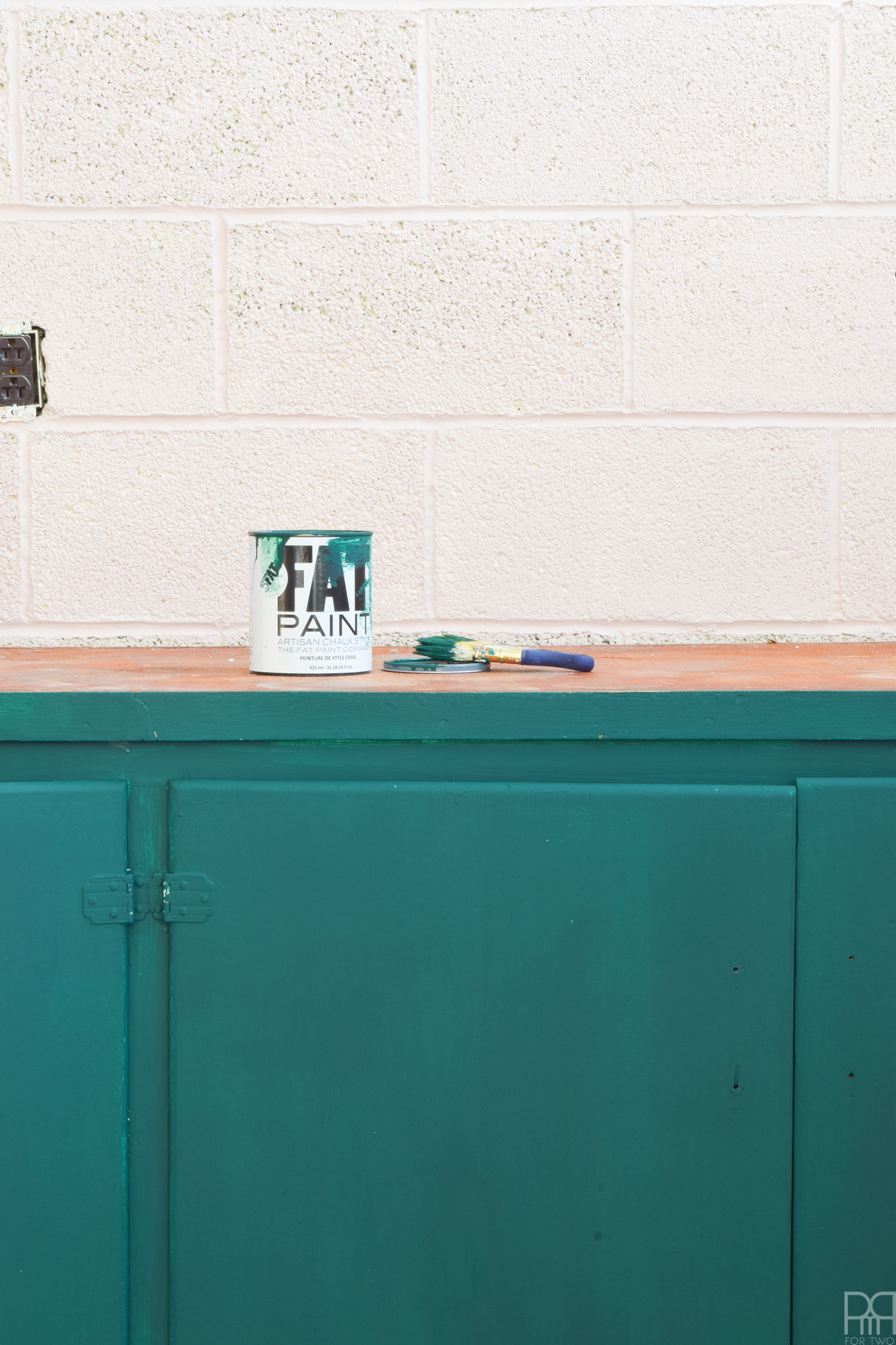
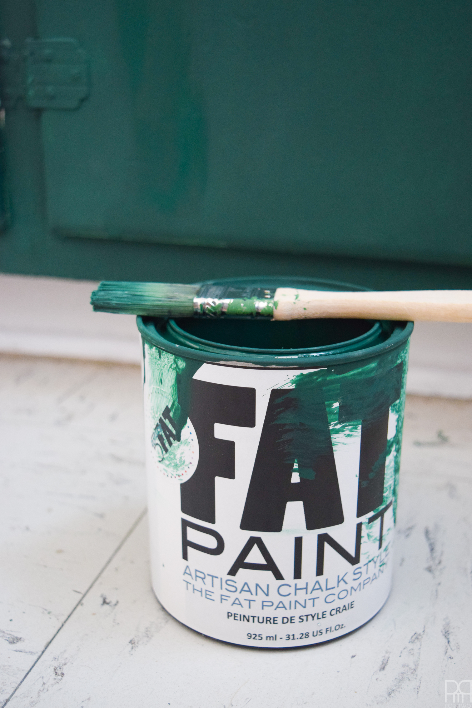
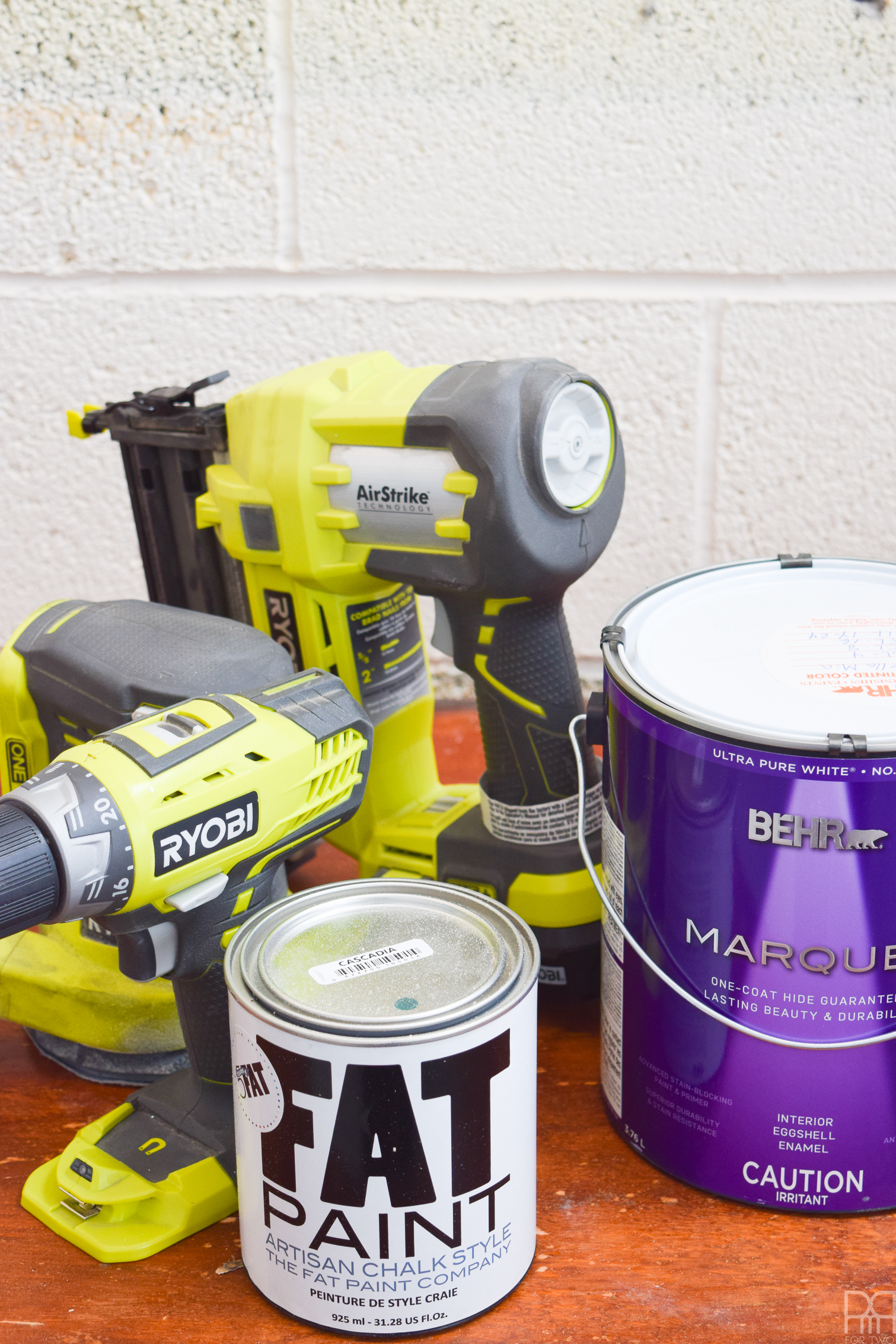
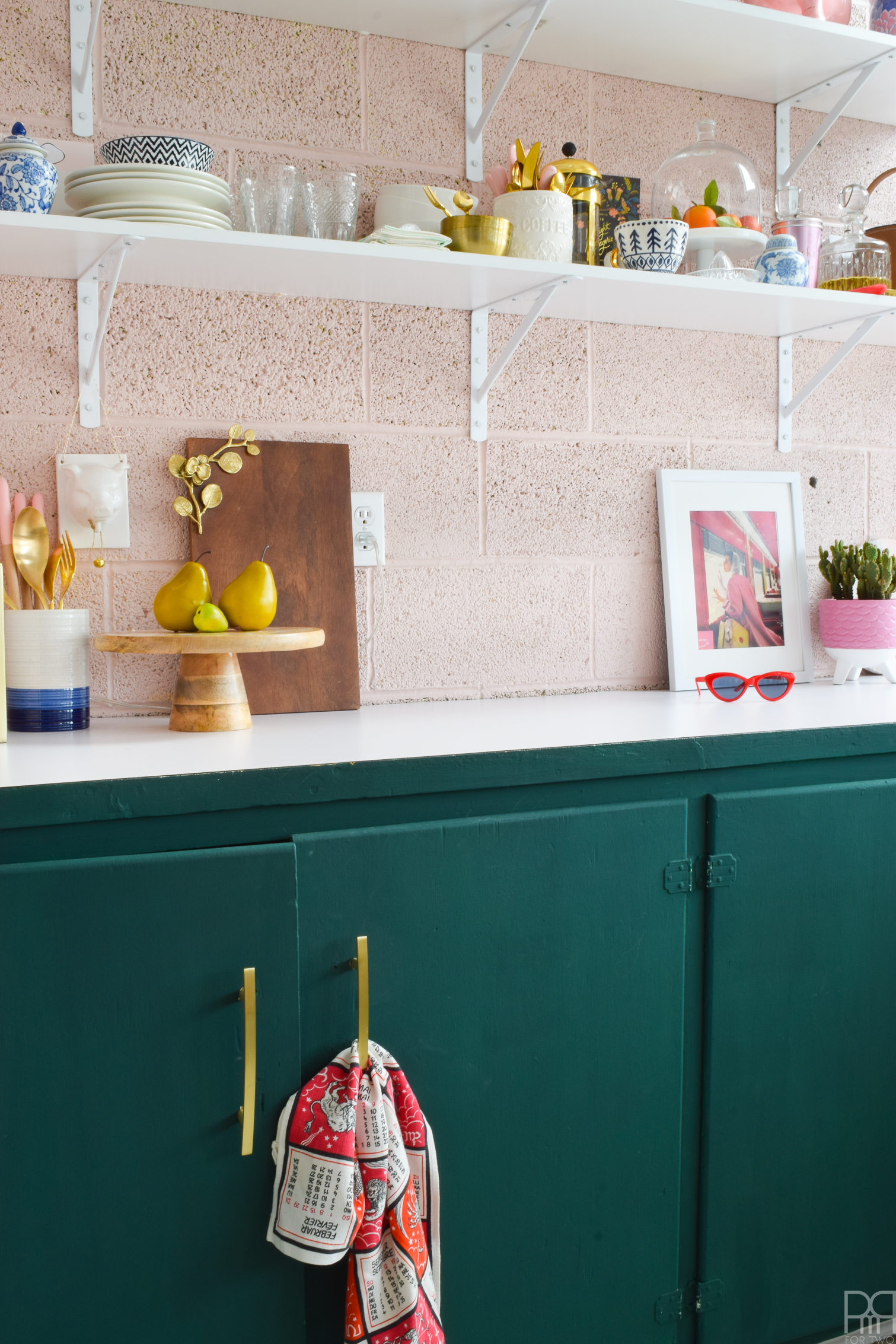
I already had the cabinets and walls covered. I’ve been lusting after FAT Paint’s Cascadia (their new colour) and knew that I wanted to use it on the kitchen’s cupboards. It’s a small enough space that the colour really gets to shine, and it’s not overwhelming because it’s contained to a specific area.
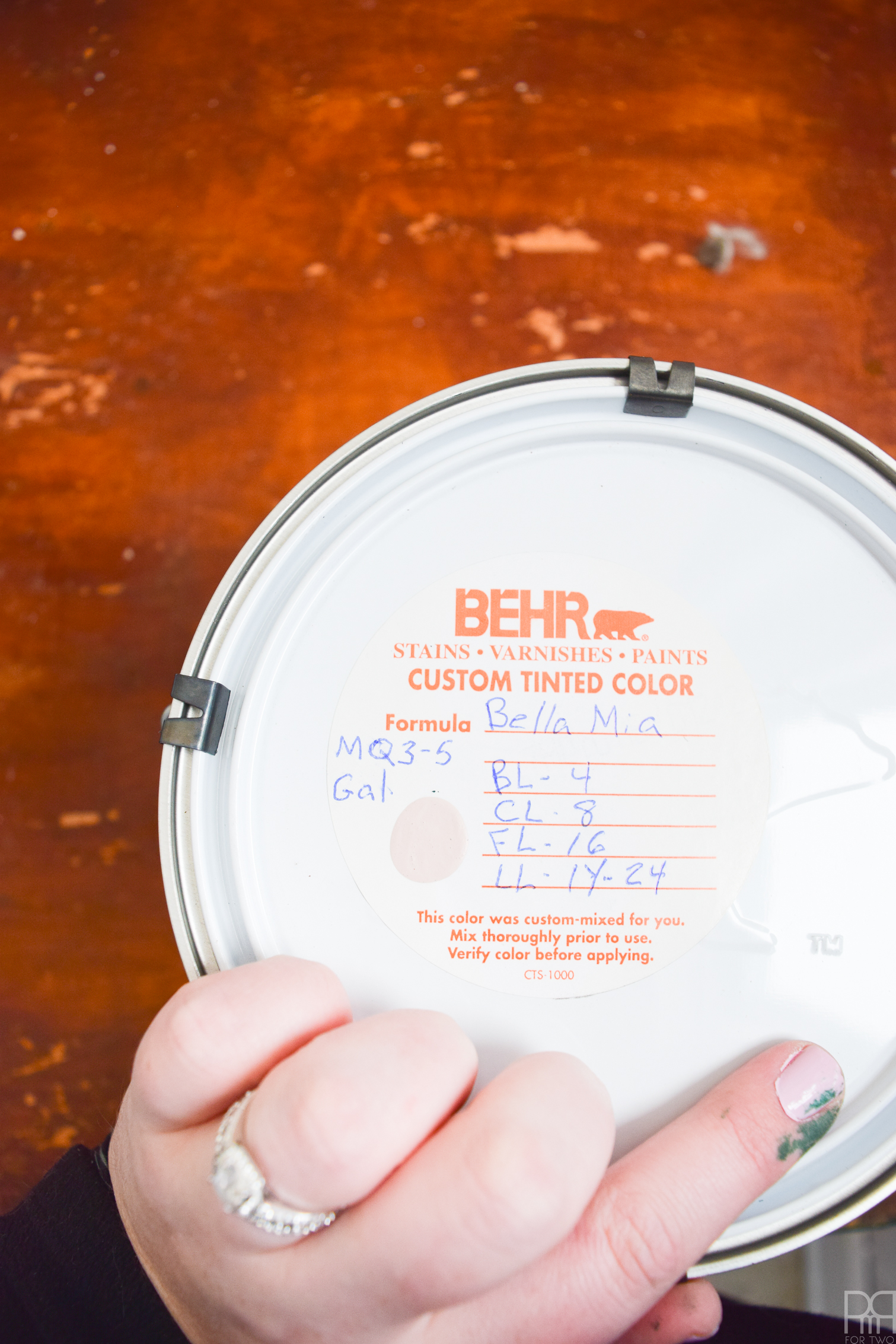
For the walls, I used the only paint I trust for a job like this – Behr’s Marquee paint. I used Bella Mia MG3-5, the colour we used on all the dividers for continuity. In the space there are now 2 shades of pink and 2 shades of green, and it all works together in perfect harmony.
Let’s see what we started with shall we?
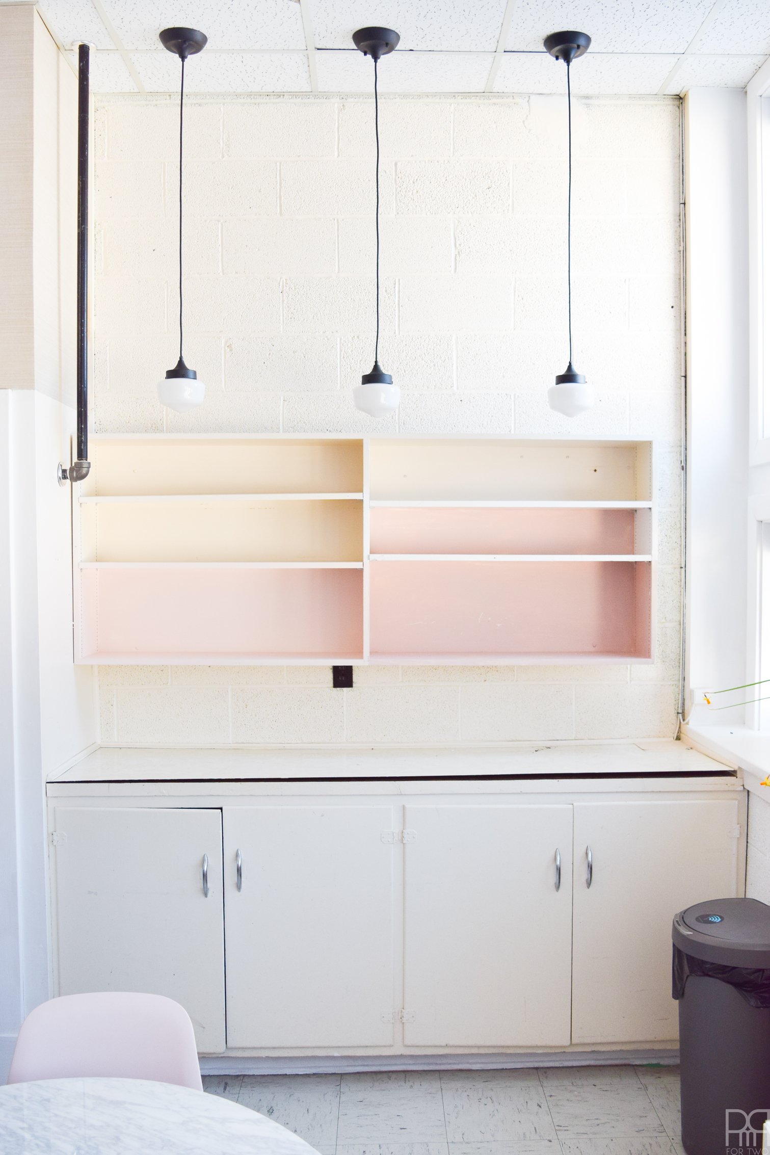
Minus the 3 pendant lights – which were added last week – this is what we were working with. I tested some paint colours on the shelving back in November, but it wasn’t really working, so we decided to take it down and put in shelving.
As you can see, the countertop veneer has almost completely lifted off the counter, and it was poorly patched in one corner. This was NOT blogging quality people, this wasn’t good.
After taking down the unit and ripping off the veneer top, I got to work painting the cabinets using that velvety goodness called FAT paint.
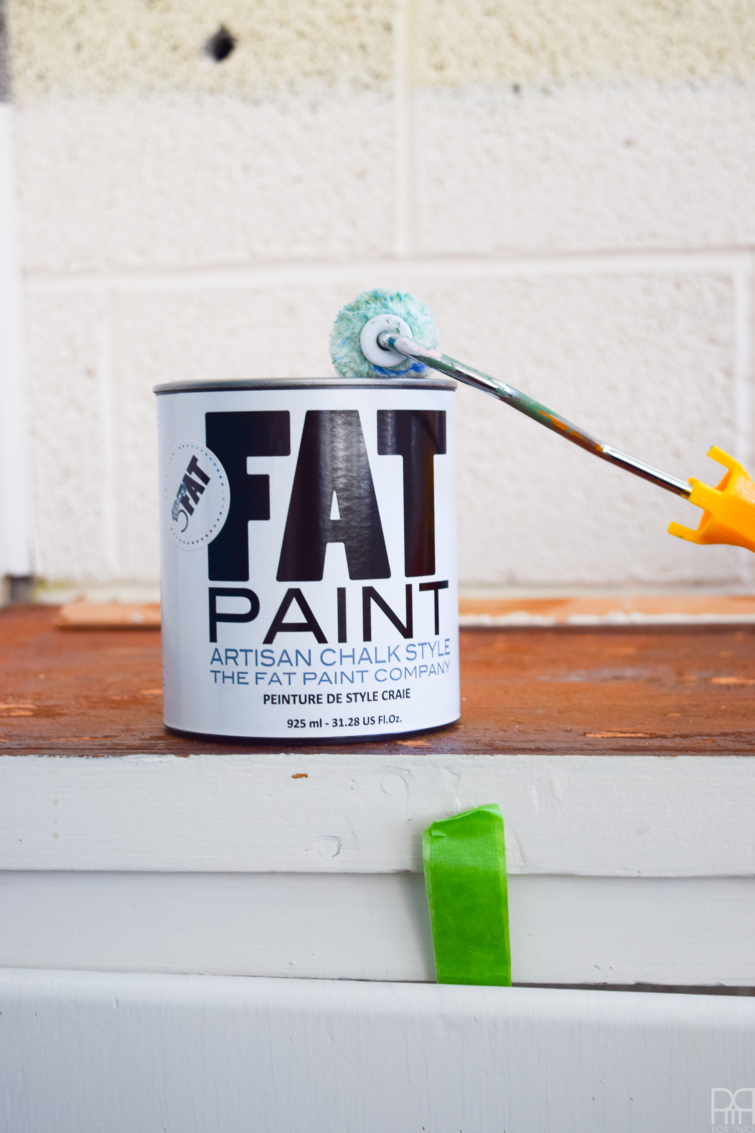
I removed the hardware, sanded the doors, and applied a first coat. It was trickier than I had imagined, with all the little areas and strips that needed to be painted.
It took me about 2 days and 3 coats to get the coverage I wanted. Because the doors had been painted so many colours, short of taking all the paint off the doors, it was going to require a few coats.
I’m expecting some wear and tear on the inside seems and the joints over time, but thankfully that’s not a hard touch-up.
If I was painting these cupboards every day use in my own home, I would have removed the hinges as well, and stripped everything down to wood. But since this is for the studio and won’t get as much action, I figure we’re OK.
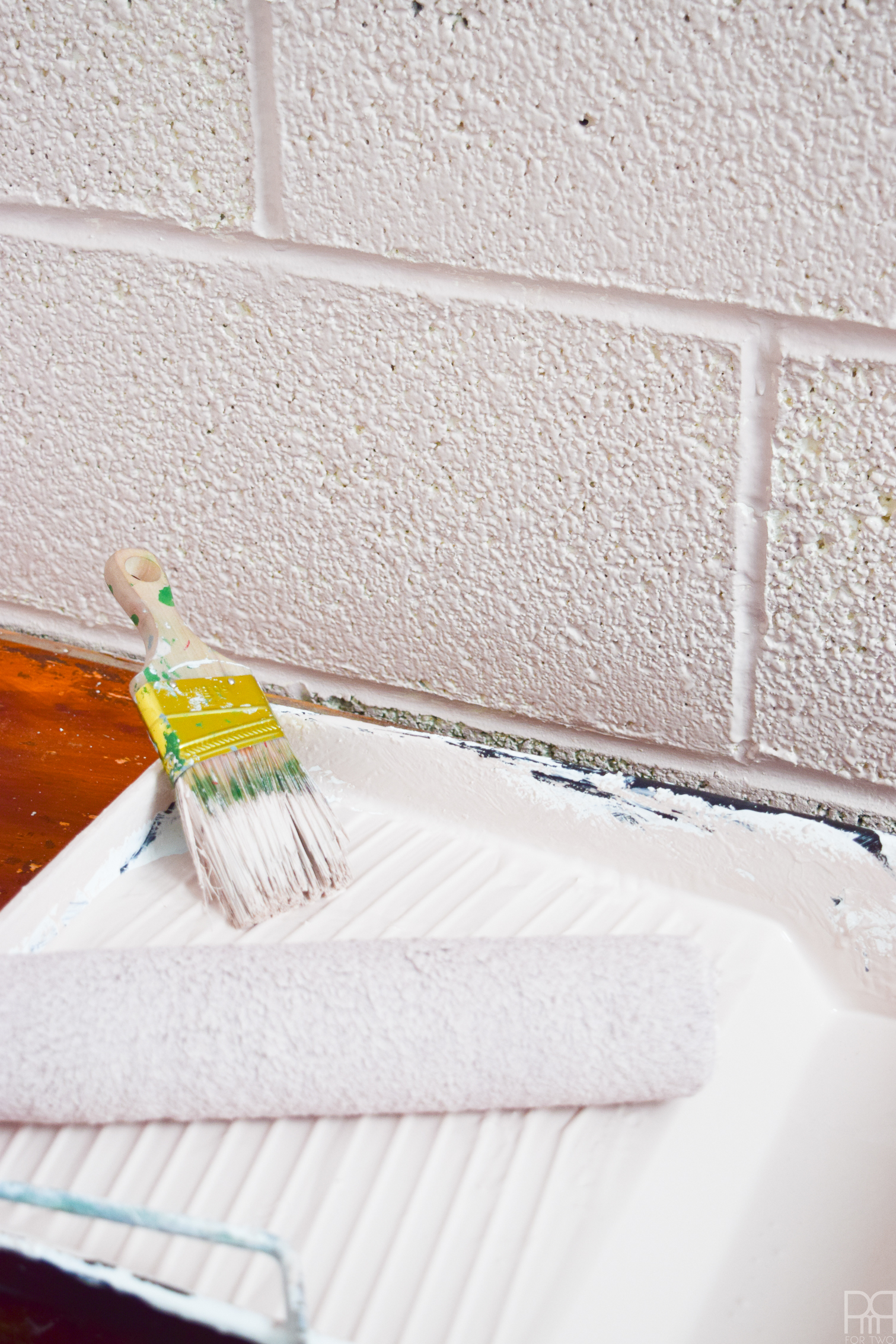
The pale pink is beautiful blush with hints of taupe. It’s not overwhelming, and it’s got great versatility, which is why I had used it on the dividers in the rest of the space. Because we had painted the rest of the space using Behr’s Marquee in Ultra White, we knew how to paint the brick walls and get good coverage.
When painting brick walls, get the grout lines first with a brush, and then go over the bricks with a thick roller. It will take a few coats but the outcome is stunning.
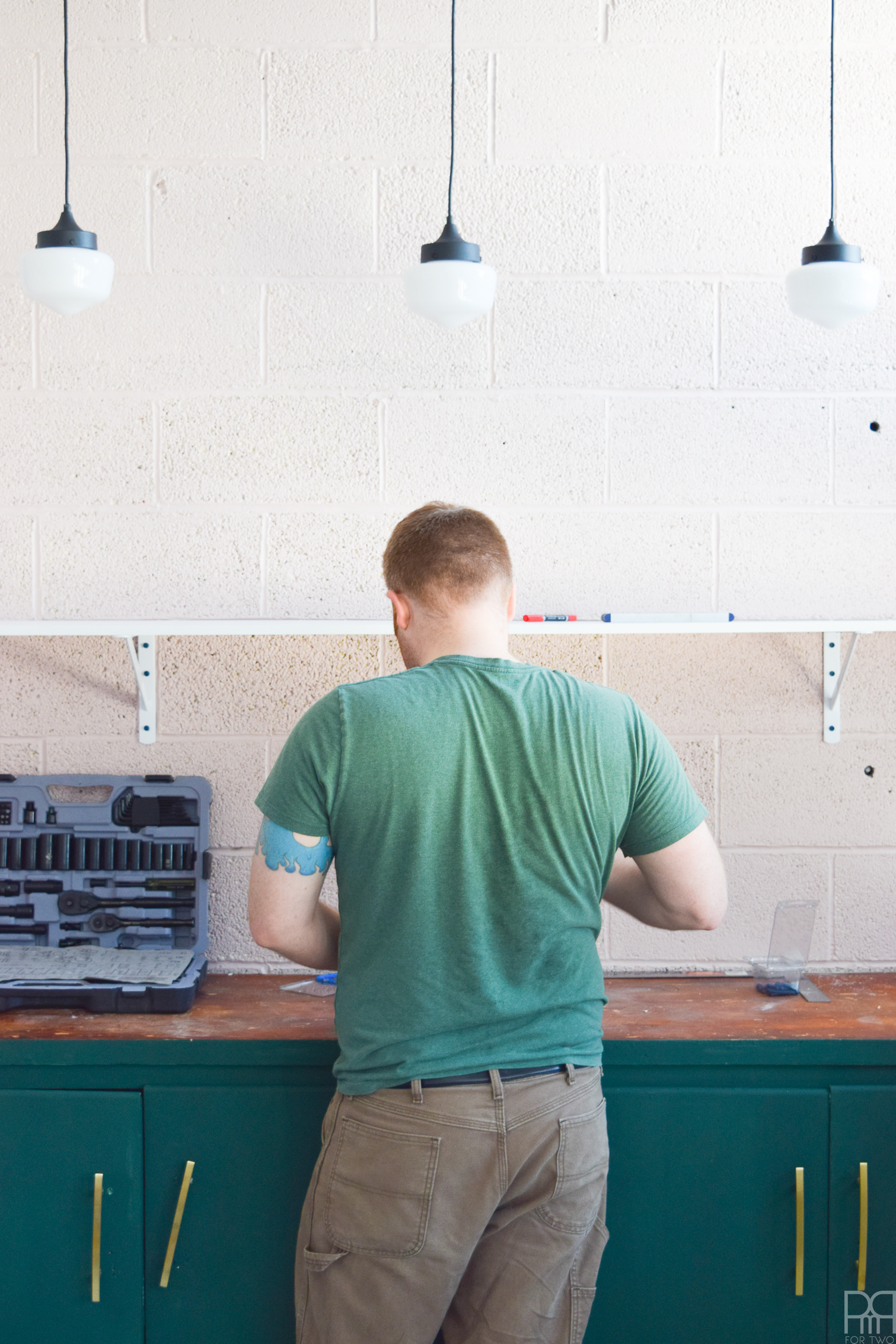
Next, I had Dan help me install the shelving. We had to drill through brick, and that’s always fun *insert eye roll* so Dan was here to be the muscle.
Our Ryobi drill did the trick on one battery though, so that’s pretty impressive!
Between the FAT Paint on the cabinets, the BEHR Marquee on the walls, and the shelving finally up – we were in business! Gluing down the veneer countertop was super challenging for me because it required the most precision, and I’m not into precision on the first try lol. Anyone who’s worked with contact cement knows what I’m talking about, but I got it to work!
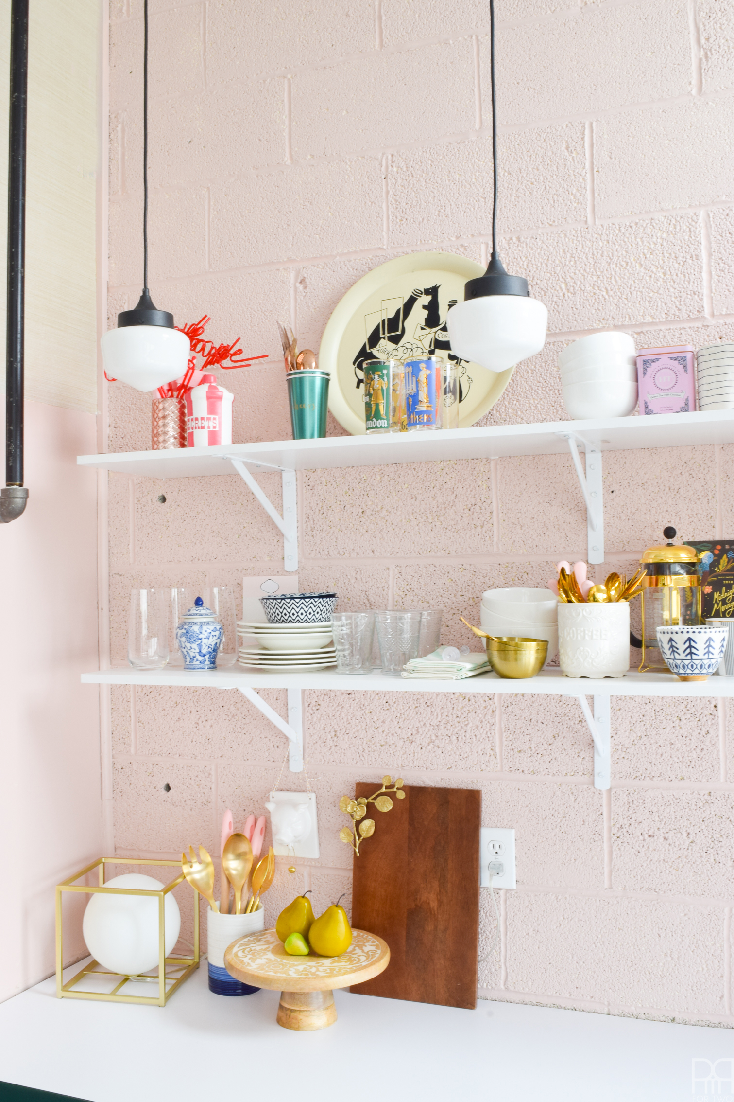
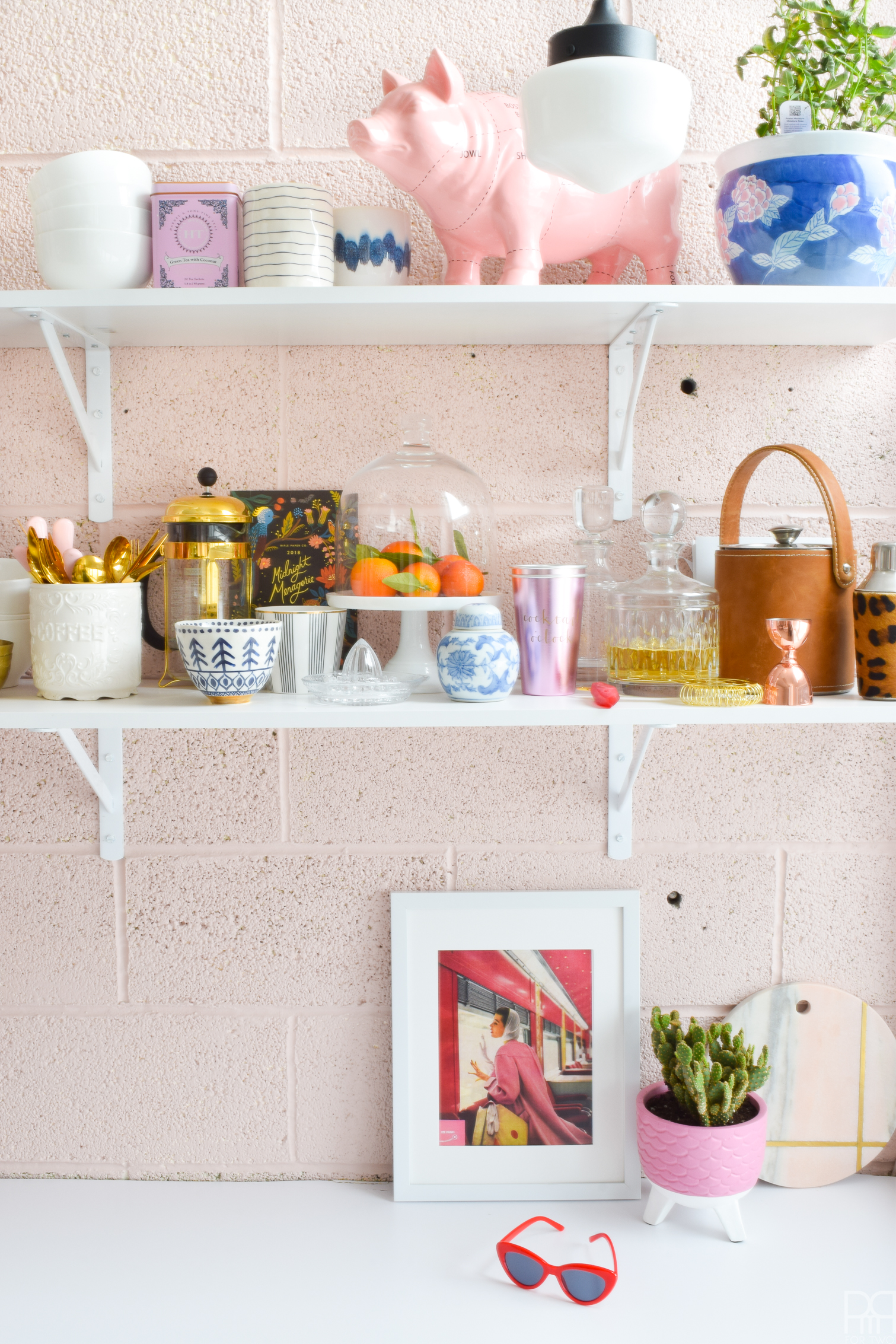
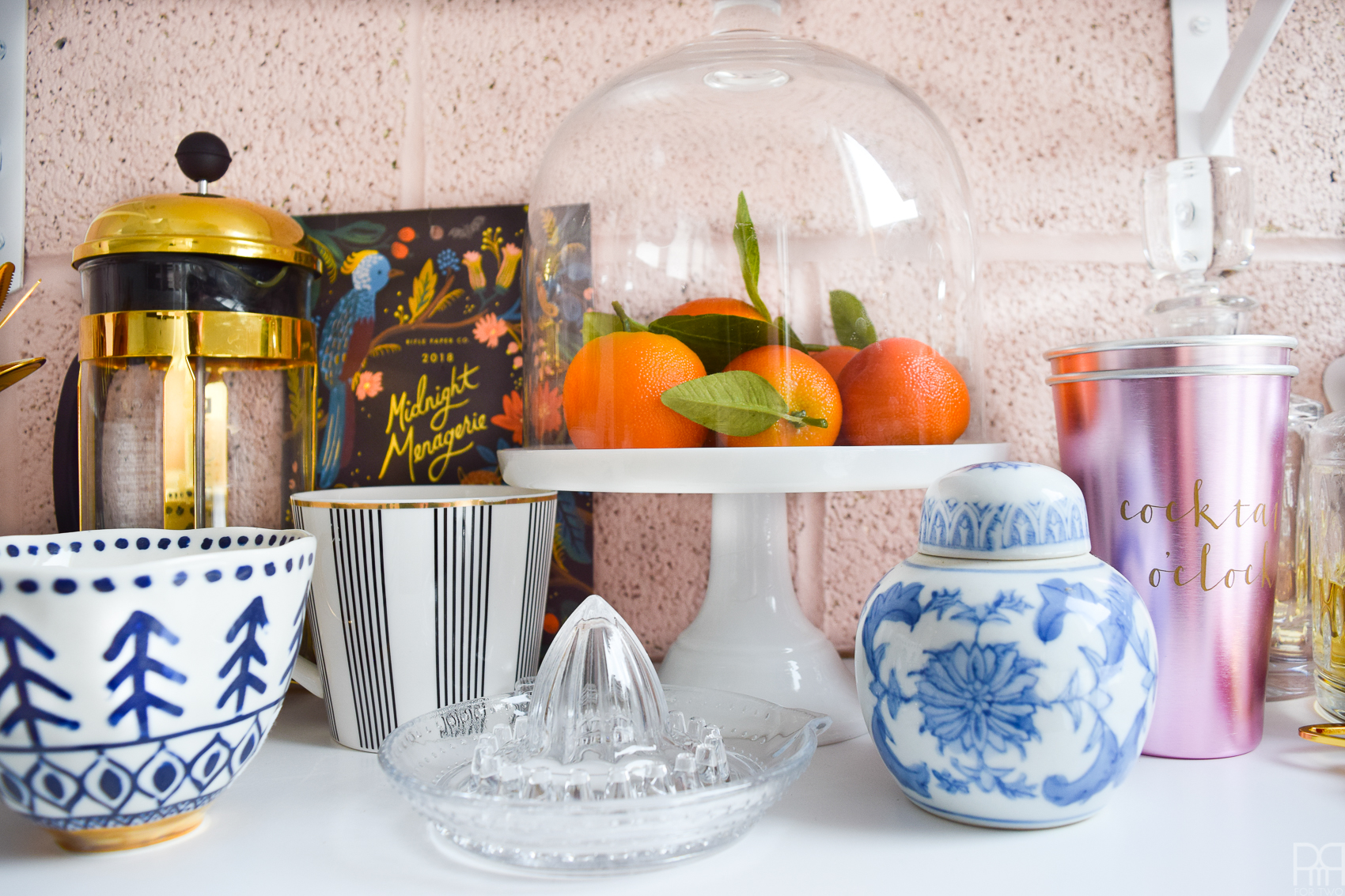
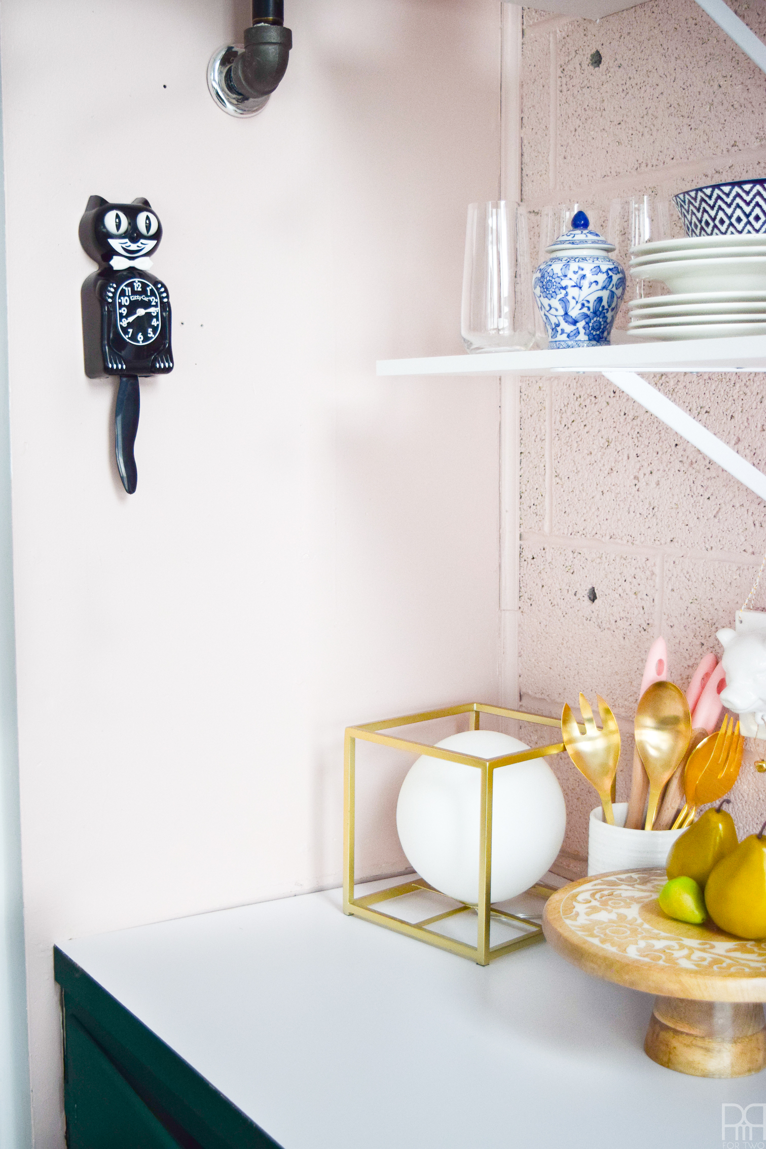
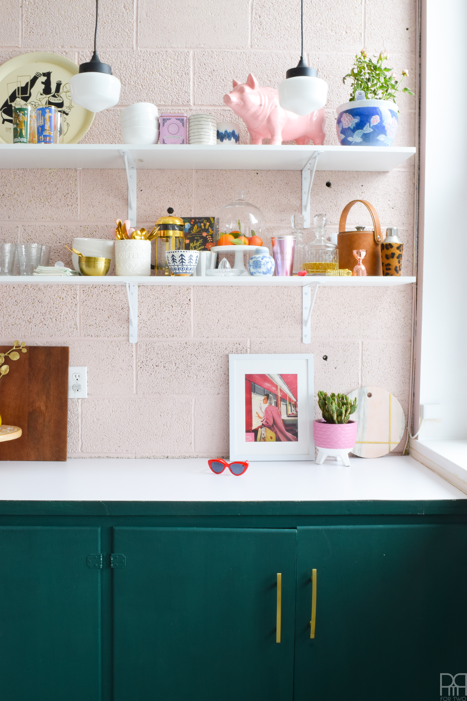
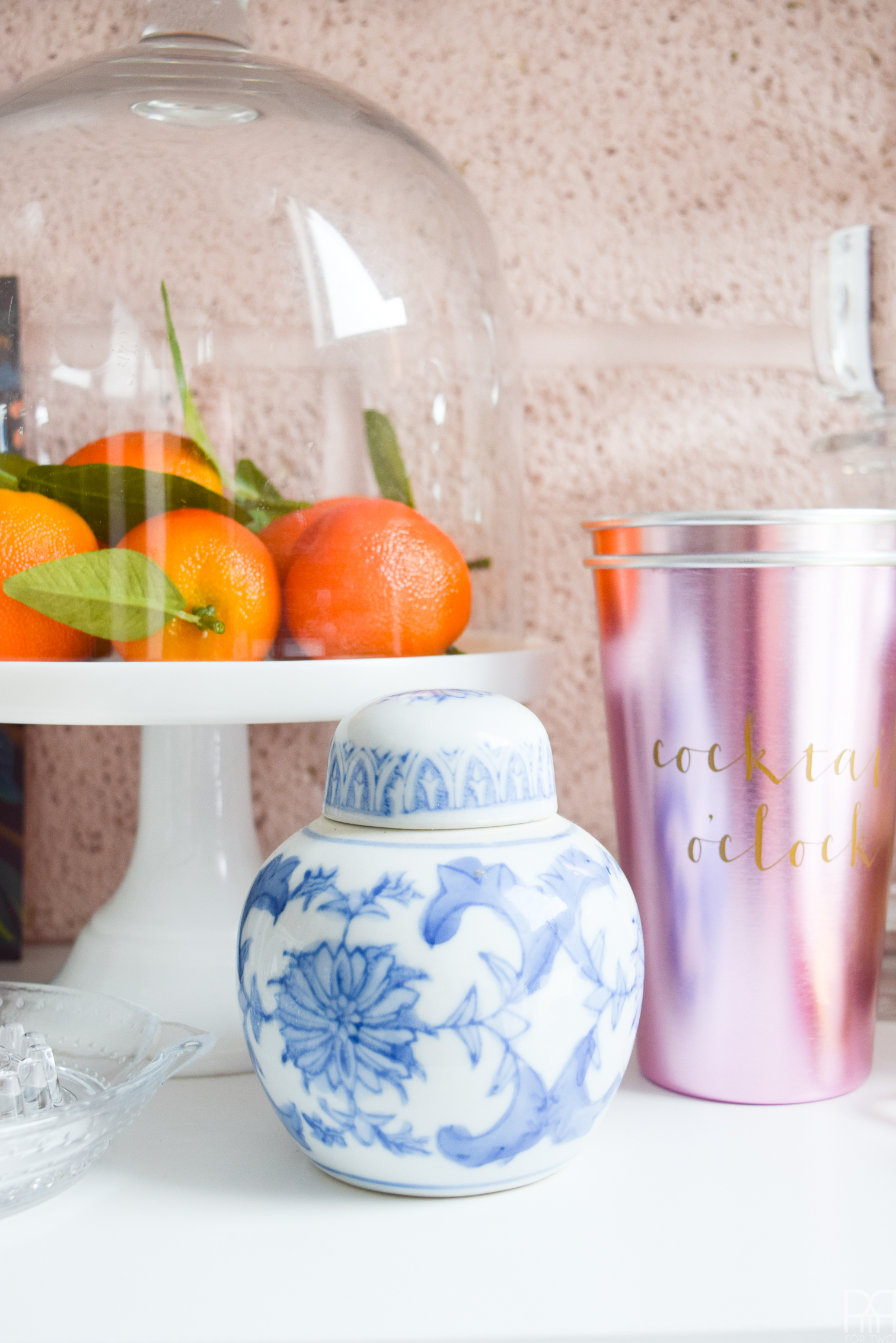
All that was left was to style the the shelves using some of my fave Homesense finds. Before Christmas – when we started on this journey, I started stocking up on items for the space. The majority of them made it into the first post about the space, but all the little details and knick knacks ended up in the kitchen.

Enjoy this feast for the eyes! Every detail was placed deliberately, and all the changes were made with care.
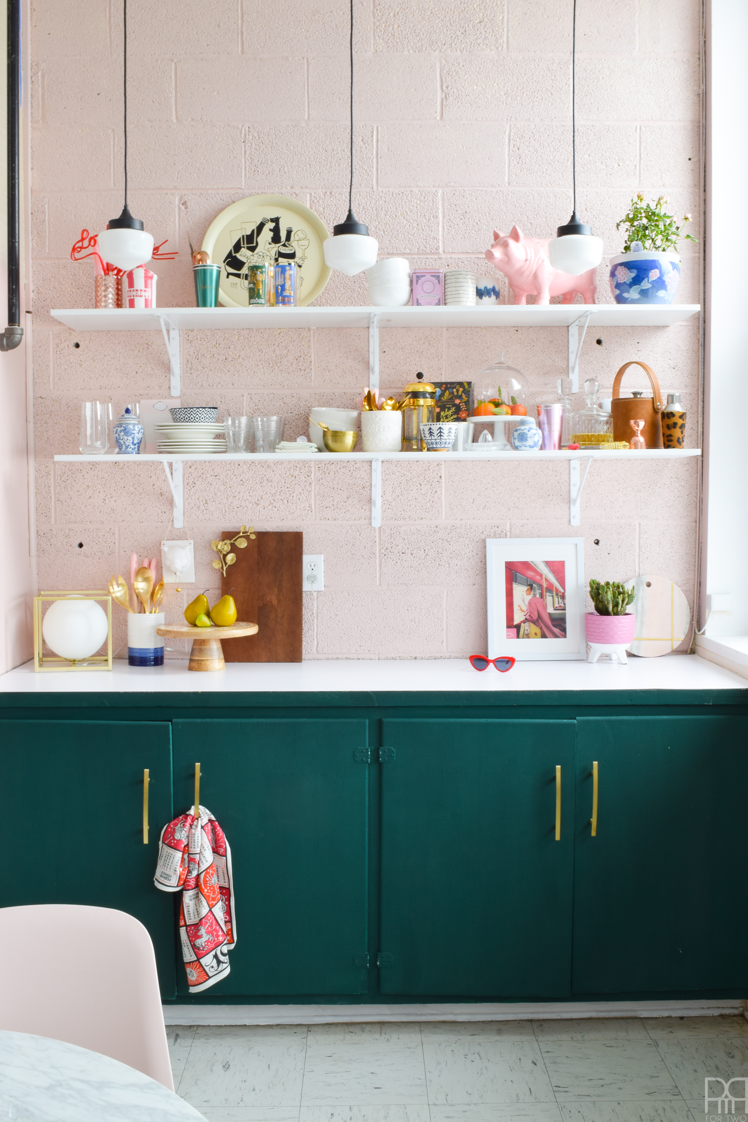
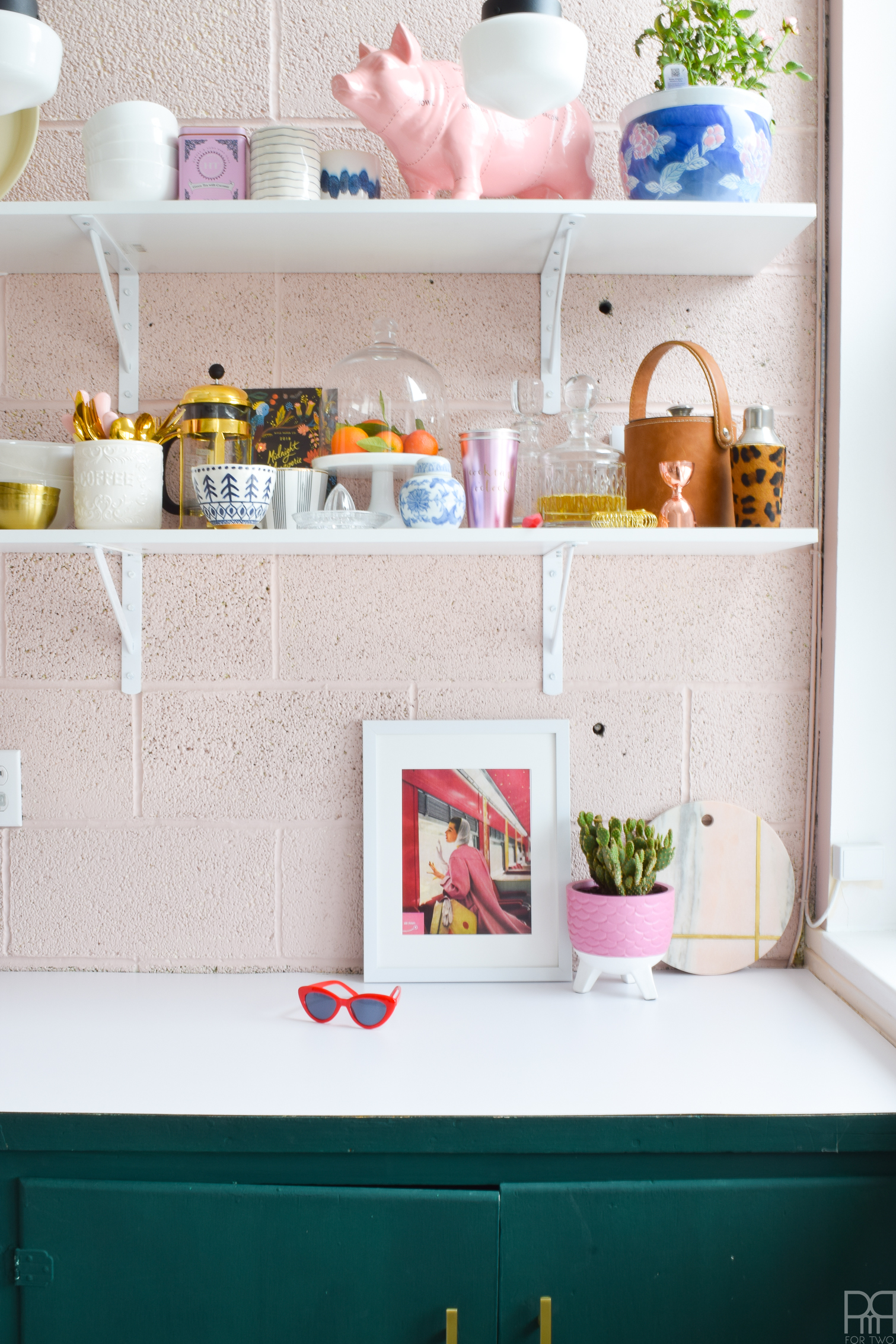
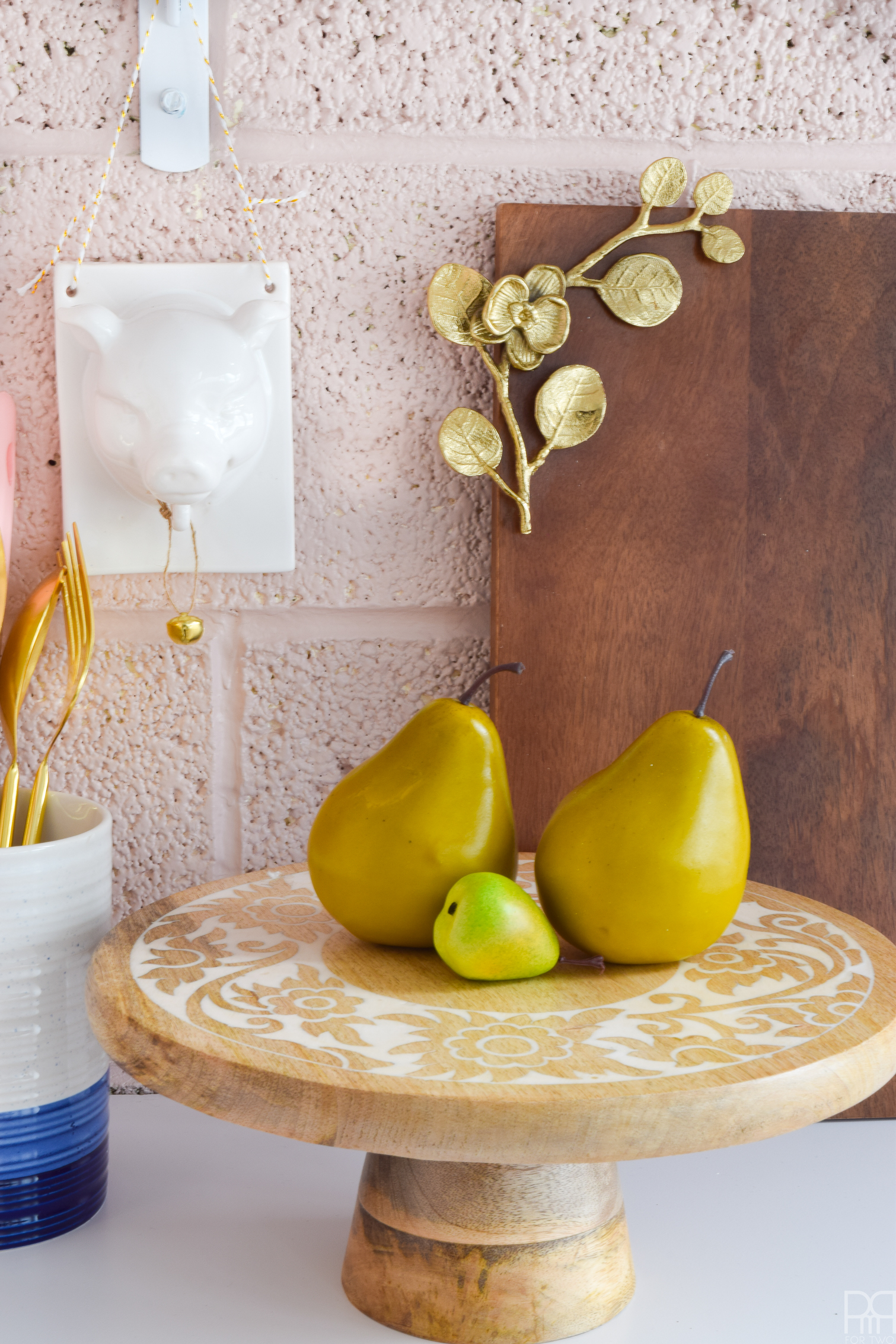
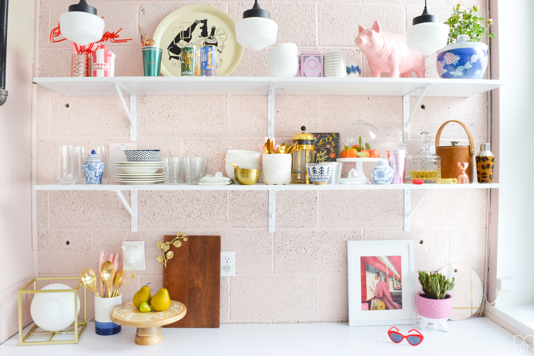
Almost all the serving ware and cups, mugs etc. are carefully curated from HomeSense. They were all chosen with care over many trips to my home away from home, and I am so impressed that I was able to snag them for such a good price. HomeSense – you should go!
Source List
- Cabinet Paint – FAT Paint’s Cascadia find some at your local retailer.
- Wall Paint – Behr Marquee Bella Mia MQ3-5
- Pendant Lights – Olive Pendant from Canadian Tire
- Shelves, Brackets, Veneer Countertop – Home Depot
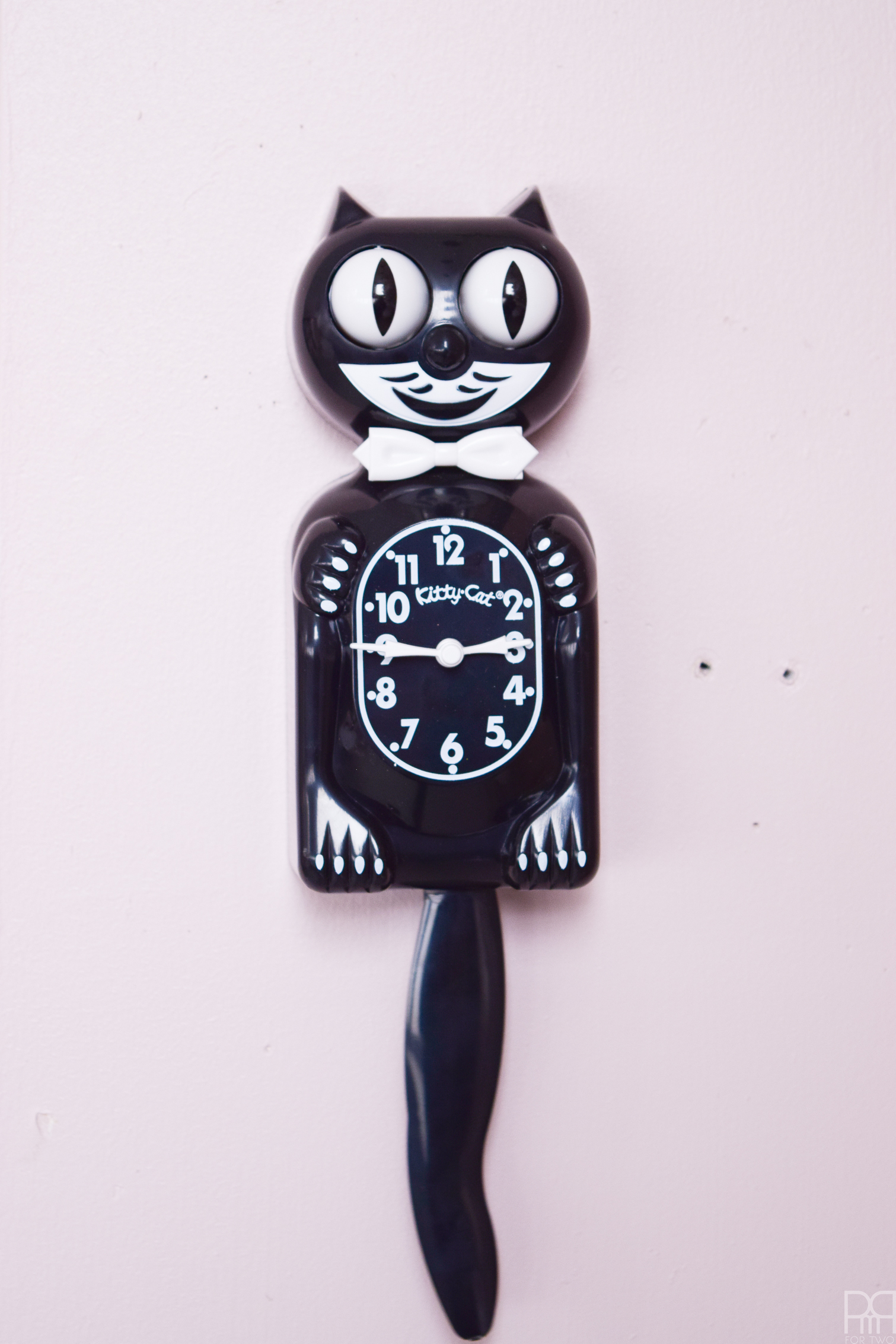
- All cups, plates, bowls, stands, accessories – HomeSense


I love all these colours together. So good!
Thanks Tania! <3
Looks amazing! So much good inspo to be found with your stylish finds on the shelves. I wish Homesense would hurry up and make a location where I live!
Thanks girl! It was a real treat getting to hunt for, shop for, and style the shelves. Homesense has such great finds, and I’m sure once they open near you, you’ll be in business!
GIrl, this looks awesome! loving the cabinet color, and of course your shelf styling is on point per usual. great work!
Thank you so much Kate! I had the shelves styled before the countertop veneer was down! ha!
I’m so glad a designer such as yourself approves 😉
GIrl, this looks awesome! loving the cabinet color, and of course your shelf styling is on point per usual. great work!
Pretty amazing considering what you started with! Love your piggys.
Thank you! I am very pleased with how it turned out. It just took a little longer than I had expected 😉 Those piggies are both from HomeSense too!
I like how you stated it was a ‘feast for the eye’s because, it sure is! Another job well done!
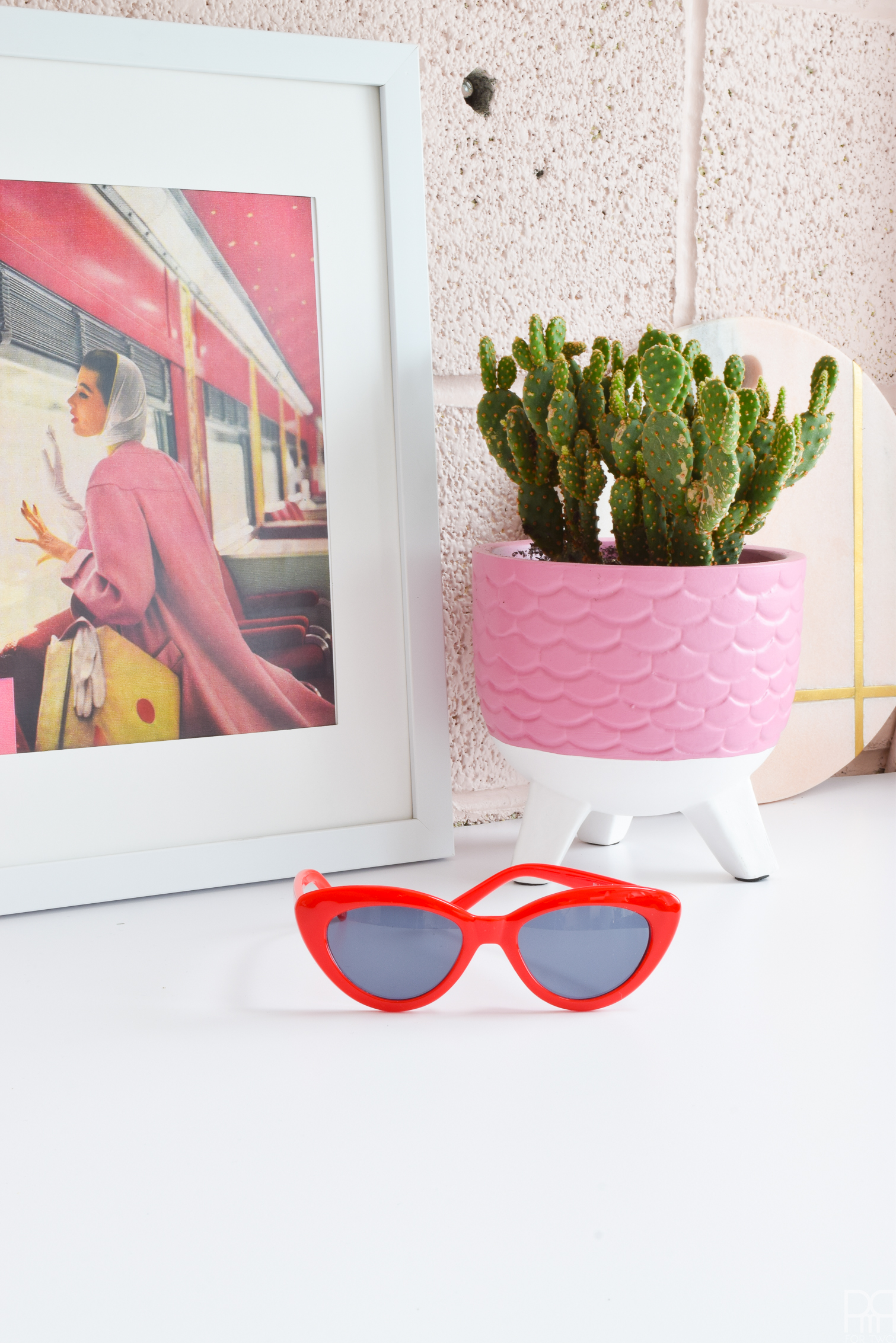
This kitchen space is fantastic! You worked wonders with that blank canvas.. I especially love your paint colours – oh, and the placement of those retro sunglasses next to that print … genius!
Looking good! I’d love to paint my whole kitchen but the amount of cabinets makes it a daunting task.
It looks amazing and I love your styling! The colours work so well together, a glorious combination! You must be so excited! xxx
Looks GREAT AND SO FRESH! I LOVE HOW YOU DO A LOT WITH A LITTLE. <3
this space is amazing! normally cement walls give off a “cold” feel, but you’ve managed to make this space look warm and inviting!
Thank you so much Holly! Cement bricks keep this place nice and cool in the heat, but they def needed a paint job.