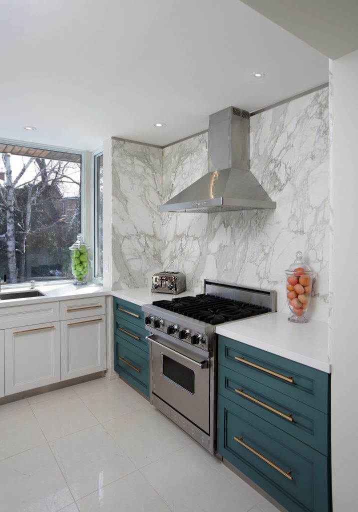
Everyone dreams of beautifully constructed and decorated kitchens. Even if it’s not an active daydream, an ugly and very small kitchen will make even the most ardent “I don’t car-er” cry. I make no illusions about the fact that I live in military housing or that we’re perpetual renters. It’s part of our life right now, and until we’re posted to a city where I can reasonably hope to sell a home that I would obviously upgrade the heck out of, I’m stuck living my Pinterest dreams in a restricted way.
*Behr Paint sponsored this post, but all thoughts are my own. Thank you for supporting the brands that make PMQ for two possible.

However, with the Splurge vs. Save campaign that Behr Paint and I are working on, I was given the opportunity to splurge a little, while also saving. As renters, we’re still limited in what we can do. I can’t sand and re-paint all my kitchen cabinets, just like I can’t change the flooring or counter-top. What I can do though, is work within the realm of the possible and use the power of paint and some key fixtures to transform the space. With the help of paint I got closer to making my Pinterest dreams a reality!
Paint is such an effective transforming agent in homes, and it’s the first thing I recommend people do when they move into a new home (even if it’s a rental – just paint it back). It’s affordable and will instantly update the look and feel of a space. When we first moved into this PMQ I painted the walls a light blue // here // and to be honest, it was a stop-gap measure. I had a very similar shade of blue in my last PMQ and because I didn’t have a clear vision for the space at the time, it made sense to go with what I knew.
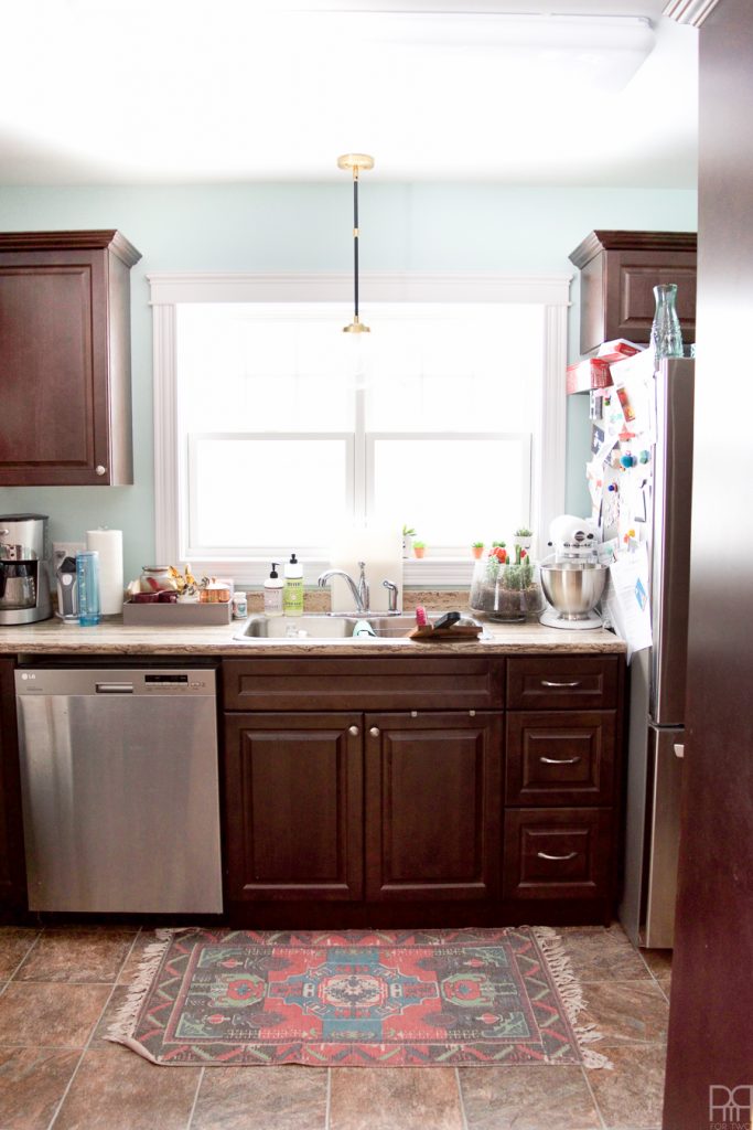
It’s not catastrophic, but it ain’t good. The marks from the trash bin were showing on the wall, the dirt and oil from life in a kitchen was too visible, and I hated how dark everything seemed, even with a light blue! So I made the obvious choice to paint one wall dark green. Trust me on this one.
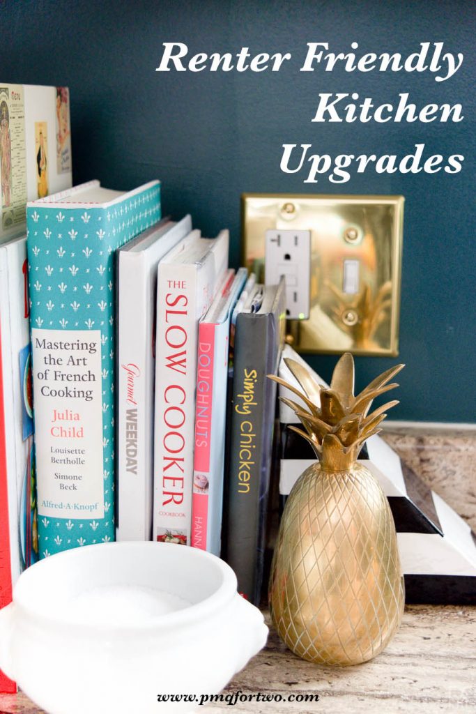
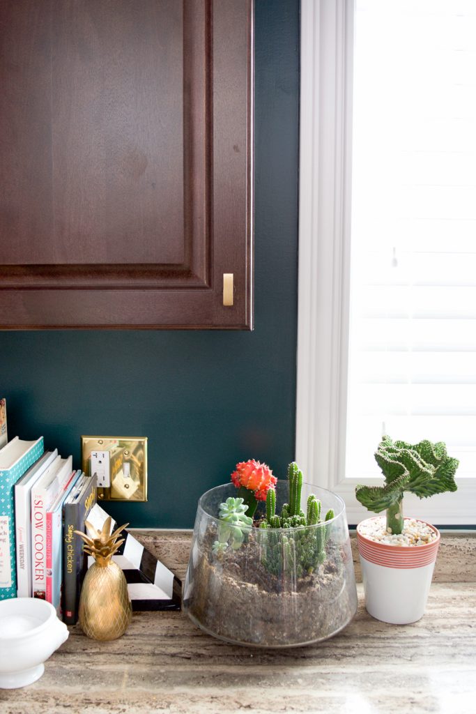
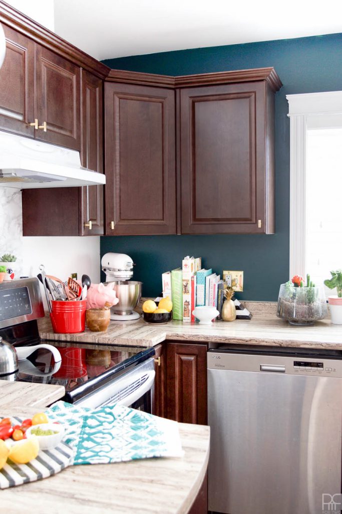
As you saw on my inspiration board, we were going to use brass and a deep complex greeny-blue, to infuse some character into this otherwise forgettable space. We also had the exact same shade of paint Hosta Leaf MQ6-09 on the back of the built-ins across the room in the living room // here //. While I don’t go for the obvious symmetry in a space, this was something DH felt strongly about and I was inclined to agree.
We wanted to bring in some white marble, more brass, and a way to add colour to the wall between the fridge and the cupboards without having to paint the entire thing. Enter more bead board! I tell you, the stuff is magical and I may go bead board crazy and add it all over the house. Once we saw the image below, we knew we had found a winning combination. Sure, they used the blue on the cupboards, the concept of colour-blocking and accenting with brass and marble holds just as true. To see more about our inspiration for the space click // here //

We ordered what we needed online from The Home Depot and then got to work! Much like the Bathroom transformation // here // I’m breaking-down our timeline in case you’re curious
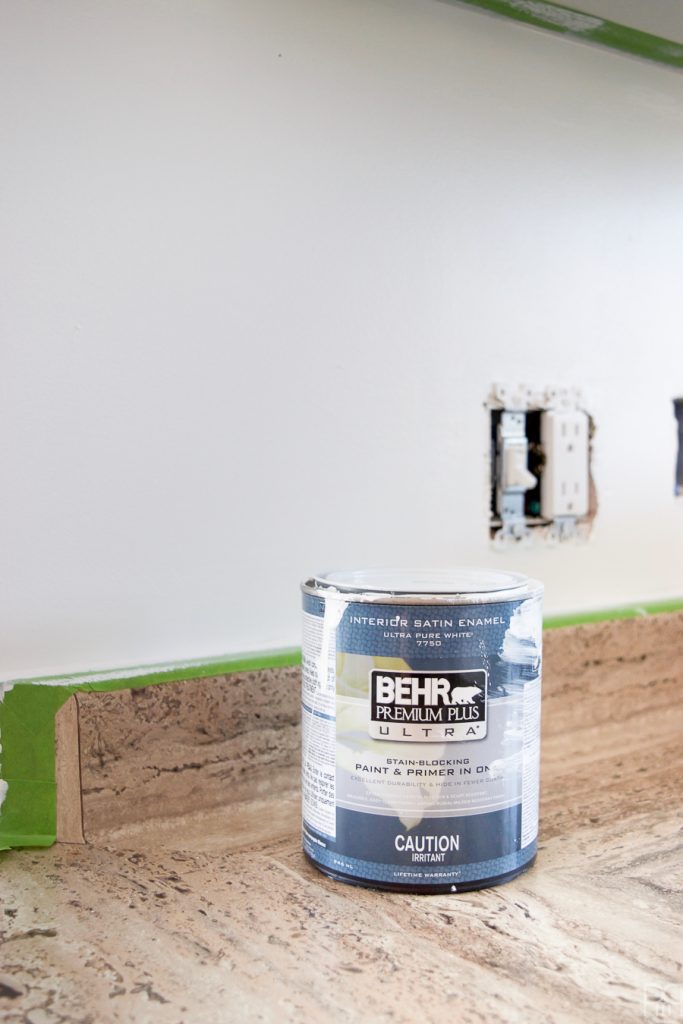
Friday Night: Tape for the walls that will be painted white. Remember to remove anything and everything off the counters first, so wait till you’ve had dinner first – don’t do like we did. This includes removing switch plates and counter-top appliances.
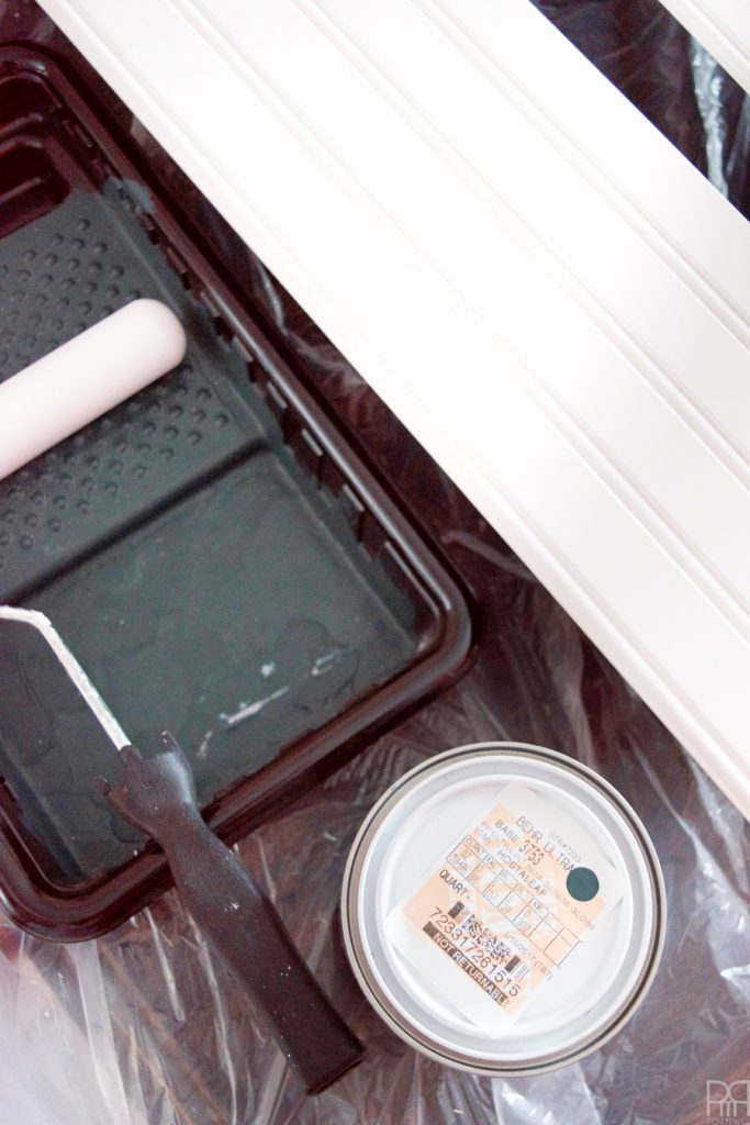
Friday Night 2.0: Get the first coat of white paint on the walls, even if it’s just the trim and edges. It will make rollering that much easier. Paint your bead boards and rail. They’ll need a solid 2-3 coats since the primed boards are very absorbent. We tend to listen to podcasts while doing this kind of thing, so if you ever want a hoot- check out ReplyAll by Gimlet!
Saturday Morning: If you haven’t already, apply your first coat of white paint to the walls. If you have, apply the second coat and do more detail work.
We used Behr’s Premium Plus Ultra Paint in Pure White on two of the walls, and even though it’s a paint & primer in one, it still took 3 coats to get complete coverage. Remember though, we were going over a vibrant blue, so that was to be expected!
Saturday Midday: While the paint is drying, measure the space behind your stove and under the hood / between the cupboards, and cut a piece of 1/4″ MDF to fit. Then, using a scrapper and lots of precision, wrap your marble contact paper around the MDF. It may take lots of firm pressing and holding, but the look will be worth it. We were going to do the entire under-side of the cabinets on the same wall as the stove, but the veining in the marble wouldn’t have lined-up and the it presented too many issues with all the switch plates we’d have to cut-out.
Saturday Afternoon: Apply your final coat of paint to the white walls, and start swapping-out the hardware on your cabinets and drawers. I used these pieces in brushed brass because they would compliment our existing light fixtures (which we bought back in Quebec to match the piece we chose for the dining room // here //). The pieces are sturdy, sleep and functional – just what I need in a kitchen!
Saturday Evening: Using regular screws (we went with sleek black ones), mount the marble covered mdf behind the stove and under the hood. Our pannel is 6″ longer than the space that is visible, so that we could really ensure it was securely affixed to the wall.
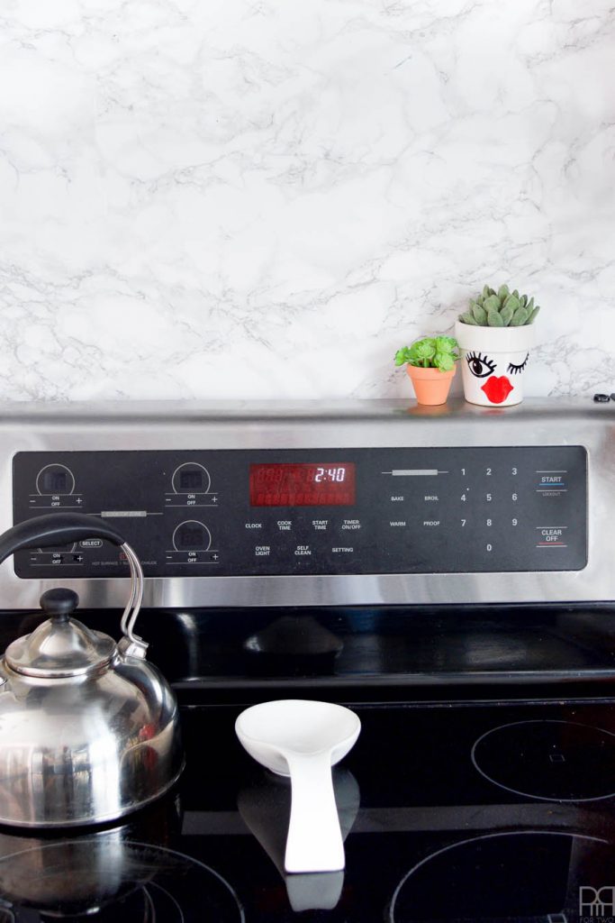
A note on safety: Our stove has a high backing and does not use gas or flames. We felt the contact paper would be plenty safe where it is, and even did a few trials before embarking on the project to make sure. We’ve been living with it for a few weeks now and the contact paper stays cool to the touch while cooking, so you know it worked!
Sunday Morning: Time to paint that accent wall! Tape the walls for the accent wall and get going! Because we were applying a much darker colour to an existing colour, it barely needed two coats. The Premium Plus Ultra Paint glided on and looked so sexy! Especially against the brass and marble… we’re just ignoring the existing countertops.
Sunday Midday: Apply the bead board to your wall of choice. The bead board system is very easy to assemble, and consists of sliding the panels into place and securing with the rail, which we did much like in the bathroom. Super easy and took maybe 15 minutes.
Sunday Evening: Apply your final coat of paint on the accent wall (if needed) and do any touch-ups before replacing the switch plates and styling! This is also when we decided to instal the blinds we purchased at The Home Depot from their Home Decorators collection. This took longer than expected because I had to shorten them, but I guess you could say I’m a pro a blinds now.
And there you have it guys – a weekend project to transform your space from top to bottom in a renter-friendly way! For a complete list of sources, scroll to the bottom of the post where I’ll list everything we used. This space is night and day from what it looked and felt like before, and the small changes we made, coupled with the renter-friendly items were also very budget friendly coming in just under 500$ for the whole kit and caboodle. If we had done a full-on kitchen reno I don’t think we could have purchased the tiles for the backsplash for that price.
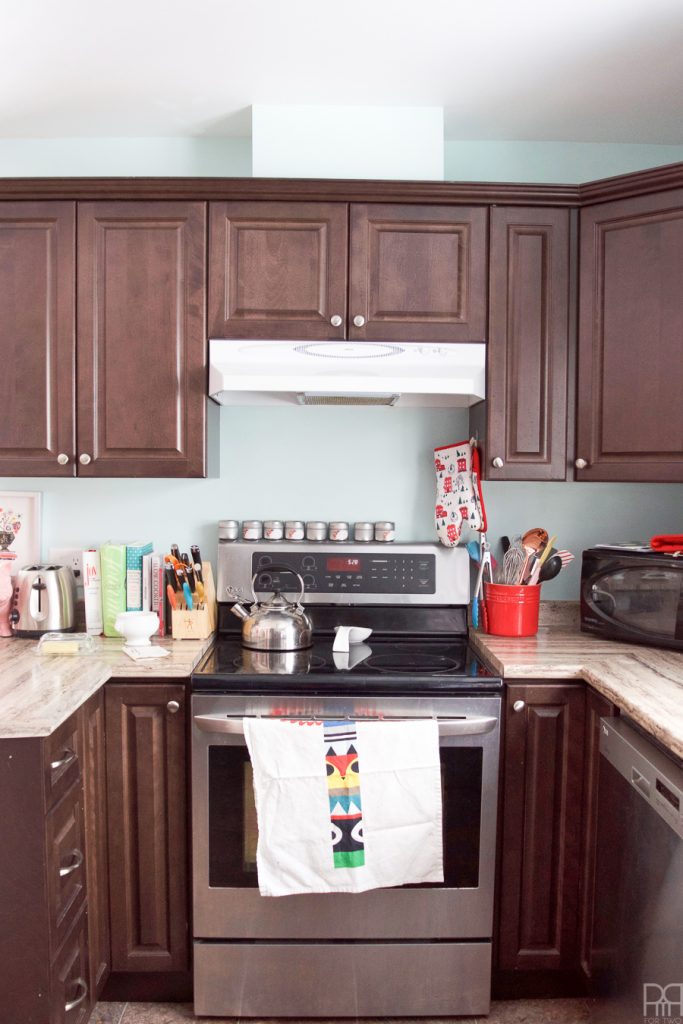
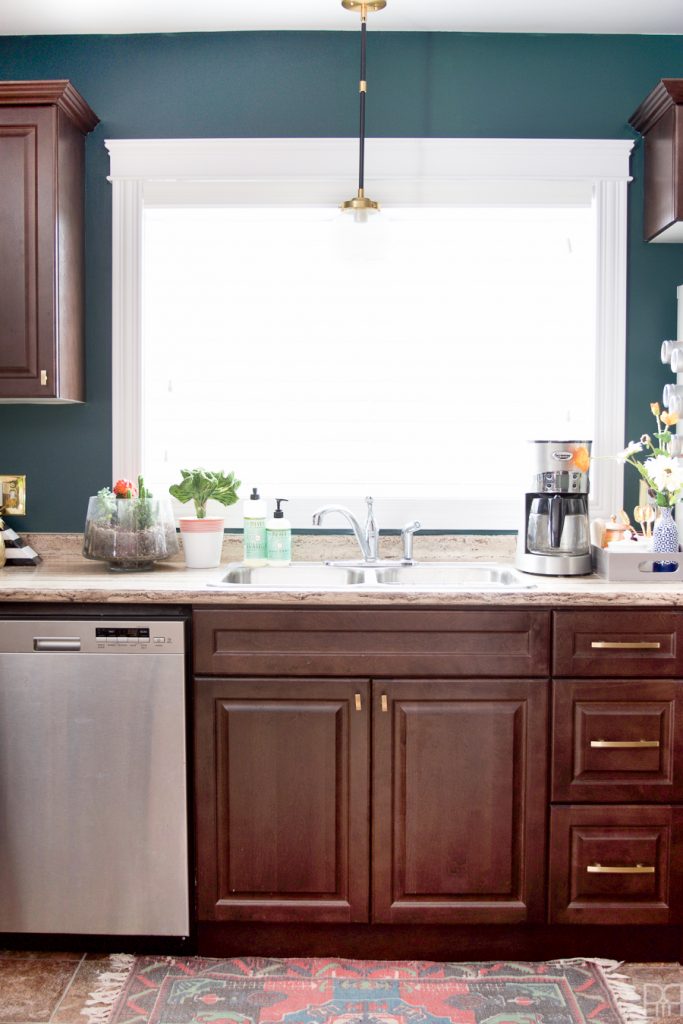
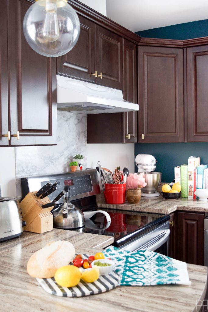
I love the way the cupboard knobs look against the cabinets. The brushed chrome was fine, but it didn’t do anything for me, and seeing how the brass pops I can’t believe I didn’t do it sooner!
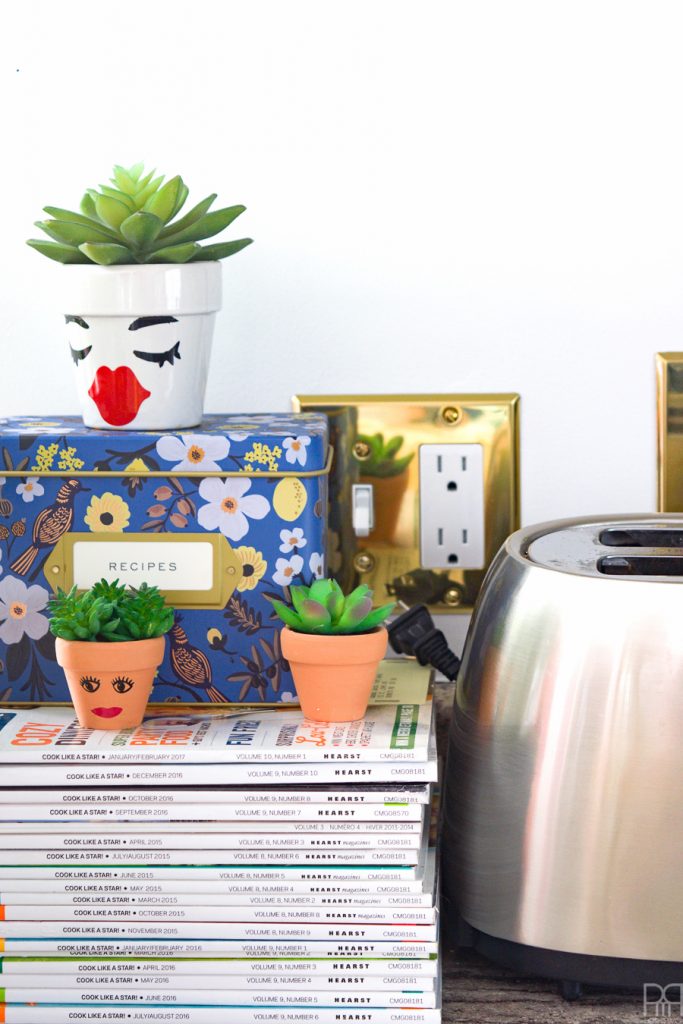
You can really see the difference that the brass switch plates make in these shots. They pop against the white as well as the blue, and help bring the metal in a different finish, throughout the room. I never want a space to be too coordinated for fear of leaving-out future additions. Sticking to one metal and one finish is just the way to do that. By mixing brushed & polished, brass and stainless steel, the space looks human and livable.
Our little trick with the marble contact paper was my favourite. I’ve done it to use as a prop board in my home office, and knew it would work just as well in the kitchen. DH was less keen on having it run along that entire wall, so I compromised and only did one part. I still think it looks great, and can always do the rest of the backsplash if the mood strikes me.
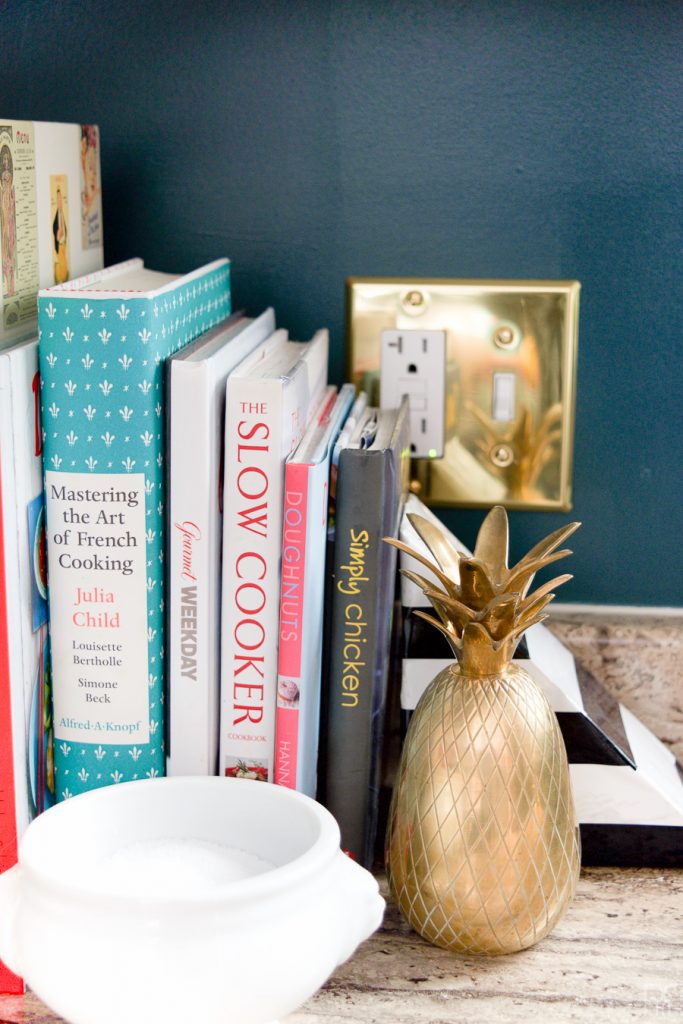
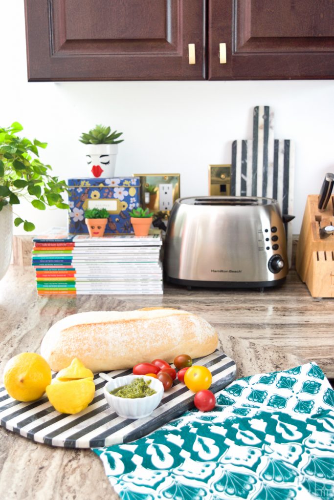
I also moved my cook books around and finally found a place for this brass pineapple that I found at Value Village a while back. It came in a pair and they were gross, but with some brasso I cleaned them up perfectly. My impromptu salt pig i.e a french onion soup bowl, is the other perfect accessorie.
You can see the blinds – sort of/not really – in the kitchen window. Blinds are meant to complement a space, not be the focus. The white imitation wood ones did just that, and I love that I can control how much light comes into the kitchen now. It’s especially a blessing in the evening and early morning when, in a vampire-like state I roam the house partially clothed. There are kids next door, and while our neighbours have never come out and said it, they did put-up curtains in all of their windows facing our home pretty quickly 😉
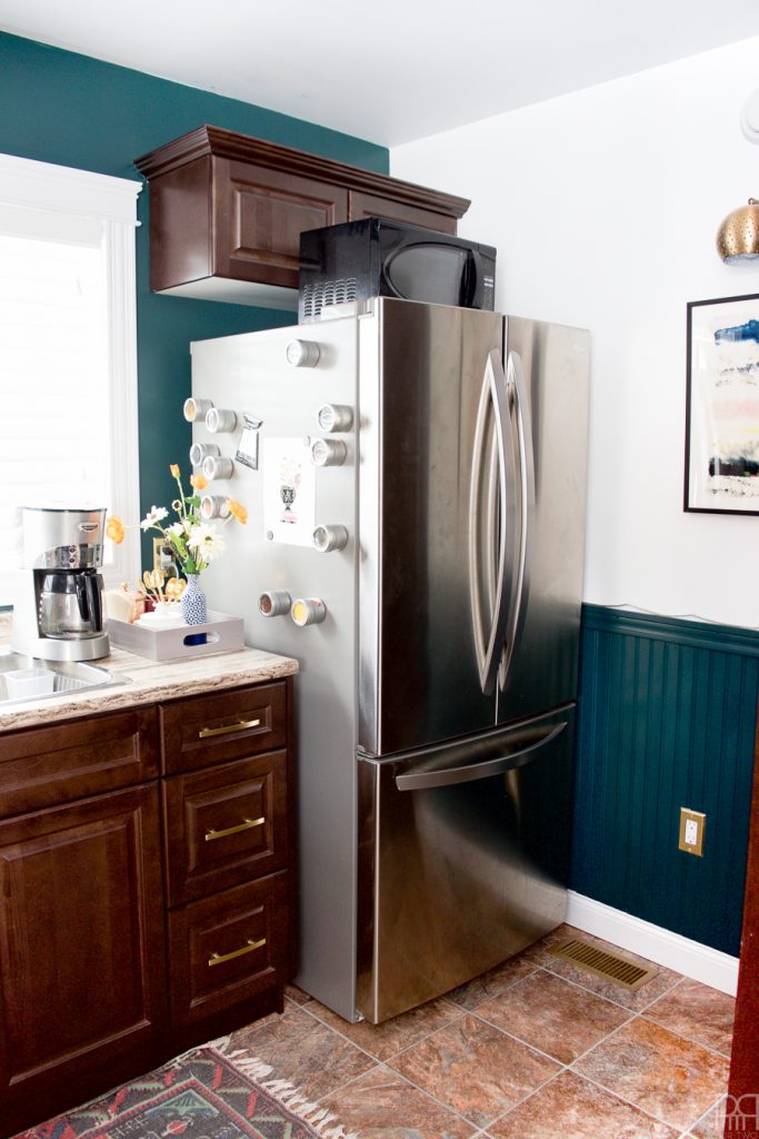
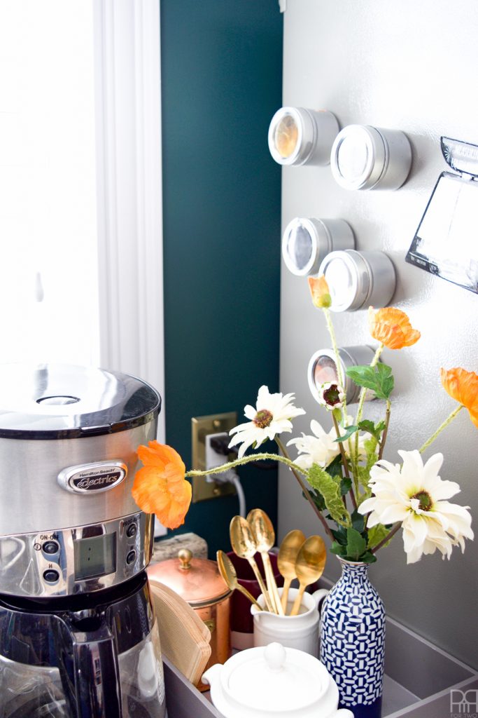
The brass plates – seen in the background here – look perfect next to the Hosta Leaf and next to the stainless steel and copper in our coffee station. I draw your attention to it here because the paint isn’t the main focus of the shot, but completes it in a way that would be impossible without it.
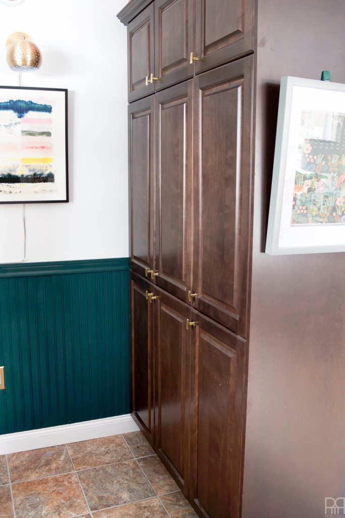
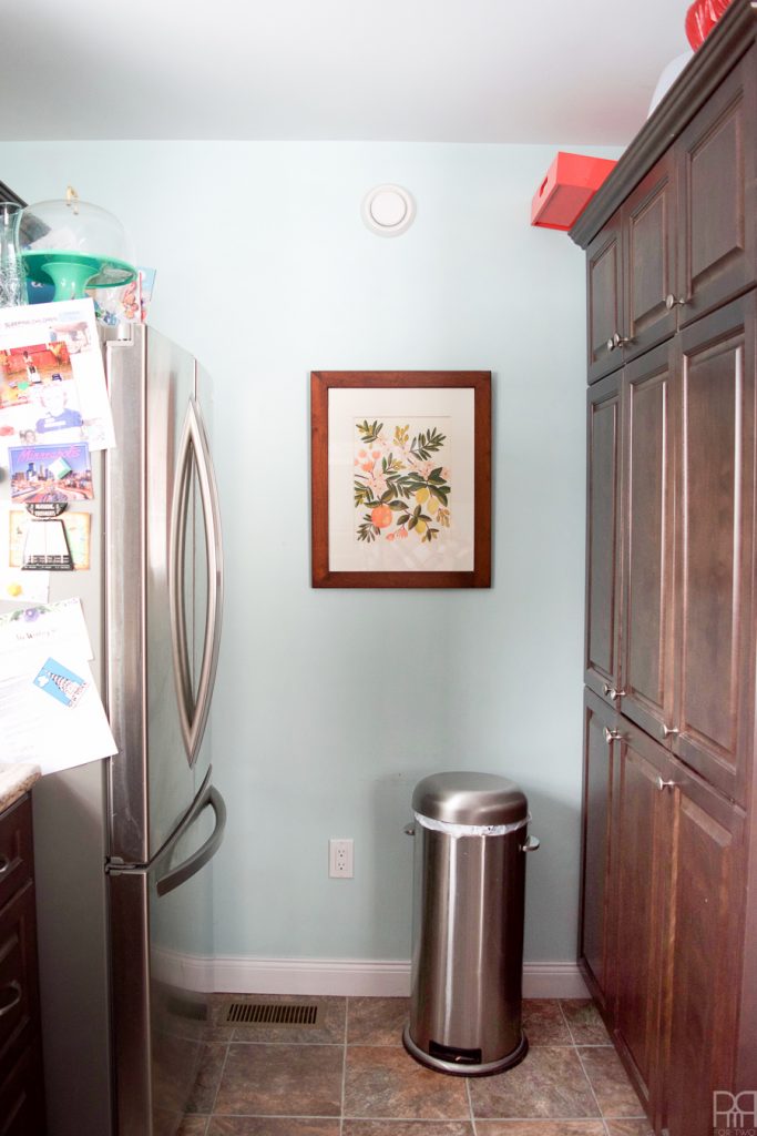
And here you’ve got the bead board in the kitchen! Our trash can normally sits right there in that corner (see before photos) but as you can imagine, it’s not photogenic and gosh darn I don’t need to show you that! It adds a completely different element to the room; the vertical lines pick-up on those of the cabinets, the brass switch plates look stunning agaisnt it, while the brushed brass knobs next to it are also stunning. You could even be tricked into thinking there weren’t ugly brown cabinets here! Did I trick you?
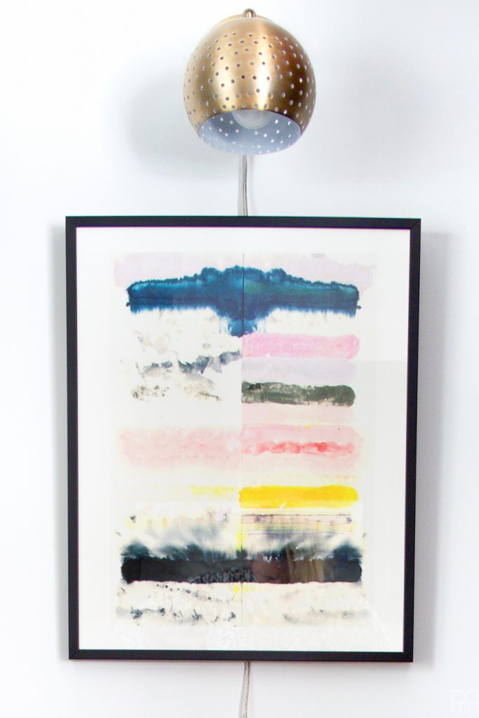
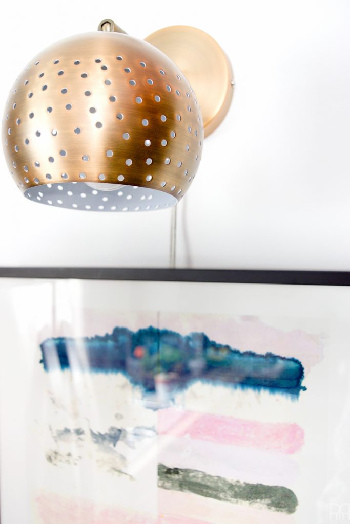
The piece on the wall under the adorable perforated articulated sconce was another match made in heaven. Beauty Inside by Kristi Kohut is like a rorschach test for the kitchen / your tummy – do you see a kale salad? a beautiful summer meal? or do you see funions and cupcakes – these are the questions we should be asking ourselves people!
Sources
Art // Picture Light // Bead Board // Premium Plus Ultra // Hosta Leaf MQ6-09 // Marble Contact Paper * // Brass Switch Plates // Brass Knobs // Brass Handles // Blinds
*Sold in stores, but not listed online