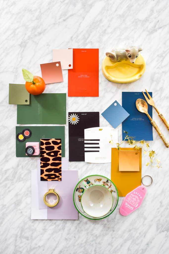
One of the first things I do before moving into a new home, is decide on a colour palette. In this case, our 1960s fixer upper is getting an era appropriate colour palette, including Behr’s Colour Of The Year – Blueprint!
Blueprint a hint darker than Rainy Season, the colour I’ve used in the PMQ’s dining room, entryway, stairway and our master bedroom.
*Behr sponsored this post, but all thoughts are my own. Thank you for supporting the brands that make PMQ for two possible.


One of the first things I have to do once we move in, is take down all the wallpaper on the walls so that I can paint. Wallpaper is fun, but not this stuff. It’s gotta go!
How to make a colour palette
While I’m in no hurry to paint the entire house, I am in a hurry to get one or two spaces completed before Christmas, so that I can enjoy them. In order to do that though, I need to make sure all my colour choices will work together.
How to pick a main colour for the palette
When you’re assembling a colour palette, especially for an older home like our 1960s era build, you need to start with one colour. In this case, I am completely in love with Behr paint’s Blueprint.
Because I used a very similar colour in most of our PMQ, so I know a lot of our stuff will work with it, plus I love the calming and restorative power of the shade. It’s fab! and it works with so many other colours.
If you’ve never used colour before, pick one that you like and then tone down the intensity by like 20. There are MORE than enough neon green spaces in the world.

Always pick a more muted shade
On the colour chip it looks fab, but you do not need the super bright version of that colour on your walls. It will be terrifying, overpowering, and very intense. Trust me. You’ll noticed that most colour chips are in a gradient. See how well the colour, two or three shades darker, looks first.
Not only that, but your furniture and decor will likely look much better with a more muted shade anyways.

buy your own Dream House Keychain
How to assemble the rest of the palette
With one colour picked, you can then select shades that work with it. If you just say “oh I want blue” and then pick a bunch of colours that are bold and punchy, you might be in for a rough landing once they’re all on the walls.
Look at a colour wheel , find your main colour, and then see which colour is directly across from it on the wheel. That colour, and the two colours on either side will work really well as accents. BOOM! Did I just blow your mind?
ex. Blue – yellows, oranges, and reds look fabulous together.
ex. Green – purples, reds, and oranges will wow.
You’ll notice that in my palette, I’ve got blue and green, and then yellows, oranges, purples, and reds. I am a magician! A true colour wizard.

How to make a retro colour palette
Now, when working with the bones and character of a 1960s fixer upper, you want to use era appropriate shades. Mammy Eisenhower pink, Baby Blue, Mustard, Navy, and orange are not only era specific, but they’ll look great with the materials in the home.
It never hurts to do some research, especially for some dedicated spaces like kitchens and bathrooms where there might already be coloured tile.
I recommend Pinterest as a great place to start, as well as combing through old editions of Better Homes and Gardens.

Which room for which colour?
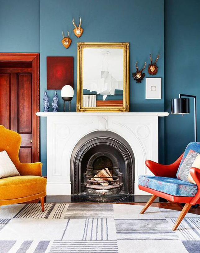
For the living room, I’m thinking of Blueprint, because it will go with all the teak and leather I want to introduce into the space.

BMID via My Domaine
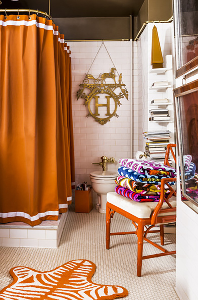
For the master bedroom I want to create a spicy little space that will coordinate with the master bathroom (full of brown tiles!). I don’t quite want red, or orange, but Torch Red is an orangey red that feels very Scalamandre meets Hermes. (I can’t find a photo that sums up what I mean, but this bathroom comes close)

For the master bathroom I’m going to go bold with a banana leaf wallpaper (I think) that will accent the brown tiles. We won’t be remodelling for a while, so I need something that will work until then!
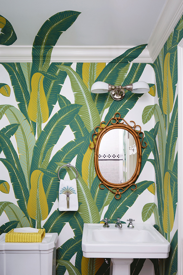

Jessica Glynn for Coastal Living
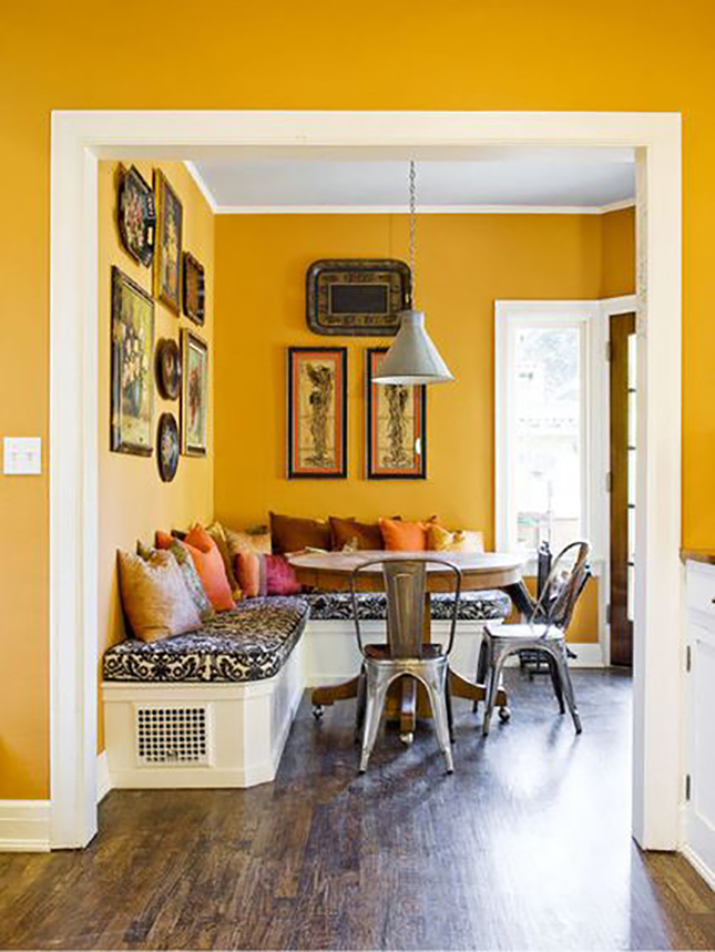
For the Dining room, I’m torn between two shades – and they’re totally opposites. I can go with a blue again to keep all the warm tones of the teak in balance. The dining room can be seen from the front door (as can the living room), so I want a bold punch of colour, and I think Opera Glasses will provide enough of an impact, while still coordinating with Blueprint.


For the kitchen, I have plans to add a black and white backsplash & flooring, and change the countertop to white. I want to keep the kitchen cabinets and their amazing wood grain, so I’m thinking Rice Curry could be good fun, and would allow for all the whites and pinks (accessories that I have planned) to shine.

For the basement and wet bar (which I haven’t shown you guys yet), we want to create a masculine Mad Men vibe, so a sexy green will do the trick. We’re still unsure on the exact shade, since the basement can be dark, despite all the windows. We’ll have to get some hues on the walls before we make that call.


image credits unknown
For the study, I’ve been dying to use a lilac or soft purple, because it’s an equally era appropriate shade. It’s also like soft pink, just a bit different.
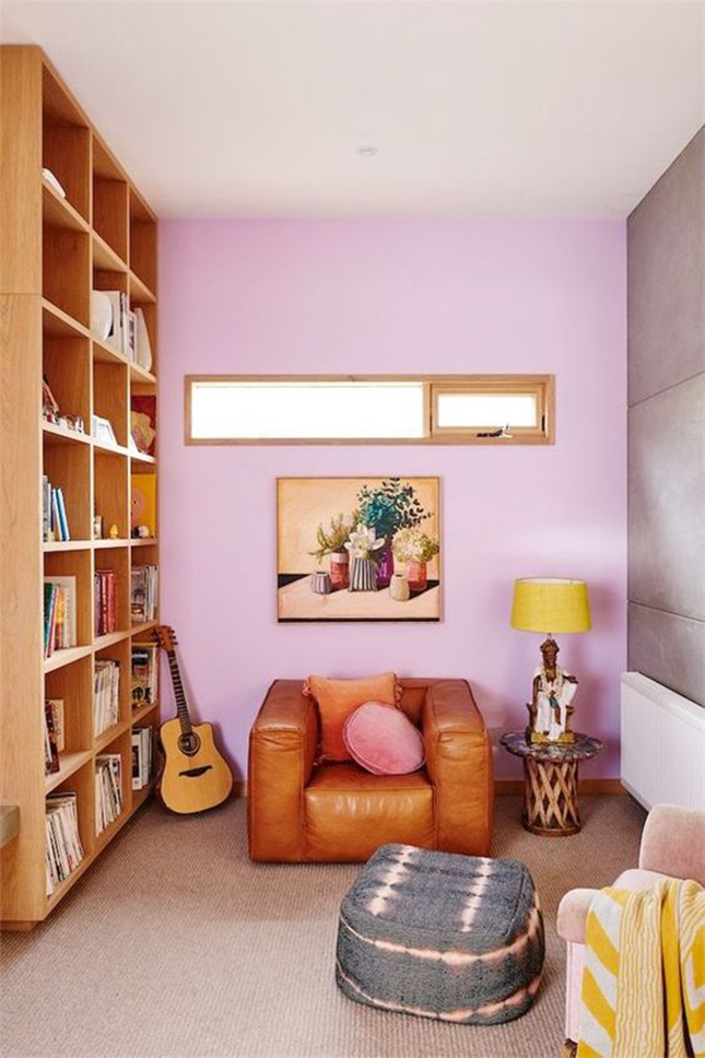
nikole ramsay for glitter guide
What’s next?
I don’t know if these are the colours that will end up on the walls, but they’re the ones I love for now, and the ones I’m working towards. It should be noted that when the time comes, I may only use that colour as an accent or a piece of painted furniture.
That’s the joys of decorating and creating, it’s all about how the mood strikes you!