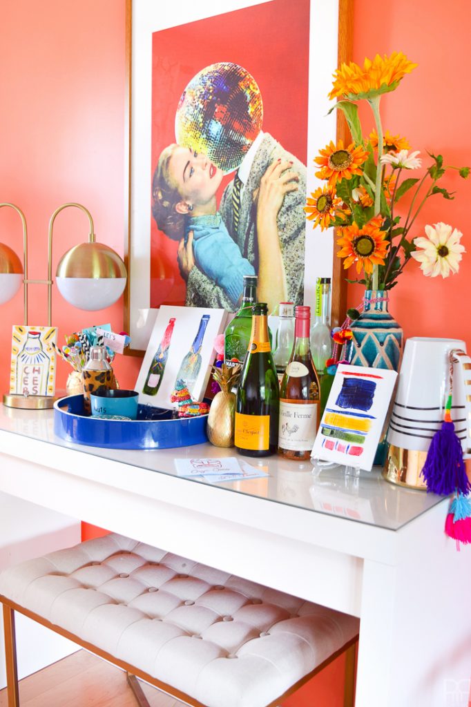
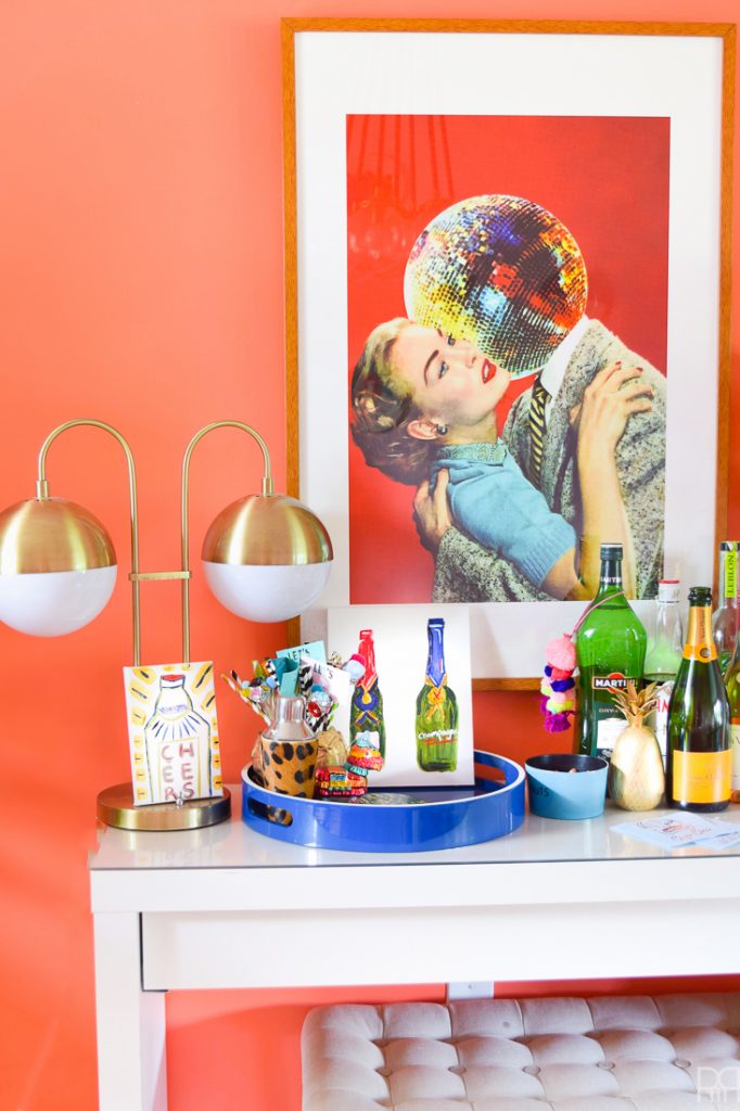
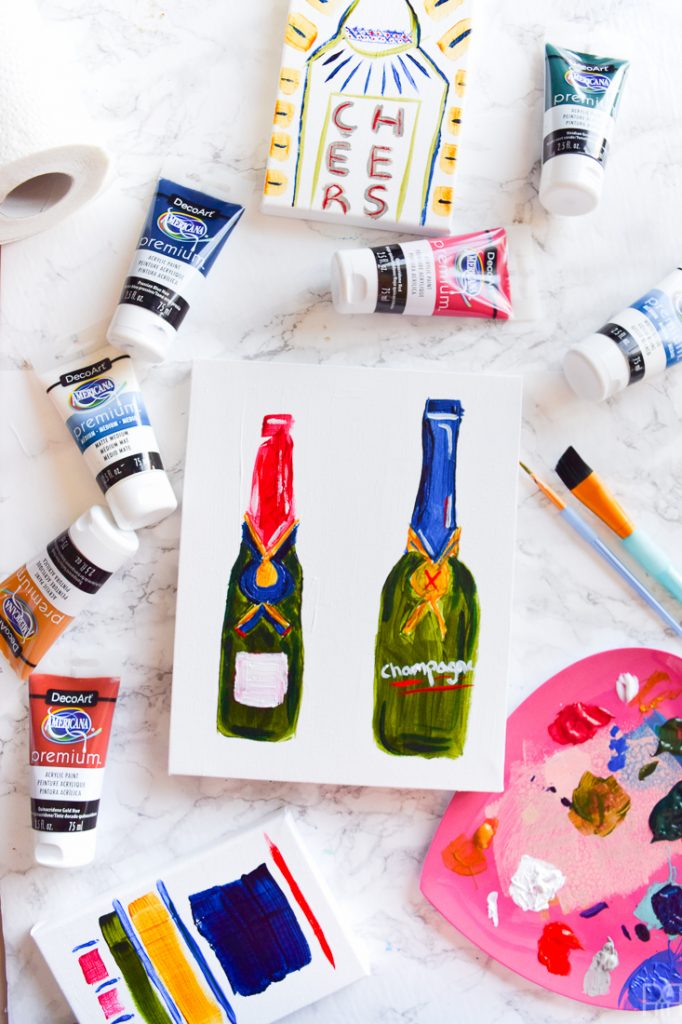
Don’t hate me, but I did another project involving my bar. I know eh?! Tons going on in the dining room, and especially with all the TGIF cocktails, but that’s because this PMQ is very small, and I’ve got the master bedroom makeover under way. So really, the dining room and living room are where it’s at! When we got our new table and swapped the buffets around it created a second bar space and focal point. While I love our bar cart, it is very small, and the lighting in that corner is awkward, so I’ve been loving the sitch over at the white buffet.With that in mind, when DecoArt offered us the chance to work with their new line of Premium acrylic paints, I was tempted to paint some small tableaus for the space. From there, the boozy bottles bar cart art DIY was born. And while this post isn’t as much a step-by-step, it should absolutely get your creative fires going to create something for yourself.
*DecoArt sponsored this post, but all thoughts are my own. Thank you for supporting the brands that make PMQ for two possible.
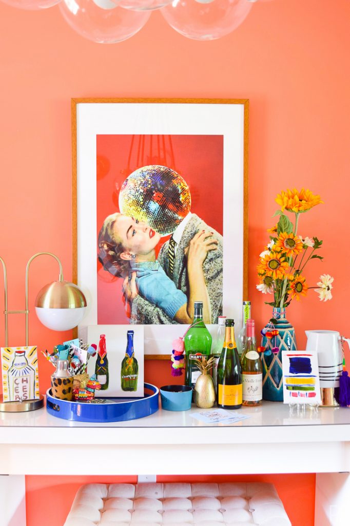

If you want to purchase the giant print for yourself you can // here //
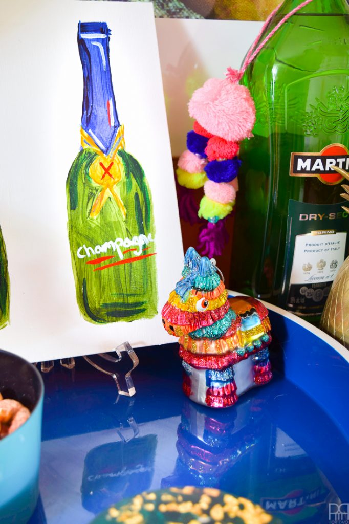
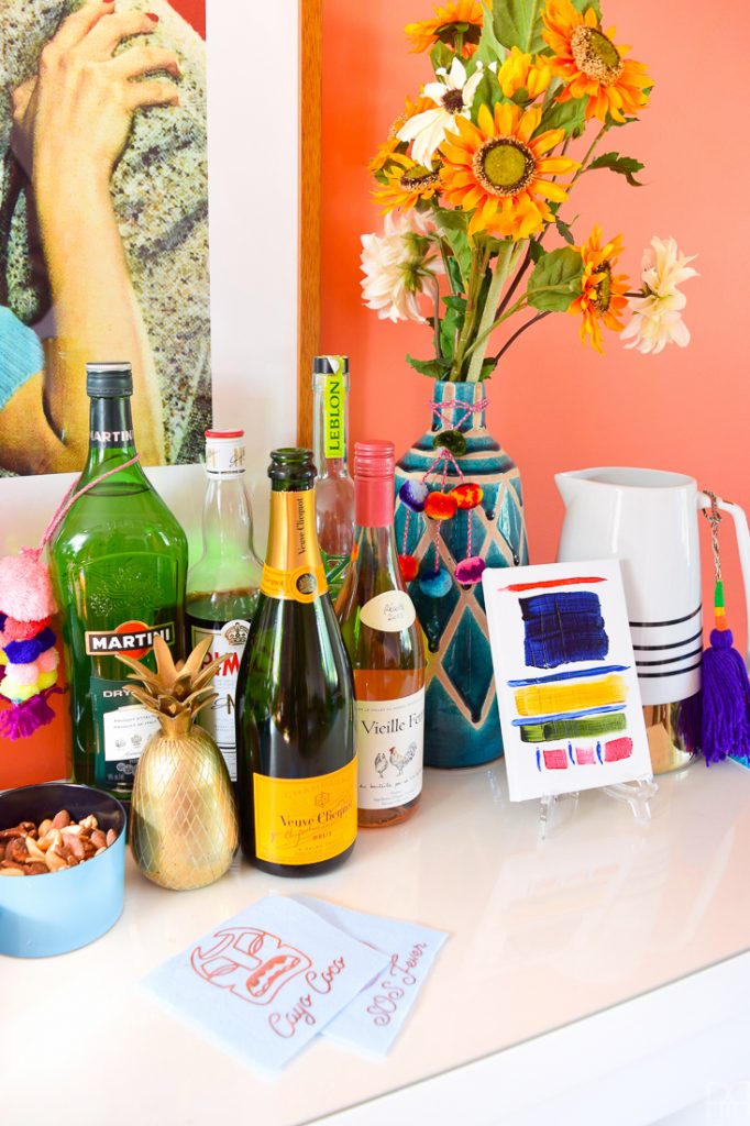
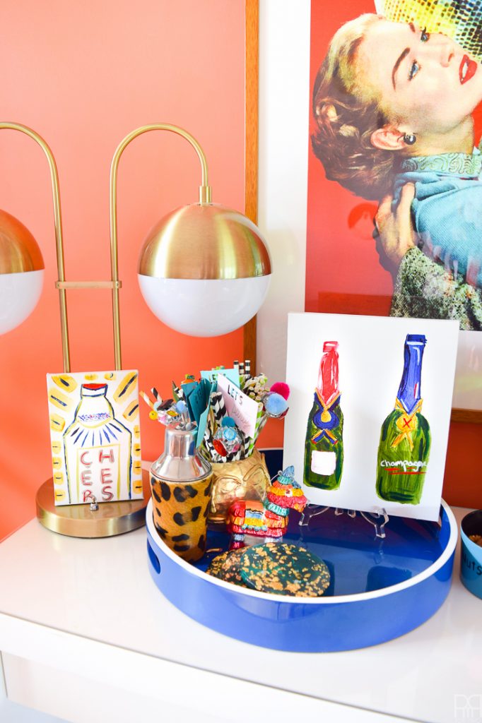
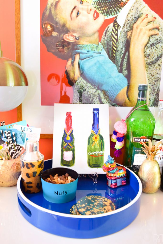
I love the warm colours in the dining room, but I’ve been looking for ways to cool down the space with the use of blues and greens, and the boozy bottles bar cart art DIY was a chance to sprinkle some more in. I’ve always loved the green hue of a glass champagne bottle. The complexity of the shade, the depth of the hue and the variance when light shines through is actually kind of beautiful. Since I can’t really afford cases of champagne to keep me entertained, I figured a nice little canvas with two bottles would do nicely.
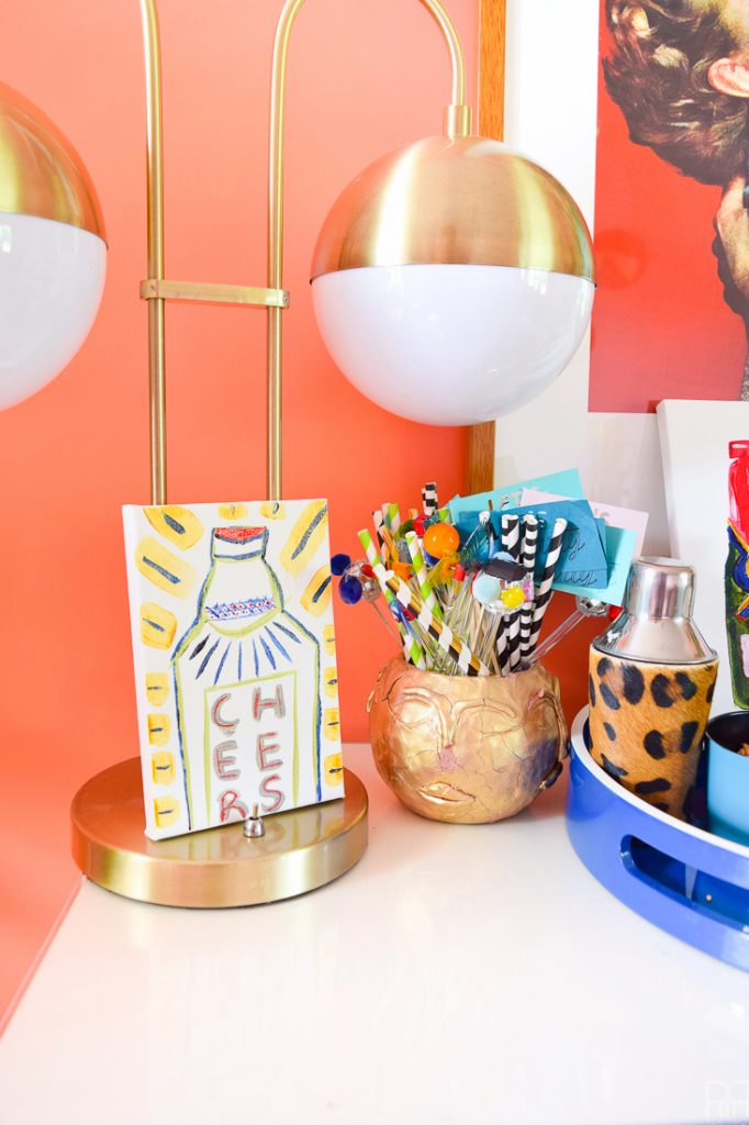
The other smaller canvases are; an abstract, similar to the ones listed in the Shop My Style page // here // and another bottle, loosely based on a gin bottle. Except instead of gin it says “Cheers”!
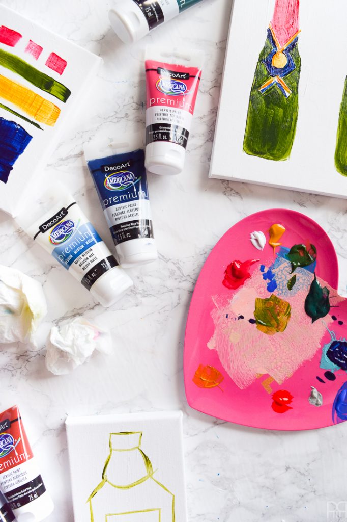
Materials
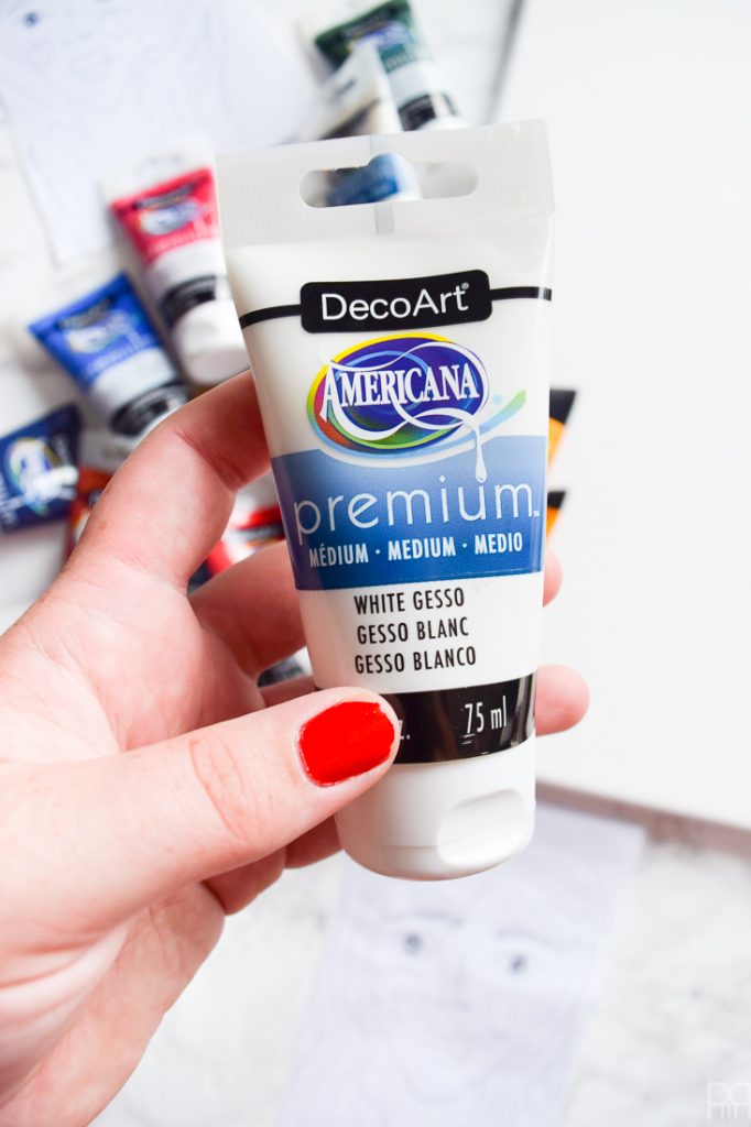
- Americana Premium Acrylics: Viridian Green Hue, Sap Green, Transparent Yellow Iron Oxide, Pyrrole Red, Quinacridone Red, Cobalt Blue Hue, Prussian Blue Hue, Warm Grey <- not yet available for purchase online. You can snag some in-store at Jo-Ann or Michaels though!
- Americana Premium White Gesso
- Americana Premium Mat – you can check-out the other mediums // here //
- Acrlyic Paint Brushes
- Canvases of your choice
- Inspiration
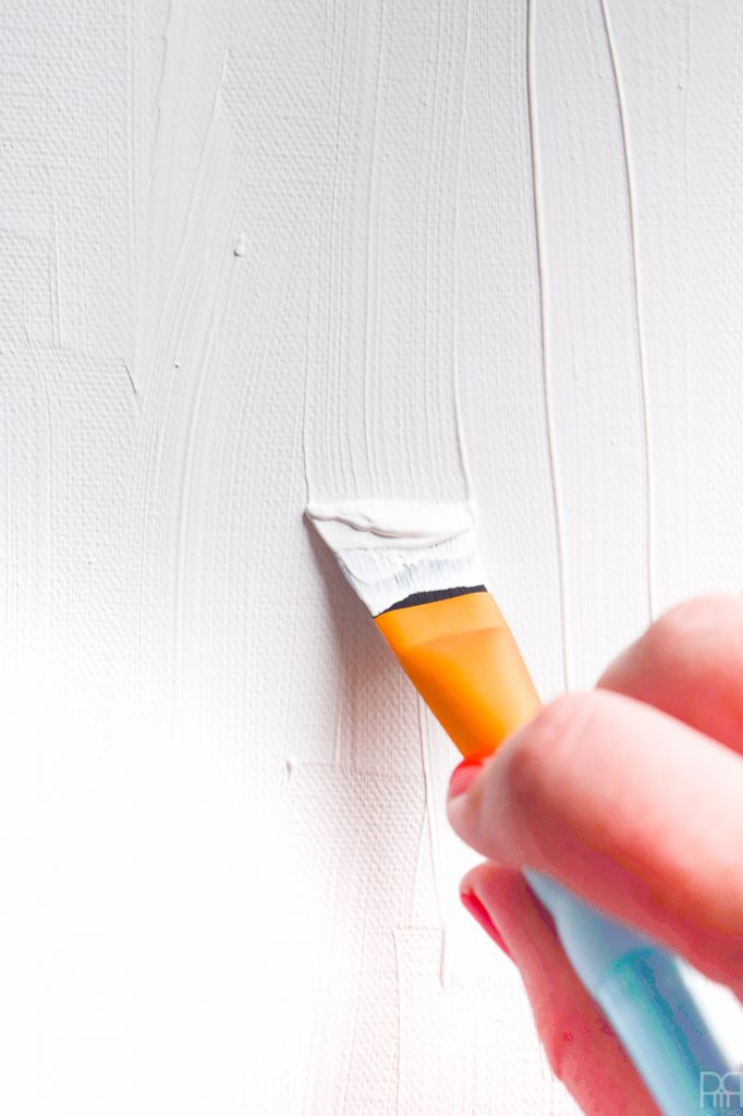
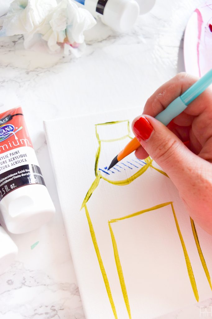
Step 1: I didn’t know that there was a product for this, but Gesso is a paint product that prepares the canvas for the paint. I always found the canvases to be off-white or easily stained, so I used to paint them white first. The white gesso is meant to do just that.
So start by priming any and all canvases with gesso. If you were going to use a darker colour all over the canvas there’s also gesso in darker colours.
The neat thing about the gesso is that you can use it to create texture too, so if you wanted, you could apply it with a small palette knife too. I just wanted a white background for my pieces, so I didn’t mind any ridges or lines.
Step 2: Start with the outline of your shapes. Much like when I paint complex flowers // here // and // here //, I start with a base colour and then add details later.
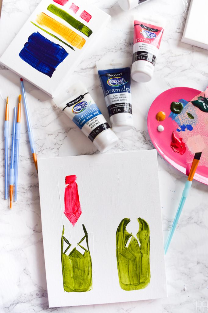
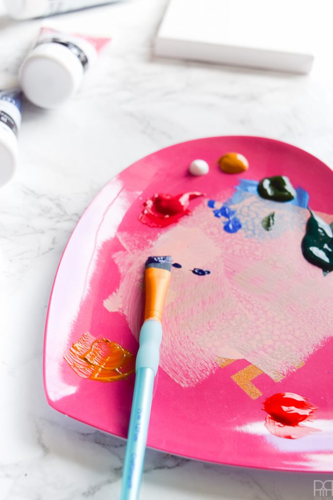
Step 3: Once the base is down, start adding details and other bold colour overlays.
Step 4: The Americana Premium Acrylics dry surprisingly quickly, which is nice. So make sure they’re nice and dry before step 5.
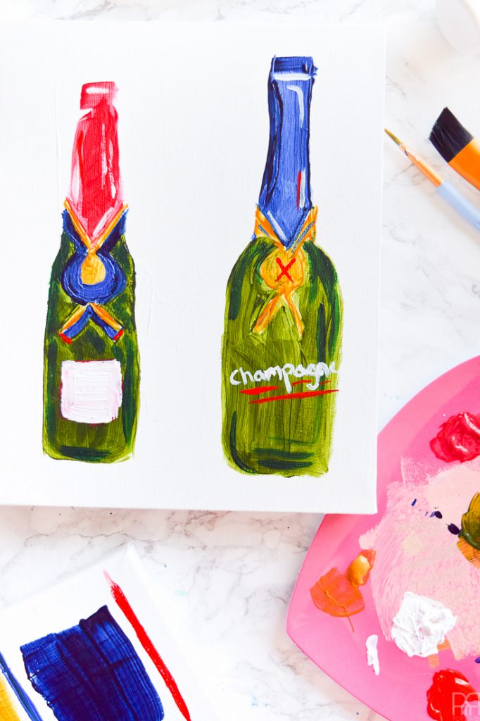
Step 5: Apply Americana’s Premium Matt Medium to your canvases. They also have a gloss finish, but I wanted something that wouldn’t compete as much with the other shiny things on the bar cart so I opted for a mat medium.


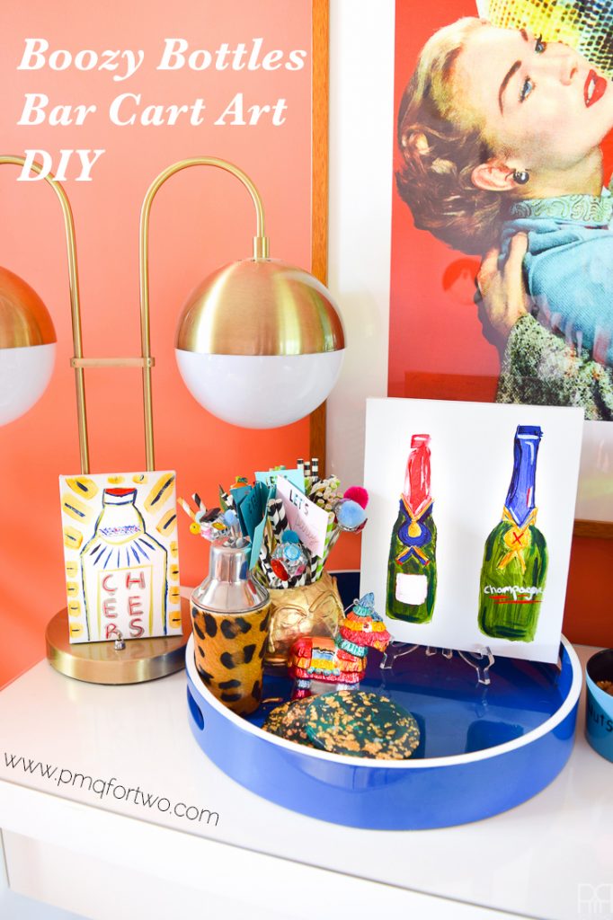
And there you have it! My boozy bottles bar cart art DIY. So as long as you have a stocked bar for inspiration and access to these lovely paints, you’re good to go!
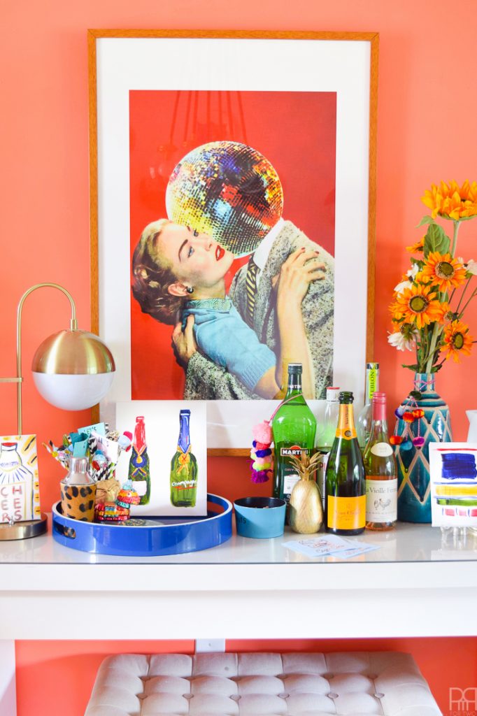
Would you believe me if I told you that I frequently clean and re-arrange the top of the sideboard? I keep trying to clear things away, but with all the use we’ve been getting out of it, it’s hard to move things off. The dining room becomes a catch-all for the house, and the sideboard is no exception!
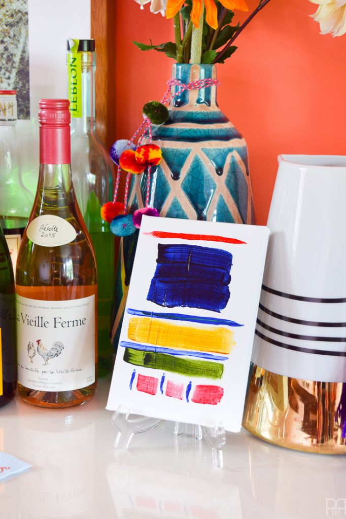
There’s something transfixing about the blues on this abstract canvas. I’m not sure why either. It’s like a big deep pool that you get lost in, and in the summer a pool is never out of place. The other colours are a testament to the dining room itself; colourful and textured.